Monday, November 21, 2011
The Rhodia premium notepad winner is . . .
. . . IvanR, who happens to have a cool Flickr photostream if you're a pen-and-paper enthusiast. Congrats, Ivan.

Sunday, November 20, 2011
Raise your hand if you hate counterfeiters as much as I do
I bought a Chinese fountain pen on eBay recently. The pen is nice enough. It has a really unique look and writes smoothly. Not a bad pen at all for the price. I'll be reviewing it shortly.
But I am still unhappy with the transaction, because the package included an insert that featured a lot more pens for sale, all of which were knock-offs (the one I purchased was not). Bad enough that the pens copied others of far greater quality. But in this insert, the pens were not only look-alikes, they were actually labeled in the ad with the trademarks of well-known pen makers.
Now, neither I nor anyone who reads this blog regularly is going to think he's buying a real Mont Blanc or Pelikan for $25. Heck, no one who is not a pen-and-paper nut is going to think he's buying a real Pelikan or Mont Blanc for $25. But the whole idea of trying to pass off one's product as someone else's really ticks me off. It's one of the reasons I enjoy enforcing intellectual property rights as a lawyer so much.
I won't be buying from that seller again. I know my decision isn't exactly going to bring the seller to his knees. But I can't reward a counterfeiter with further business.
Am I the only one who reacts so viscerally to this?
Saturday, November 12, 2011
While we're on the subject of giveaways . . .
There's a huge one going on at I am the diva - Certified Zentangle Teacher (CZT®). The Diva is giving away three different packages of art supplies in celebration of her 200,000th hit. Congrats, Diva!
Zentangles appeal to me because, as I've mentioned before, I'm no artist, and zentangles are supposed to be achievable even for those without any real artistic talent. That's not a knock on zentangle artists, I'm merely repeating one of the selling features I've seen touted, such as this one from Zentangle, Inc.:
Like 99% of lawyers, I deal with a lot of stressful situations in my work. Creating zentangles is supposed to be a good activity for relieving stress. So, zentangles seem like the perfect pastime for someone like me: a pen-and-paper enthusiast whose profession doesn't allow me to use my pens and papers that much (so much of my work being done on the computer), who has no idea how to start writing prose, and who can't draw much beyond stick figures. About the only workout my stationery gets is letter-writing, notes in church, notes during the occasional meeting at work, and quick notes to my assistant.
I need a creative outlet! Since winning one of these packages might be a good way to get startedas a zentangler zentanglist zentanglerator at creating zentangles, you can bet I am entering. (Update: I browsed around on The Diva's blog a little more, and it appears the correct term for a zentangle artist is "tangler.")
Zentangles appeal to me because, as I've mentioned before, I'm no artist, and zentangles are supposed to be achievable even for those without any real artistic talent. That's not a knock on zentangle artists, I'm merely repeating one of the selling features I've seen touted, such as this one from Zentangle, Inc.:
With Zentangle, anyone can create beautiful images from repetitive patterns. This method is easy to learn and easy to do. And even though it is a specified series of steps, it results in a creative expression that transcends its own rules.They even use the trademark phrase, "Anything is possible ... one stroke at a time."
Like 99% of lawyers, I deal with a lot of stressful situations in my work. Creating zentangles is supposed to be a good activity for relieving stress. So, zentangles seem like the perfect pastime for someone like me: a pen-and-paper enthusiast whose profession doesn't allow me to use my pens and papers that much (so much of my work being done on the computer), who has no idea how to start writing prose, and who can't draw much beyond stick figures. About the only workout my stationery gets is letter-writing, notes in church, notes during the occasional meeting at work, and quick notes to my assistant.
I need a creative outlet! Since winning one of these packages might be a good way to get started
Review and Giveaway: No. 16 R by Rhodia Soft Touch Premium Notepad
The Review
Lovers of Rhodia pads must always be thinking, "What will they come up with next?" When the product seems perfect, it's hard to imagine improvements.
A few years ago, Rhodia managed to top itself when they came out with their Dot Pad. In my opinion, they've topped themselves yet again with the R by Rhodia line of premium "soft touch" notebooks.
The classic notebooks have 80 sheets of 80g, bright white paper with purple ruling (and a left margin line in the lined notebooks). R by Rhodia have 90g, very pale ivory paper with grayish ruling and no margin line. I'd like ruling that's a little less obtrusive, but I like the color combination in the premium notebook more than the classic line. I like the bright white paper of the classic line, but I've never been a fan of the purple ruling.
The 90g paper is thicker than the paper in the classic, so you get ten fewer sheets — 70 — in the premium notebook, making it just about the same thickness as the classic (pic).
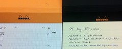
I'll give you the short version on performance. Awesome. The paper is smoooooooth. I used some pens with wet-writing nibs to slather on some super-saturated inks: not even a hint of show-through, let alone bleeding. No feathering. So, then I swabbed on some Aurora Black, and the paper still didn't bleed, and the only reason the show-through was noticeable was because the paper puckered where the ink dried.

Some other reviewers seem to think that inks dry faster on the premium pad than on the classic or on Clairefontaine's 90g Triomphe stationery (which I use all the time), but I didn't get a chance to test it.
For me, there's more to a product than its performance. I like nice aesthetics. Give me a choice between a product that performs magnificently but is utilitarian in appearance and a product that performs not quite as well (but still very well) and is beautiful to behold, and I'll go with the beautiful product every time.
And this pad is beautiful. That might seem a bit strong for a notepad, but I see real beauty in this pad.
Lovers of Rhodia pads must always be thinking, "What will they come up with next?" When the product seems perfect, it's hard to imagine improvements.
A few years ago, Rhodia managed to top itself when they came out with their Dot Pad. In my opinion, they've topped themselves yet again with the R by Rhodia line of premium "soft touch" notebooks.
The classic notebooks have 80 sheets of 80g, bright white paper with purple ruling (and a left margin line in the lined notebooks). R by Rhodia have 90g, very pale ivory paper with grayish ruling and no margin line. I'd like ruling that's a little less obtrusive, but I like the color combination in the premium notebook more than the classic line. I like the bright white paper of the classic line, but I've never been a fan of the purple ruling.
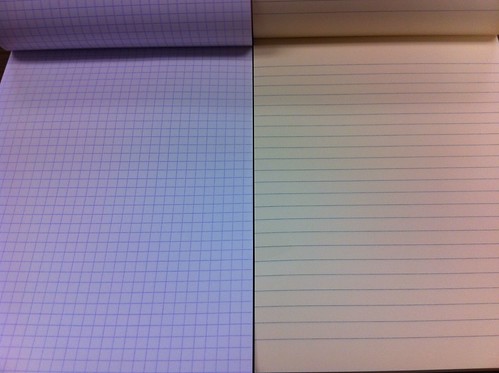 |
| Left: the classic notebook - bright white 80g paper, purple ruling. Right: premium notebook - cream-colored, 90g paper |
I'll give you the short version on performance. Awesome. The paper is smoooooooth. I used some pens with wet-writing nibs to slather on some super-saturated inks: not even a hint of show-through, let alone bleeding. No feathering. So, then I swabbed on some Aurora Black, and the paper still didn't bleed, and the only reason the show-through was noticeable was because the paper puckered where the ink dried.

Some other reviewers seem to think that inks dry faster on the premium pad than on the classic or on Clairefontaine's 90g Triomphe stationery (which I use all the time), but I didn't get a chance to test it.
For me, there's more to a product than its performance. I like nice aesthetics. Give me a choice between a product that performs magnificently but is utilitarian in appearance and a product that performs not quite as well (but still very well) and is beautiful to behold, and I'll go with the beautiful product every time.
And this pad is beautiful. That might seem a bit strong for a notepad, but I see real beauty in this pad.
The beauty is in the cover. Rhodia orange it is (also comes in black), but it is not glossy like the classic Rhodia covers. Touching it is like touching velvet. How did they do that? The black inside of the cover is just as smooth. The cover is so nice, it would almost be a shame to put this pad in a pad holder and cover it up. Unlike the classic notebook, the cover of the premium line is orange outside, black inside.
OK, that's it. I'm keeping this short because: (1) there have been so many good reviews of this pad already, and (2) I haven't posted in nearly four months, and it's going to take me awhile to get back in the swing of things (patience, please!). Some other reviews are at The Missive Maven (lots of pictures), Ink Nouveau (with video!), Gourmet Pens, and Spiritual Evolution of the Bean.
The Giveaway
Here's the part where you'll be glad you didn't unsubscribe from my RSS feed just because I hadn't posted in nearly four months.
This pad was sent to me gratis by Karen at Exaclair, and I'm really tempted to keep it, but one good turn deserves another, so I'm passing it on to one of my readers. To enter the giveaway: (1) leave a comment on this post, AND (2) send me an email with the subject line RHODIA PREMIUM at notebookeresq@gmail.com, telling me the name you used to comment. You must do BOTH (1) and (2) to be entered in the giveaway. I will allow new entries through 11 p.m. Pacific time on Thursday, November 17.
Good luck!
(UPDATE: In case any of you are wondering, I did not write "Iroshizuku something-or-other" in my test of the paper to make fun of the ink's Japanese name. I honestly don't know which blue that is, I only know it's an Iroshizuku ink.)
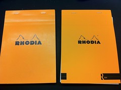 | ||||
| The "R" mark at bottom right is the most obvious thing setting sets the premium apart, but the cover is also less glossy |
 |
| Classic cover is same color inside and out; premium is orange outside, black inside |
OK, that's it. I'm keeping this short because: (1) there have been so many good reviews of this pad already, and (2) I haven't posted in nearly four months, and it's going to take me awhile to get back in the swing of things (patience, please!). Some other reviews are at The Missive Maven (lots of pictures), Ink Nouveau (with video!), Gourmet Pens, and Spiritual Evolution of the Bean.
The Giveaway
Here's the part where you'll be glad you didn't unsubscribe from my RSS feed just because I hadn't posted in nearly four months.
This pad was sent to me gratis by Karen at Exaclair, and I'm really tempted to keep it, but one good turn deserves another, so I'm passing it on to one of my readers. To enter the giveaway: (1) leave a comment on this post, AND (2) send me an email with the subject line RHODIA PREMIUM at notebookeresq@gmail.com, telling me the name you used to comment. You must do BOTH (1) and (2) to be entered in the giveaway. I will allow new entries through 11 p.m. Pacific time on Thursday, November 17.
Good luck!
(UPDATE: In case any of you are wondering, I did not write "Iroshizuku something-or-other" in my test of the paper to make fun of the ink's Japanese name. I honestly don't know which blue that is, I only know it's an Iroshizuku ink.)
Subscribe to:
Comments (Atom)


