Lovers of Rhodia pads must always be thinking, "What will they come up with next?" When the product seems perfect, it's hard to imagine improvements.
A few years ago, Rhodia managed to top itself when they came out with their Dot Pad. In my opinion, they've topped themselves yet again with the R by Rhodia line of premium "soft touch" notebooks.
The classic notebooks have 80 sheets of 80g, bright white paper with purple ruling (and a left margin line in the lined notebooks). R by Rhodia have 90g, very pale ivory paper with grayish ruling and no margin line. I'd like ruling that's a little less obtrusive, but I like the color combination in the premium notebook more than the classic line. I like the bright white paper of the classic line, but I've never been a fan of the purple ruling.
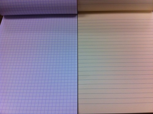 |
| Left: the classic notebook - bright white 80g paper, purple ruling. Right: premium notebook - cream-colored, 90g paper |
I'll give you the short version on performance. Awesome. The paper is smoooooooth. I used some pens with wet-writing nibs to slather on some super-saturated inks: not even a hint of show-through, let alone bleeding. No feathering. So, then I swabbed on some Aurora Black, and the paper still didn't bleed, and the only reason the show-through was noticeable was because the paper puckered where the ink dried.

Some other reviewers seem to think that inks dry faster on the premium pad than on the classic or on Clairefontaine's 90g Triomphe stationery (which I use all the time), but I didn't get a chance to test it.
For me, there's more to a product than its performance. I like nice aesthetics. Give me a choice between a product that performs magnificently but is utilitarian in appearance and a product that performs not quite as well (but still very well) and is beautiful to behold, and I'll go with the beautiful product every time.
And this pad is beautiful. That might seem a bit strong for a notepad, but I see real beauty in this pad.
The beauty is in the cover. Rhodia orange it is (also comes in black), but it is not glossy like the classic Rhodia covers. Touching it is like touching velvet. How did they do that? The black inside of the cover is just as smooth. The cover is so nice, it would almost be a shame to put this pad in a pad holder and cover it up. Unlike the classic notebook, the cover of the premium line is orange outside, black inside.
OK, that's it. I'm keeping this short because: (1) there have been so many good reviews of this pad already, and (2) I haven't posted in nearly four months, and it's going to take me awhile to get back in the swing of things (patience, please!). Some other reviews are at The Missive Maven (lots of pictures), Ink Nouveau (with video!), Gourmet Pens, and Spiritual Evolution of the Bean.
The Giveaway
Here's the part where you'll be glad you didn't unsubscribe from my RSS feed just because I hadn't posted in nearly four months.
This pad was sent to me gratis by Karen at Exaclair, and I'm really tempted to keep it, but one good turn deserves another, so I'm passing it on to one of my readers. To enter the giveaway: (1) leave a comment on this post, AND (2) send me an email with the subject line RHODIA PREMIUM at notebookeresq@gmail.com, telling me the name you used to comment. You must do BOTH (1) and (2) to be entered in the giveaway. I will allow new entries through 11 p.m. Pacific time on Thursday, November 17.
Good luck!
(UPDATE: In case any of you are wondering, I did not write "Iroshizuku something-or-other" in my test of the paper to make fun of the ink's Japanese name. I honestly don't know which blue that is, I only know it's an Iroshizuku ink.)
 | ||||
| The "R" mark at bottom right is the most obvious thing setting sets the premium apart, but the cover is also less glossy |
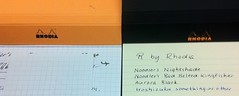 |
| Classic cover is same color inside and out; premium is orange outside, black inside |
OK, that's it. I'm keeping this short because: (1) there have been so many good reviews of this pad already, and (2) I haven't posted in nearly four months, and it's going to take me awhile to get back in the swing of things (patience, please!). Some other reviews are at The Missive Maven (lots of pictures), Ink Nouveau (with video!), Gourmet Pens, and Spiritual Evolution of the Bean.
The Giveaway
Here's the part where you'll be glad you didn't unsubscribe from my RSS feed just because I hadn't posted in nearly four months.
This pad was sent to me gratis by Karen at Exaclair, and I'm really tempted to keep it, but one good turn deserves another, so I'm passing it on to one of my readers. To enter the giveaway: (1) leave a comment on this post, AND (2) send me an email with the subject line RHODIA PREMIUM at notebookeresq@gmail.com, telling me the name you used to comment. You must do BOTH (1) and (2) to be entered in the giveaway. I will allow new entries through 11 p.m. Pacific time on Thursday, November 17.
Good luck!
(UPDATE: In case any of you are wondering, I did not write "Iroshizuku something-or-other" in my test of the paper to make fun of the ink's Japanese name. I honestly don't know which blue that is, I only know it's an Iroshizuku ink.)


Wonderful review, I have not tried this notepad yet so would love to get my hands on one.
ReplyDeleteI really like Rhodia, but haven't tried the new Premium pads. Looks like a great product.
ReplyDeleteI've never tried Rhodia....so count me in :)
ReplyDeleteI've never tried Rhodia, but my wife likes them.
ReplyDeleteI'm the wife, and I do. I LOVE THEM.
ReplyDeleteWelcome back, and excellent review! I've always wanted to try a Rhodia product.
ReplyDeleteThanks for the 411 on the product - it's so nice to get your evaluation!
ReplyDeleteA new notebook? Yes, please.
ReplyDeletemmmmm notebook.....
ReplyDeleteI currently don't have any Rhodia products in my arsenal, so it would be really great to win this one. =)
ReplyDeleteFantastic review! I have a blank page version (and reviewed it at http://lifeimitatesdoodles.blogspot.com/2011/09/rhodia-r-pad-review.html) and absolutely love it! Wouldn't mind having one of the lined ones, so I'm entering!
ReplyDeleteSounds like a great notepad!!
ReplyDeleteHm, i'm a big fan of paper... notepads too!! i'm entering (and emailing)
ReplyDeleteLove me some Rhodia! Thanks for the giveaway.
ReplyDeleteOh that looks delicious...*drool*
ReplyDeleteThanks for the review, the notebook sounds wonderful. And thanks for the giveaway.
ReplyDeleteIt's been awhile since I have used a Rhodia notebook. I would like to "remember" what they are like.
ReplyDeleteI would love to try these. Thank you for passing it on.
ReplyDeleteI've always gravitated to these at the bookstore on campus, but always end up buying the cheaper ones. I'd love to prove to myself that they're worth it
ReplyDeleteI haven't yet tried the R by Rhodia line, but I'd sure like to!
ReplyDeleteI beat you on length of time between blog posts. Glad to see you back. Would love to give this a test run also. Thanks!
ReplyDeleteRhodia pads with ivory papers. That's what I was waiting for. Nice review! Count me in for the giveaway!
ReplyDeleteThrow my name in the hat! I haven't tried the 'R' stuff yet, but I'd love the opportunity to do so for free. Thanks for the generosity.
ReplyDeleteEntering and emailing as this would be great for Zentangle patterns and journaling both! Thank you for the possibility to win!
ReplyDeleteI just love Rhodia Pads, never have enough! Thanks.
ReplyDeletePlease pick me oh grand and mighty number generator:)
ReplyDeleteGood to see you back again.
ReplyDeleteI need more Rhodia for the collection too.
Thank you for the chance. I love the #16 format.
ReplyDeleteI've been admiring these pads for a while, but haven't had the chance to try one out yet. They look great! And welcome back to blogging!
ReplyDeleteGreat review - I am completely in love with these pads. Hmmm, I think it's time to order more... :-) Thank you for the link, too.
ReplyDelete