 |
| The Platinum Plaisir: the Japanese pen with the French name |
Plaisir is the French word for "pleasure," and I was expecting the $20
Platinum Plaisir fountain pen in a red finish to be a pleasure to look at and a pleasure to write with. It turned out to be neither, but maybe that's just me. Somewhere out there is a good home for this pen, where someone will appreciate it, so I am giving it away (paired with a red Platinum Preppy, for reasons I explain below). Entry instructions are at the end of this post.
First Impressions
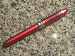
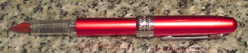
If you are looking for a fountain pen that is sure to be noticed whenever you whip it out, look no further than the red Platinum Plaisir. I cannot convey how bright the red finish on this pen really is. My pictures do not do it justice . . . even
the photos at Jet Pens, from whom I purchased it, make it look dull in comparison to what it looks like when you're holding it in your hand. Make no mistake: this pen is to red
what the Monteverde Invincia Stealth is to black. Vivid, bright and glossy.
Which is why I am giving it away. I bought it expecting a more understated finish, and every time I look at it, I am reminded of a giant lipstick. This particular finish, to my mind, in combination with the trim, makes for a distinctly feminine look, which did not come through at all in the photos.
Just looking at those photos again, though, I have to wonder,
What was I thinking? But I remember exactly what I was thinking. I was thinking that an inexpensive red pen would be perfect for keeping inked up with a red ink for editing documents at work. And I probably spent too much time looking at the photo of all the pens together, in which the pen's finish looks more dull. The final factor in my purchase was probably my penchant for purchasing entry-level pens from high-end pen manufacturers.
In any event, I'm glad I have this blog, because I know this pen can find a good home. If I kept it, it would not come out of the drawer again.
Other design features
Once you get past the red finish on this pen, there are some other design characteristics of note.
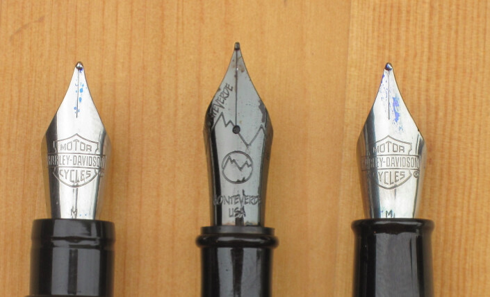
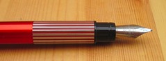
The stripe down the center of the clip is color-matched to the finish of he pen barrel. The nib is likewise color-matched, but of course is not the same finish.
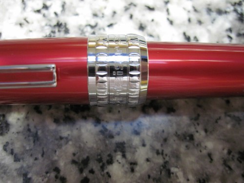 |
| The busy cap ring |
The cap ring is very, very shiny — I don't know if it is likewise aluminum or is instead plastic, but I'm sure it could blind you at just the right angle in sunlight. Its design is a little too busy for my tastes. It's broad, which is fine, but it looks like Platinum felt compelled to squeeze as many engraved design elements in there as it could. The
Plaisir name is engraved on the cap ring directly below the clip in an outlined font; 180 degrees opposite that are the Platinum logo and the words "Platinum Japan," and the gaps in between are filled with what looks like a chain pattern. Above and below that lettering are hash mark borders, and finally a solid section on the top and bottom of the ring. That's a lot of engraving packed into that ring.
Overall, the outside of the pen gives the impression of a much more expensive pen, but the plastic section and colored nib are clues that this is a budget model.
Construction
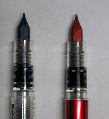 |
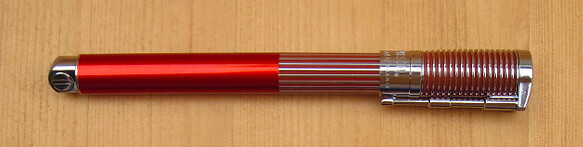
| Left to right: Preppy, Plaisir |
The nib, plastic section, and feed on the $20 Plaisir appear to be identical to those on the $3 Platinum Preppy. They look identical in a side-by-side comparison and the section of one fits perfectly in the other.
The cap posts very securely, but it's another feature of the cap that appears to be the Plaisir's claim to fame. From
the product page at the Jet Pens website:
Everyone has experienced the inconvenience of pens drying up after a long period of unuse. It is even more problematic for fountain pens, which require almost daily use to prevent drying. The Plaisir has a specially designed cap which prevents ink from both drying and evaporating even with no use for a whole year. As talked about in Yahoo, World News, and other news sources, this new development makes fountain pens suitable for both everyday and occasional uses. In addition, the ink is preserved without waste.
I'm afraid I don't have the patience to test that claim.
Writing Experience
I have three or four Platinum Preppy fountain pens with fine nibs that I really like to write with. I figured my Plaisir would be an even smoother writer because it has a medium nib, but my experience was exactly the opposite.
It isn't scratchy so much as it's . . .
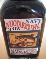
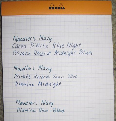
squeaky. The Apica twin-ring notebook I was trying it out in has exceptionally smooth paper, but I tried a couple of other papers, too, just to make sure it wasn't the Apica notebook to blame. It squeaked on Office Depot recycled multipurpose paper and in a Piccadilly notebook. It did not squeak in a Rhodia Webbie or a Moleskine. I also tried a Levenger ink (Shiraz, I think) and Noodler's Navy, one of the most lubricating inks I know. Still got squeaking on some papers. Finally, I took a medium nib from a red Preppy and installed it on the Plaisir, and . . . still squeaky!
I realized then that I had barely used the red Preppy, because I found the "red" ink to be pink. So I tried the Preppy, and it squeaked, too. Which is weird, because I like the fine-nibbed black, blue-black, and blue Preppies I have just fine. Maybe there's something about the red nibs?
I thought about trying to tweak the nib into better performance, but as soon as I decided to give the pen away, I thought I'd better leave the tweaking to the recipient.
As usual, there are more photos in
my Flickr photo set for this review.
The Giveaway
To tell you the truth, I've lost track of whether the nib on the Plaisir is the nib that came on it or is the nib from the Preppy. (I feel a little like Dirty Harry.
1) So I am going to send them both to the winner. You can mix and match the sections and nibs to your heart's content if you are the winner.
If I haven't talked you out of wanting this pen, here's how you sign up for the giveaway:
1. Leave a comment.
2. Send me an email at notebookeresqATgmail.com. The body of the email
must include the name you used to comment and the subject line of the email must read
exactly:
PLAISIR GIVEAWAY
I need the email so I can be sure I can contact the winner. If you leave a comment without sending an email or email me without leaving a comment, you will not be entered.
I must receive the comment and email no later than midnight on Halloween night (October 31); the time stamp on the comment and email will be the "official" times of your submission.
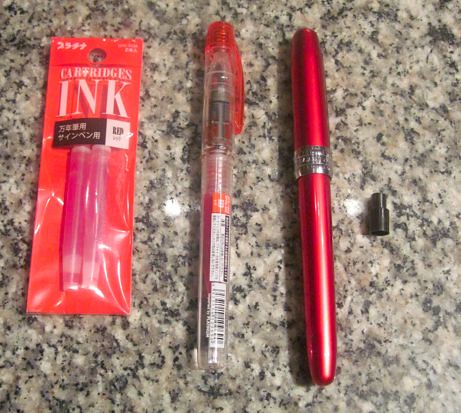 |
The Platinum Giveaway Package: red ink cartridges, Preppy fountain pen,
Plaisir fountain pen, and ink cartridge adapter |
Good luck, everyone!
-------------------------------------------
1"I know what you're thinking. 'Did he fire six shots or only five?' Well, to tell you the truth, in all this excitement I kind of lost track myself." — Clint Eastwood as "Dirty Harry" Callaghan in
Dirty Harry.

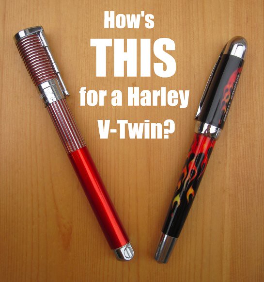
Two-pen giveaway! Red Platinum Plaisir Fountain Pen, Medium nib and Red Platinum Preppy, Medium Nib

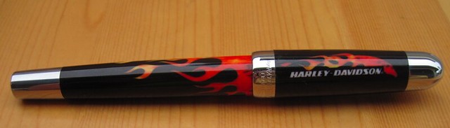
 The presentation of the Horizon is fun: it ships in a plastic case that is shaped like the teardop of a motorcycle gas tank. (Hey, if you're going to be a little kitschy, why not go all the way?)
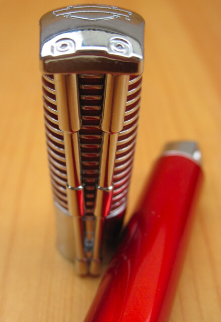
 I don't particularly like the section on this pen. Where it steps up in diameter is placed so that your grip has to take into account that step, unless you grip the pen a long way from the nib. I have seen this design on other pens and don't quite get it. It just doesn't seem like it would be comfortable for anybody. Is there some trick to gripping it that I am missing?
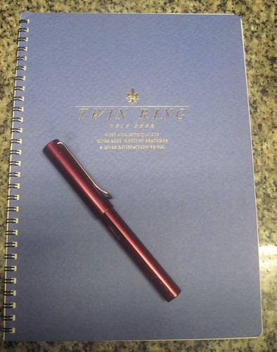
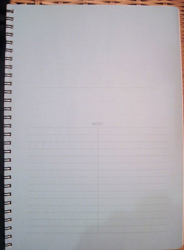 The first page is a light blue (could be other colors in notebooks with different colored covers) and ruled for an index. Odd that the index ruling only covers the bottom of the page. A nice odd, though, if you're the artistic type and want to use the top half of the page for designating the contents of your notebook in some fancy lettering or with a drawing.
 Following the index page are 40 pages of off-white pages with gray ruling. The outside top corner of each page has a space for numbering and dating each page. The top two rules and bottom rule on each page are somewhat heavier with tick marks spaced along them at 1 cm intervals. The ruling is 6.5 mm spacing (near a I can measure), which is just a tad narrower than the ruling in a Rhodia Webbie.


