A technophile lawyer rediscovers the joys of pen and paper

Tuesday, September 25, 2012

The stationery in the jury box

I was in court this afternoon on the motion calendar. There must have been a trial going on later in the afternoon, because the clerk was putting a steno pad and pen in each of the chairs in the jury box.

Like any self-respecting pen-and-paper addict fanatic maniac connoisseur, I had to stretch over the rail to try to see what the jurors were being given to take notes with. Boy, did I try to see.

I managed to make out the steno pad. I'm pretty sure it was a Universal brand steno pad.

The pen was a much bigger challenge. The pens were stuck through the rings of the steno pads. They resembled capped ballpoints, maybe something like a Paper Mate Write Bros. pen, but I really couldn't tell.

Needless to say (I think), this pen and paper combination just wouldn't work for me. So, I got to wondering. If I were in the jury box, would I find the inferior pen and paper so distracting that I couldn't pay attention to the case? Or, maybe it would be good to have inferior pen and paper. I might be able to pay more attention to the case. If I got to jot notes in the jury box all day with one of my favorite fountain pens in something like a Rhodia Webbie, maybe I'd find the writing itself so intoxicating that I'd pay less attention to the case.

Hmmmm . . . maybe I should make questions about stationery preferences part of my voir dire?*
_____________________________
*partial definition of voir dire from dictionary.law.com:
from French "to see to speak," the questioning of prospective jurors by a judge and attorneys in court. Voir dire is used to determine if any juror is biased and/or cannot deal with the issues fairly, or if there is cause not to allow a juror to serve (knowledge of the facts; acquaintanceship with parties, witnesses or attorneys; occupation which might lead to bias; prejudice against the death penalty; or previous experiences such as having been sued in a similar case).


Share/Save/Bookmark

Friday, September 7, 2012

Booker-Palooza 2012 Review and Giveaway #5: Clairefontaine Back to Basics 1951 Vintage Notebook (Enties closed and winners announced)

Welcome to day 5 of Booker-Palooza 2012. This is the fifth — and final — givewaway of the week. And it's another "two-fer" — there will be two winners.

The Review


Retro something or other
 The first problem I had in writing this review was . . . fatigue. I've been working like crazy this week. Wrong week to host Booker-Palooza, I think! It's been fun, though, and I'm glad I did it. But I think my fatigue is going to show in this post. This will be a pretty lazy review.

The second problem I had in writing this review was what the heck to call this product. There are so many different words on the label, I wasn't sure. I'm still not. European Paper Company ("EPC") from which I ordered these notebooks, calls it the "Clairefontaine Vintage Notebook." Interesting, because "vintage" is one word that does not appear on the label. So I looked for this in the Clairefontaine catalog, and couldn't find it. So, we'll go with what I think is the best combination of words from the label: "Clairefontaine Back to Basics 1951 Vintage Notebook."

But it seems pretty clear that Clairefontaine was going for a retro feel. That is suggested by the "1951" and "Back to Basics" on the label, and the look of the cover as well.

Speaking of the cover, it looks in photos almost like it could be cloth, and the product description at EPC calls the cover "textured." All they mean, though, is that the cover has a rough laid finish, unlike the glossy finish you see on most Clairefontaine notebooks.

As you can see, there is a labeling area on the front cover. The back has a Clairefontaine logo, so there's no chance of confusing the orientation of the notebook. There is no pocket in the back, and the cover stock just doesn't feel that sturdy to me

This is a staple-bound notebook. I've never carried one of these around much, so I can't comment on its durability, but I always feel better if the binding is stitched.

The ruling runs to the end of the page and has no margin line, but each page does have some blank top and bottom margins. A lot of people don't like that, but I find the margin habit hard to break. Even when my notebook doesn't have them, I tend to leave some blank space at the top and bottom. At 8mm spacing (my measurement could be a little off), the lines are a little more widely spaced than I prefer.

As for the paper . . . I didn't even test it out. Why bother? Its 90 gsm smooth, bright white Clairefontaine paper, which is consistently awesome for fountain pens: no feathering, no bleeding, easy to write on both sides. The only downside to Clairefontaine's paper is that inks take a long time to dry on it (at least, in my opinion). I'm always amazed when a blogger reviews an ink and says it dries in 10 seconds, because I've had ink smear after 40 or 45 seconds on Clairefontaine paper (but I don;t mind because the writing experience is so great). The fact that I take all these things for granted and didn't test the paper means that these winners won't have to put up with a page of my scribbling, like most of my notebook winners.

I had second thoughts about ordering these at $13 until I realized that is the price for a two-pack. At that price, they are very reasonable. That $13 price is for the large size (5.75 in. x 8.25 in.). It also comes in pocket size (3.5 in. x 5.5 in.) at $9 for a two-pack. In either case, you can choose your colors.

The Giveaway


You can enter by email, by commenting, or by both. It's perfectly OK for you to enter both ways. Not everyone is necessarily going to take the time to do that (very few did on the first giveaway), so entering both ways may increase your chances of winning.

To enter by email, send an email to me at notebookeresqATgmail.com, with the following subject line:

1951

Your email must reach me by 12:01 a.m. Pacific Time, Saturday morning, September 8. You may send only one email per person.

To enter by commenting, click in the comment field, then use one of the login methods displayed or click in the NAME field to comment as a guest. Please note that if you log in using your Twitter or Facebook account, I will not have your email and will not be able to contact you directly if you win. In that case, you'll have to return to this post to see if you are the announced winner and claim your prize. (If you are concerned about privacy, note that your email will not display in the comment.) Your comment must be timestamped no later than 12:01 a.m. Pacific Time, Saturday, September 8.

Per my usual practice, the winners — remember, there are two winners in this giveaway — will be selected by generating a random number at random.org (in this case, two random numbers) and counting down the list of entries. Good luck!

UPDATE — WINNERS ANNOUNCED — Not only do we have two winners of this prize, we have our second double-winner of the week. Our first-time winner is Stan and our second-time winner is Kyle Curia. Congrats!

Share/Save/Bookmark

Thursday, September 6, 2012

Booker-Palooza 2012 Review and Giveaway #4: Frictionless Planning Pad (Entries closed and winner announced)

Welcome to day 4 of Booker-Palooza 2012. This is the fourth givewaway of the week, with one more to follow, so make sure you check tomorrow.

The Review

Is there a prize for out of focus pictures?
Okay, so you're wondering why this is called the "Frictionless" Planner Pad. Does the pen really glide across the page that smoothly?

Well, before I answer that question, I need to point out that "Frictionless" refers to the company. The Frictionless website is all about reducing friction in your life — in your relationships, workflow, daily routine, you name it. These planning pads are one of two products offered for sale at the website to help you accomplish that.

Now, when I bought this, I thought to myself, "$12 seems kind of pricey, and I'm not sure what I'd do with that layout. I'll probably give it away on the blog." And here we are. Another prophecy fulfilled.

The layout is Cornell note-taking on steroids. A Cornell layout has a main notes area, a wide left margin for "calling out" key points, and a wide bottom area for summarizing the notes. The bottom area on this pad looks similar in size to other Cornell layouts I've seen, but the left "call-out" area is very wide, roughly a third of the page. (The Frictionless site describes the layout thus: "Just enough structure to help you plan, but not enough to get in the way.")

Gray and red boxes in top margin; grid in notes and call-out section

 The main writing area and call-out section have a grid ruling. I measured roughly 2.5 mm per square. Think of a typical Rhodia or Moleskine graph with each existing square made into four smaller squares. The summary area at the bottom is solid gray. (I could be off a little on the size of the squares. I found it easier to write on every other line on this paper than I do writing every line on a 5mm grid.)


The 50 sheets of 8.5 in. x 11 in. paper are, according to the website, "70lb. premium smooth uncoated stock to handle anything you can throw at them."  It pretty much lives up to that promise. I tried out half a dozen pen/ink combinations. The ink tends to spread, but without feathering, and more so with some inks than others. Platinum blue-lack delivered via a $3 Preppy seemed to do best; Noodler's Navy was the worst. Everything else was in between. But all of the fountain pen inks worked better in the call-out area than the notes area. The few gels, rollerballs, and ballpoints I tried all worked great on this paper.

You don't have to worry much about bleedthrough. First, because there isn't much (Noodler's Navy being the worst offender again.) Second, there's no ruling on the reverse.

The only thing I really disliked about this pad is that the backing is not very sturdy as a writing surface. Take this pad off your desk, and you'd better have some other surface to rest it on before you can write on it easily.

The glued binding was a nice change of pace from the usual perforated pages. Pages remove cleanly, and you don't have to be so careful about leaving some behind. It might make it a little less durable on the road, though.

The reason my giveaway prediction came true is that I cannot come up with a really good way for me to utilize the layout of this paper. Everything about the pad (with the exception of the backing) is great. If I had a practical way to use the layout, I'd definitely keep it.

The Giveaway

You can enter by email, by commenting, or by both. It's perfectly OK for you to enter both ways. Not everyone is necessarily going to take the time to do that (very few did on the first giveaway), so entering both ways may increase your chances of winning.

To enter by email, send an email to me at notebookeresqATgmail.com, with the following word, and ONLY the following word, in the subject line:

FRICTIONLESS
 
Lower case or upper case doesn't matter, as long as your email reaches me by 12:01 a.m. Pacific Time, Friday morning, September 7. You may send only one email per person.

To enter by commenting, click in the comment field, then use one of the login methods displayed or click in the NAME field to comment as a guest. Please note that if you log in using your Twitter or Facebook account, I will not have your email and will not be able to contact you directly if you win. In that case, you'll have to return to this post to see if you are the announced winner and claim your prize. (If you are concerned about privacy, note that your email will not display in the comment.) Your comment must be timestamped no later than 12:01 a.m. Pacific Time, Friday, September 7.

Good luck, and check back tomorrow for giveaway number 5 — the last giveaway of Booker-Palooza 2012! The last giveaway post will go up at 12:01 a.m. the morning of Friday, September 7, and entries in the giveaway will be accepted for 24 hours. Then, sadly, Booker-Palooza 2012 will be over.

UPDATE: The winner is . . . Millicent, who was also a winner of a Doane Paper A4 pad. I swear I don't know her, folks. She's just lucky this week. And, there haven't been that many entries, so the odds of a double winner have been pretty good.

Share/Save/Bookmark

Wednesday, September 5, 2012

Booker-Palooza 2012 Review and Giveaway #3: Pentel Tradio Fountain Pen in Pearl Black Finish (Entries closed and winner announced)

Welcome to day 3 of Booker-Palooza 2012. This is the third givewaway of the week, with two more to follow, so make sure you check back daily.

Please note that because I screwed up the timing of this post and it published late, I will keep entries open for an additional 24 hours, until 12:01 a.m. on Friday, September 7.

Pentel Tradio Fountain pen, Black Pearl Finish

You're probably wondering how I decided to give away this this Pentel Tradio Fountain Pen after spending 28 bucks on it a year or so ago. The clue is in the last part of that sentence. I purchased this at least a year ago, tried it out for a day to write the review, then put it away and never got around to writing the review. Something tells me there are not legions of Tradio fans scouring eBay for a deal on this pen, so I figured, what the heck . . . give it away! So, here we go.

The Review


The Tradio is comparable in size to a Lamy Safari (though here, I have it pictured next to a Lamy AL-Star,) at least in length. But it tapers more at the ends and is thus less cylindrical. It feels uch smaller than the Safari, though, perhaps partly because of its shape and partly because it's virtually weightless. When you're writing unposted, there's no heft to the pen at all. Some people will like that, some won't.

While I'm comparing it to the Safari in size, I might as well make the comparison in a few other ways, especially since they are similarly priced (in fact, at Jet Pens, the Tradio and Safari are both priced at $26.00) and both could be considered "entry level" pens.

Pentel Tradio and Lamy AL-Star side-by-side, capped
Top: Lamy AL-Star, bottom: Pentel Tradio
The finish on the Tradio is a little fancier, probably designed to give the illusion that the pen has a gunmetal body instead of a plastic one. It looks more purple in the photos than it does right in front of you. (The picture of the cap captures the finish better.) But if you like shiny, metal-looking plastic, the black pearl Tradio is for you. The other Tradio finishes look, online at least, like they would be more obviously plastic. So, in the fancy-shmancy category, score a point for the Tradio.

The Tradio doesn't feel very durable, but I have to admit I never really put put it to the test. Perhaps it is because the pen is so light, but I just would not have the same confidence shoving this pen into my jeans pocket as I would carrying a Safari that way. It feels more breakable to me, but I have no scientific evidence to back that up.

The wire Safari/AL-Star clip is very distinctive, and I've read a lot of negative comments about how ugly it is, but I happen to like it in both form and function, and I do not like the Tradio's clip as much. The cap and clip on the Tradio are part of he same molded piece of plastic; there is no spring for the clip except for whatever physical properties the molded plastic has. While not quite as guaranteed to go over your pocket every time, the Tradio clip is nonetheless pretty consistent. But I have to give the nod to the Safari in this one.

Pentel Tradio fountain pen cap
One-piece clip and cap; view window near top
The Tradio cap, like that on the Safari, clicks on rather than screws on, and has one feature that I consider somewhat gimmicky: a window in the cap that lets you see the nib while the pen is capped. I'm not sure what function that serves, though I suppose it's possible you might have a Tradio rollerball in the same color and want to be able to tell the difference. If you're going to put a viewing window in a fountain pen, better to have it so you can view the ink level, like on the Safari.

The nib on the Tradio writes incredibly smooth for a pen at this price point. Really, really , nice. I actually like the feel of this nib much better than any on my Safaris.And it has an aesthetic leg up on the Safari nib as well, with some design on the nib and, according to Jet Pens at least, some gold plating. Unfortunately, the design of the nib was usually obscured by ink; this nib displayed lots of nib creep when inked with Noodler's Navy, but I didn't try other inks and for all I know, that same ink would creep on a Safari. But the Safari has something else going for it: the nib is easily changed, and relatively inexpensive replacement nibs (around $10 each, I think) make it economical to experiment with different nib widths, including three widths of italic nibs.

Overall, the Tradio is a solid entry-level pen or daily writer for those accustomed to fountain pens. It's a viable alternative to a Lamy Safari if you happen to like the design silhouette or finish better, want a fancier nib, want a smoother writing experience (though your mileage may vary on this consideration), or, like a lot of people, are turned off by the Safari clip.

I got my Tradio through Writer's Bloc; they still carry the pen in a few other finishes, but not black pearl.  You can find the black pearl finish and several others at JetPens. I've ordered a lot more over the years from JetPens than I have Writer's Bloc, but they are both reliable vendors in my experience.

The Giveaway

 If you'd like this pen, here's how to enter the giveaway.

Please note that because I screwed up the timing of this post and it published late, I will keep entries open for an additional 24 hours, until 12:01 a.m. on Friday, September 6. 

You can enter by email, by commenting, or by both. It's perfectly OK for you to enter both ways. Not everyone is necessarily going to take the time to do that (very few did on the first giveaway), so entering both ways may increase your chances of winning.

To enter by email, send an email to me at notebookeresqATgmail.com, with the following word, and ONLY the following word, in the subject line:

TRADIO
 
Lower case or upper case doesn't matter, as long as your email reaches me by 12:01 a.m. Pacific Time, Friday morning, September 7. You may send only one email per person.

To enter by commenting, click in the comment field, then use one of the login methods displayed or click in the NAME field to comment as a guest. Please note that if you log in using your Twitter or Facebook account, I will not have your email and will not be able to contact you directly if you win. In that case, you'll have to return to this post to see if you are the announced winner and claim your prize. (If you are concerned about privacy, note that your email will not display in the comment.) Your comment must be timestamped no later than 12:01 a.m. Pacific Time, Friday, September 7.

Good luck, and check back tomorrow for giveaway number 4 in Booker-Palooza 2012. Remember,  each of the giveaway posts this week goes up at 12:01 a.m. and the sign up period on each is only 24 hours, so you'll have to check back every day to make sure you don't miss your chance at something interesting.

UPDATE: 29 emails and 19 comments equals 48 total entries. And the winner is . . . drum roll please . . . [CYMBAL CRASH] . . .
Kyle, the third email entry received. Congratulations, Kyle!

Share/Save/Bookmark

Tuesday, September 4, 2012

Booker-Palooza 2012 Review and Giveaway #2: Doane Paper A4 Writing Pad (Entries closed)

Welcome to day 2 of Booker-Palooza 2012. Today's giveaway is a "two-fer" — there will be two winners!

Odds are, you've seen Doane Paper before. Maybe not at the office or in your home, but if you follow my blog, you almost certainly follow Brad at The Pen Addict, for whom Doane Paper is the go-to paper for pen reviews. Today's review is of the Doane Paper A4 Writing Pad.

The Review


Let me say up front that I really admire people that come up with new ideas. (I'm a big advocate for intellectual property rights, e.g.) And Chad Doane had a good one: combine graph paper with lined ruling, and deliver the benefits of both types of ruling on a single sheet of paper. Clever, indeed.

Whether you will personally find it useful, of course, depends largely on what you do on paper. If you find yourself switching back and forth a lot between lined ruling and graph ruling, this could be just the ticket for you.

I think the "grid + lines" formula, as it's called on the Doane Paper website, is a better way of of combining the two functions than dot grid paper, which I think is also an attempt at merging them. I find it next to impossible to write in straight lines on Rhodia's dot grid paper, so I use it — the giant no. 38 size — only for drawing diagrams for project plans or to sketch out the relationships among different facts or concepts in a case.

That said, there are some things I would prefer were different on this pad, but they are purely personal wishes. Here's the layout, in a snippet of a picture from the Doane paper website:

Design detail from the Doane Paper website

You'll see that this layout means a spacing of 3/8 of an inch between the heavier horizontal lines. That's much wider than most lined paper; uncomfortably so if you're used to ruling around 1/4 inch or less. And it's really not practical to write across anything but the heavier lines. Unless your writing is very large, you're likely to see a lot of white space left on the paper, leaving you feeling like you could have made better use of the page real estate. I'd also prefer that those heavier lines were not quite so heavy. This would not only merge the "grid + lines" concept a little more, but perhaps make it feasible to write on every other line, rather than just the heavier ones.

But these comments are quibbles. The bottom line is that this paper does provide a great deal of versatility. (Hey, I'd also prefer Rhodia change their graph ruling to 6 mm or 1/4 inch, but I don't expect them to do it just for me.)

In any event, the company makes it easy for you to try out this ruling before you buy. PDF downloads are available at the Doane Paper website (look for the DOWNLOAD section near the bottom right of the home page). I suggest you take a good look around the website, which offers a number of notebooks and pads with the Doane Paper layout, and even some leather products.

As for other details . . . usually, I try to use my reviews to fill in the holes of the product descriptions you usually find online, so you have a better idea what you're getting. But there is little for me to add in this case, because the Doane Paper site does such a good job of letting you know what you're getting with this product, including the type of things that can surprise you with other brands.  Besides giving you the basics — telling you that each pad in the 3 pads-for-$11.95 package (a fair price, if you ask me) has 50 sheets of 20-lb. bond paper — you're also told that the paper is ruled on only one side (which I haven't seen since those green engineering pads I used at USNA, which were designed to be used on the reverse side from the ruling), and that while the entire pad is 8.25 in. x 11.75 in. (A4), each sheet is only 11 in. long once removed from the pad.  That last one, especially, is helpful. I've run across many pad descriptions that make it impossible to know what the dimension of the separated sheet will be.

The 11 in. length once torn from the pad is helpful if you're in the USA, because it is the same length as letter-sized US paper. No need to fold or cut to get it to fit in the file.

Even though you know from the product description that the ruling is only on one side, it still seems weird when you get the pad and see it. I'm not sure I get why the pad is designed that way, unless it's because the paper is so thin that it would be hard to have ruling printed on both sides unless it is lined up exactly with the other side.

If you're used to using a Doane Paper flap jotter and think one of these pads is for you, be forewarned (as you are, if you pay attention to the product description when ordering) that the paper in these pads is very different from the jotter. The former has 60-lb. paper; the pad has 20-lb. paper, so you're in for a big disappointment if you're not ready for that difference.

Unlike the 60-lb. paper in the jotter, which performed well with all sorts of inks and has a great feel to it, the 20-lb. paper in these pads has the feel of every day office paper and is not a good match for any ink that tends to feather or bleed. Most fountain pen inks I tried did plenty of both on this paper. Some of the rollerballs bled, too (the Tombow Object 0.7 mm being the worst). But none of the roller balls or gel pens feathered, and the gel pens barely ghosted through to the other side at all. Then again . . . does bleedthrough matter when there's no ruling on the other side anyway?

Overall, I really like the concept of this paper, and will find myself using it to sketch out relationships that do not require the room of the Rhodia no. 38. But I'm not likely to use it for straight notes; it would take me a good deal of time to get used to writing on lines 3/8 in. apart.

By the way, I tried to read up on Chad Doane a little more, and was very surprised to see that there was no Wikipedia entry either for him or for Doane Paper. How can that be? You can gain a little insight, though, through this post at Wantist and the post about him in the "What's on their desk?" series at Office Supply Geek.

The Giveaway

Entries are now closed. The following procedures will no longer work.

I am giving away two of these pads, one to each of two winners. If you'd like one, here's how to enter the giveaway. (Please note there are some differences from Monday's giveaway.)

You can enter by email, by commenting, or by both. It's perfectly OK for you to enter both ways. Not everyone is necessarily going to take the time to do that (very few did on the first giveaway), so entering both ways may increase your chances of winning.

To enter by email, send an email to me at notebookeresqATgmail.com, with the following word, and ONLY the following word, in the subject line:

DOANE
 
Lower case or upper case doesn't matter, as long as your email reaches me by 12:01 a.m. Pacific Time, Wednesday morning, September 5. You may send only one email per person.

To enter by commenting, click in the comment field, then use one of the login methods displayed or click in the NAME field to comment as a guest. Please note that if you log in using Twitter or Facebook account, I will not have your email and will not be able to contact you directly if you win. In that case, you'll have to return to this post to see if you are the announced winner and claim your prize. No matter how you sign in to comment, and even if you comment as a guest, your email will not be displayed with your comment. Your comment must be timestamped no later than 12:01 a.m. Pacific Time, Wednesday, September 5.

Good luck, and check back tomorrow for giveaway number 3 in Booker-Palooza 2012. Remember,  each of the giveaway posts this week goes up at 12:01 a.m. and the sign up period on each is only 24 hours, so you'll have to check back every day to make sure you don't miss your chance at something interesting.

UPDATE: Congrats to Plum Dragon and Millicent, each of whom will soon have a Doane Paper A4 Writing Pad on it way to them!

Share/Save/Bookmark

Monday, September 3, 2012

Booker-Palooza 2012 Review and Giveaway #1: Levenger Wired Notebook-White Full Page Ruled (Closed to new entries)

Welcome, everyone, to the inaugural post of Booker-Palooza 2012!


Today's giveaway is the Levenger Wired Notebook-White Full Page Ruled. Usually, I link the name of the product to someplace you can buy it, but I don't see this product on the Levenger website anymore. I don't know if that situation is temporary or not, but I'm surprised to see it gone. I've been buying these for a while and usually saw them whenever I was just browsing and drooling the Levenger website. (While I'm mentioning the Levenger website, I should mention that the Labor Day Sale they have going is fantastic, and it goes through September 5. And, full disclosure: Levenger has provided products me free products (but not this one) to review.)

Anyway, on to the review.

The Review


I've had one of these notebooks opened on my desk at work for probably eight months out of the last year, using them mostly to keep my timesheets, but also using them occasionally to take research notes or to make notes for upcoming oral arguments. While it has its faults, I like it well enough to have bought seven of them when they were on sale.

It sits open at my right hand, so I can immediately jot down the tasks and time spent on my client matters, making for very accurate time reporting and detailed, accurate bills for my clients. There's nothing about the notebook itself that really improves my timekeeping, exactly, unless you count the fact that I enjoy writing in it so much. Maybe, on some subliminal level, that makes me more likely to record my time promptly. good not only for my clients, but for me, too, as billable time does not escape billing.


The reason I like writing in it is the feel of the paper. I love, love, love, heavyweight paper. Not so much for the writing, but for the handling. Once these sheets are removed from the notebook, they are a joy to shuffle, sort, or arrange. Since the paper is white, the weight of the paper (and slightly narrow dimension, as discussed below) helps my pages of handwritten notes stand out in a stack of other white papers.

The writing experience is quite nice, too. Most pens, except those with tips of less than 5 mm, tend to write very smoothly.

Levenger claims the paper is fountain pen friendly, and that was my initial impression of the paper. In my post last December year about the great variance in paper quality among various Levenger products, I wrote about this particular notebook:
This one is a standout. The white paper has great weight, smooth feel, great performance. No bleed through even with heavily saturated inks delivered through juicy nibs. This is awesome paper.
Unfortunately, that initial impression has not held up. I use a different pen and ink color virtually every day on my timesheets, sometimes with a few changes during the course of the day, so I've tried lots of different combinations on this paper. It's definitely hit-or-miss when it comes to handling fountain pen ink, at least with respect to how usable the opposite side of the papers is going to be. There's very little or even no feathering with most inks, but show through and bleed through vary significantly and are very unpredictable.  Some saturated inks barely show through and make it easy to write on both sides of the paper, while some less saturated inks through the same pen bleed through like crazy. The particular notebook I chose to test for this post seems especially susceptible to bleeding.
I've really got to learn how to take a properly exposed photograph. Sorry about that.
You also need to choose your other pens carefully. The Bic permanent marker (felt tip) I tried bled through. (I did not have a sharpie to try out.) Surprisingly, the brown Platinum Preppy (at the very bottom in the photo), despite being one of the broadest and wettest lines, showed through very little compared to the Bic. Finer gel pens did best, but finer points tend to stick a little on this paper and take away the smoothness. Some rollerballs do better than others, even with the same color ink.

None of this particularly bothers me, because I'm not worried about writing on both sides. But if you are, I suggest keeping a few pages at the back of the notebook as test pages to try out pen and ink combinations before using them elsewhere in the notebook.

I prefer the full width ruling on this paper to the annotation ruling found in so many Levenger products. This is especially helpful for my timekeeping, where I don't need to "call out" notes to the margin. Ruling across the entire page gives me plenty of real estate to track my time and to tally it up at the end of the day.

This is billed as a letter-sized (8.5 in. x 11 in.) notebook, but keep in mind that is the dimension of the paper before removing it from the notebook. Once torn out, the paper is a little narrower, approximating the width of an A4 sheet. It's just enough to be another aid in finding one's notes among other white papers in a stack, but not so much to make it difficult to include in a file of letter sized paper. Putting notes in the file is also made easier by the fact that the pages are perforated, so the raggedy edges created from tearing a page out from the binding is easily removed.

While a great desktop companion, this notebook is not very portable. Few letter-sized notebooks are, but this one has a couple of other factors working against portability.

First, this paper is so substantial that the 85 pages make the notebook nearly a half inch thick. That's fine if you carry a full size briefcase. But it can be a bit of a space hog when space counts, such as in a laptop bag or in my Levenger Briefolio, which is all I tend to carry (besides my planner) back and forth to work.

Second, it's not especially durable. I carried one back and forth to work every day (besides the space it took up in briefolio) for about 4 months. It didn't fall apart, but the covers, which are not especially stiff, got beat up a bit. And the wire for the twin ring binding is not especially strong; it eventually started to bend and separate,  so about a third of the back cover started slipping off the wire. That second problem is likely to be even worse if you remove pages as you go, because I think the rings are more vulnerable without a full notebook attached. (One indication regarding the lack of strength in the wire is that several notebooks arrive from Levenger with the end wires bent.)

If this notebook is gone for good, that's a real shame. I much prefer it to the wired notebook with multi-colored paper and annotation ruling, both because I prefer the full page ruling and because the colored paper and fountain pen ink don't really seem to get along, and it doesn't even feel good to write on the colored paper.

For all its faults —principally, the inconsistency of the paper when it comes to different inks, and the features making it unsuitable for portability — I still really like this notebook, at least to keep on my desktop. Enough to have ordered seven of them when they were on sale for $8 (they were normally $12).

The Giveaway

Entries are now closed. The following procedures will no longer work.

If you'd like one, here's how to enter the giveaway. Make sure you read through ALL these instructions, to make sure you are entered and possibly double your chance at winning, before you actually carry out any of the steps.

Send an email to me at notebookeresqATgmail.com, with the following word, and ONLY the following word, in the subject line:
WIRED

Lower case or upper case doesn't matter, as long as your email reaches me by 12:01 a.m. Pacific Time, Tuesday morning, September 4. You may send only one email per person, but . . .

if you leave a comment on this post, that comment will count as a second entry as long as your email gives the name you used to comment. I need an email from every entrant because I need to be able to contact the winner, so a comment without a corresponding email will not count as an entry.

Good luck, and check back tomorrow for giveaway number 2 in Booker-Palooza 2012.

UPDATE: Congrats to winner Gerald!

Share/Save/Bookmark

Friday, August 31, 2012

You won't believe it's ballpoint (updated)

A year or more ago at Flax Pen-to-Paper, another customer was trying out some ballpoint pens. And when I say trying out, I don't mean squiggling a few lines or signing his name. I mean writing in large Spencerian script and Copperplate script, complete with huge line variation . . . from a ballpoint!  I always regretted not asking him if I could shoot video with my phone and post it on my blog.

The other day, I think I ran across something even more impressive with a ballpoint pen (well, many ballpoint pens), and I hope the artist, Samuel Silva, doesn't mind me showing his work:


Incredible! There are several more works at the link. The odd thing is, some of them look more realistic — much more realistic — than others. But they're all amazing. 

In fact, I started to wonder if I was falling for an "urban legend" trick, so I tried looking this up on snopes.com, and I didn't find anything. Is ballpoint pen art like this really possible?  Check out the other works and let me know what you think.

Update (9/3/2012): My Dad sent me a link to a second site profiling Silva, which has more of his works. My doubt in the legitimacy of these drawings was once high. Now, not so much. Oh, one other thing pointed out at the new link: Silva is a lawyer. But apparently, that's where the similarities between him and me end!


Share/Save/Bookmark

Thursday, August 30, 2012

Are you ready for BOOKER-PALOOZA 2012?

From Urban Dictionary, a definition of palooza:
The art of throwing a very drunken extravagant party with a plethora of friends. Whoever is throwing the palooza usually adds their name as a prefix to the word. Paloozas are usually held on Wednesday.
Okay, that's a bit of an exaggeration. It captures the celebratory atmosphere I want at Booker-Palooza. But there won't be any drinking. (Well, a beer or two for me, maybe, and I can't stop you if you want to tip one back. But no drunkenness.)

The "Wednesday" part of the definition is right. But in the case of Booker-Palooza, it's incomplete. Because Booker-Palooza will also be on Monday, Tuesday, Thursday and Friday of next week.

What's it about?

Giveaways.

Five straight days of giveaways.

Here's the deal:

•   The first giveaway post will go up Sunday night at a minute past midnight — in other words, at 12:01 a.m. (PST) on Monday, September 3.

•   Every 24 hours, a new giveaway post will go up, the last one going up at 12:01 a.m. on Friday, September 7.

•   Each giveaway will be open to entries for exactly 24 hours from the time the post goes up.

•   Winners will be selected at random using the random number generator at random.org and will be announced daily.
So, you're dying to know what I'm giving away, right?

I'm not telling, except in the posts themselves.

So, set those repeating alarms on your smart phones to remind you to check back every day next Monday through Friday, so you don't miss out on something good!

Share/Save/Bookmark

Thursday, August 23, 2012

Rhodia Unlimited Notebook review and giveaway (UPDATE: WINNER ANNOUNCED)

Rhodia Unlimited Notebook 1
See that fading near the top? My fault. This sat on my desk
in a Levenger Unifier behind a small notepad, so the sun
faded the top.
I ran across the Rhodia Unlimited notebook by accident a long time ago while I was cruising around the Goulet Pens website (no affiliation, but I love that website and that company!), and decided to give it a shot, probably just enough for a review and giveaway. I'm glad I had the giveaway in mind, because this notebook just isn't my cup of tea. There are lots of great things about it, but some drawbacks as well. Of course, what I see as drawbacks, you might see as benefits, and vice versa.

Let's find out, shall we?

The Review

This notebook is typical pocket size, 3.5 in. x 5.5 in. Click here to see it with a Lamy Safari to give you a sense of scale.

This notebook has got a lot of style, and unsurprisingly bears the Rhodia tree logo on the cover. Unlike the matching elastic closures on the webnotebooks (i.e., orange elastic on orange covers and black elastic on black covers), Rhodia goes for contrast here. In fact, the elastic itself is bicolor — black with three orange center stripes. The strap appears to be the same on both the orange cover and black cover versions, but being bicolor, it stands out on both (though in my opinion, it stands out more on the orange cover). The Rhodia website calls it a "racing stripe."

The cover seems to have a soft feel somewhere between the cover of a regular Rhodia notepad and a cover of the "R by Rhodia" premium line of notepads, but more closely approaching the latter. In fact, for all I know, it may be exactly the same as the premium notepad covers. (On the Rhodia website, the cover on the premium notepads is described as "soft touch" while the cover on the Unlimted is described as "Verso soft touch," but I'm not sure they're different.) In any event, the cover feels very nice. It would almost be a shame to put a leather cover over this.

Rhodia Unlimited Notebook 4I'm not sure what you call this binding. Perfect bound? Glue bound? In any event, it does not make for a flat opening, unless you want to force it (which I didn't).

The perforations aren't really evident because of this — they're too deep in the binding. Every page is perforated, not just pages toward the back, as in some other notebook lines. I suppose that could come in handy from time to time, but I think I can count on two hands the number of times I've torn out a notebook page in the last two years.

Rhodia Unlimited Notebook 3The page has a lot of structure, with a two-line header field and ruling that does not extend all the way to the edge of the page. There are blank borders at top, bottom, and outside edge.

The paper is the usual excellent Rhodia quality. 60 sheets of 80 gsm paper that didn't bleed or feather with any of the inks I tried. It was a little surprising to see that the ruling — graph in my case, but lined ruling is also available — is gray rather than the usual Rhodia purple. That might disorient some Rhodia fans, but I like it (though I would prefer lighter gray). I never was a fan of the purple ruling. (Sacrilege!)

This notebook does not have a pocket inside the back cover. I've never found those pockets very practical on pocket  notebooks anyway, but diehard pocket fans should look elsewhere.

Rhodia did a very nice job with the closure, positioning the elastic so that it covers the grommets when holding the book closed. That is a nice, detailed touch in my opinion. But the grommets holding the elastic in place are likely to prove a problem as you get toward the back pages of the notebook. They are not nearly flush with the cover, and writing over those bumps would drive me a little nuts. Then again, they are placed as near to the edge of the cover as possible. With the margins in the ruling, you may not run across them that often. In any event, I don't need an elastic closure because I carry my notebook in my front pocket, so any little inconvenience resulting from the closure is not worth it to me.

Rhodia Unlimited Notebook 8
Those grommets are probably going
to get in your way eventually
Because I was planning a giveaway with this notebook, I didn't really get a chance to put it through its paces. The cover feels pretty sturdy — it ought to be, considering this notebook goes for $8— but one never knows unless one puts it to the test. I'd be curious to hear from the winner how durable it is, both in how well the cover wears and whether the pages start to separate at the perforations over time (which I've found to be a problem when using Moleskine Cahiers).

Overall, I think I prefer my current setup: A Field Notes graph notebook in my InkLeaf leather cover. If I hadn't spent the money on that cover, I might have been more willing to try out the Rhodia Unlimited for a longer period.

As usual, you can find more crappy pictures in my Flickr photo set for this review.

The Giveaway

The cover faded some at the top while sitting in my Levenger Unifier, but hey, it's free, right? Entering to win this slightly faded notebook is easy. No need to leave a comment on this post. Just:

1. Send me an email (notebookeresqATgmail.com) with the following subject line:

UNLIMITED

Lower case will work, too, but the spelling must be exact, as I will be using a filter to group all of the entries. If you misspell the subject line, you won't have a chance to win.

2.  Tell three people how much you like my blog.

We'll have to use the honor system for part 2. But think how guilty you'll feel if you win without doing step 2.

Update (8/30/2012):

The Winner

Congrats to Gaby, winner of the Rhodia Unlimited notebook!


Share/Save/Bookmark

Friday, August 3, 2012

Review: Visconti Homo Sapiens Fountain Pen — a fantastic pen with a huge flaw

Visconti Homo Sapiens Fountain Pen - presentation

They had me at lava. As soon as I saw an ad for the Visconti Homo Sapiens fountain pen, explaining that the barrel and cap are made of a mix of resin and volcanic rock from Mt. Etna, I was as hot for this pen (hot? lava? I'm hilarious!) as your typical 16-year old on a car lot is for the cherry sports car parked next to the used compact sedan his Dad wants to buy him. Lava alone did not seal the deal, but it got me started on the road to ownership. (Yet, it still took me more than a year before I caved in and bought it. What willpower!) After more than a year of longing, I finally bought one at Flax Pen to Paper during their May 2011 sale. (My understanding wife allows one expensive fountain pen per year.)

Let me start by saying that I love this pen, but . . . it has what I think is a huge design flaw that almost made me regret buying it, and caused me to send it into Visconti, hoping it might be a repair issue rather than a design issue. (More about that later.)

There's surprisingly little information about this pen on the Visconti website (the above link), but you can learn  more about it from the websites of the various vendors who sell it. There's also a nifty mini-DVD video produced by Visconti. Flax gave me one when I told them I was considering the pen. In addition to being informative, it was designed beautifully to sway people like me, with lots of shots of red lava spewing from volcanoes. That might be a stupid reason to want a pen, but it sure was an effective presentation. I'm not saying I wouldn't have bought the pen if I hadn't seen the video, but the video sure didn't hurt.
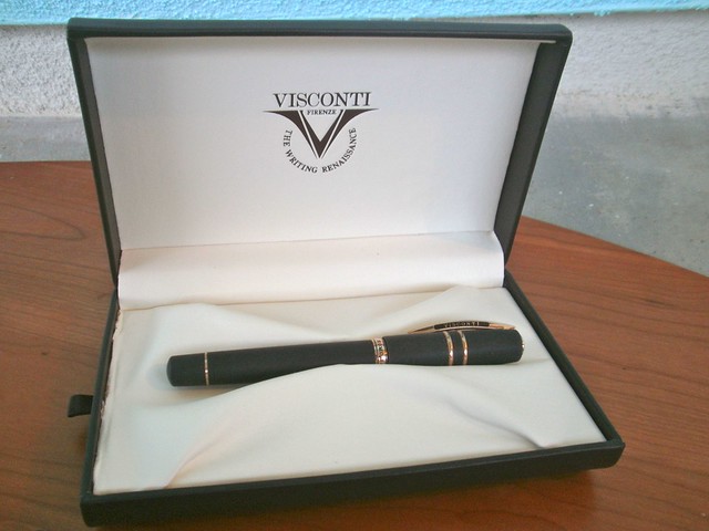
Presentation

The one comes beautifully packaged in a very nice gift box, which includes a drawer holding a small video DVD and pen instructions.  Nice, but for a pen this expensive, maybe you should expect a little nicer. Look at the left edge of the box in the photo above, and you'll see the ragged edge of the fabric, which should not be showing. Also, real leather would have been an improvement. But I guess the really deluxe packaging is reserved for special editions, and this is a regular production pen.
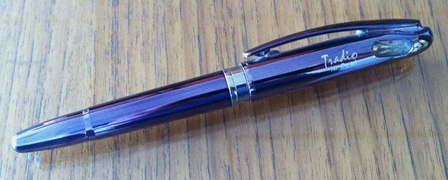
The Materials

Lava. From Mount Etna, a volcano on Sicily. That's what comprises more than 50% of the barrel and cap material. I'm not sure what the ratio of lava to resin is, but Visconti claims that the pen is virtually indestructible because of it. I'll leave the testing to the guys on Mythbusters; the thought of trying to damage a pen just to see if it withstands the trauma makes me queasy. But I have probably been a little more cavalier in my treatment of this pen because of its sturdiness and the seeming difficulty of doing any real damage to it.

The material is hygroscopic, meaning it will absorb some moisture. I've seen this used as a big selling point because the pen is supposed to be able to absorb sweat from your hands. Is that really a problem for most people? I don't know if the pen has behaved hygroscopically or not, because my hand doesn't sweat while I'm writing.

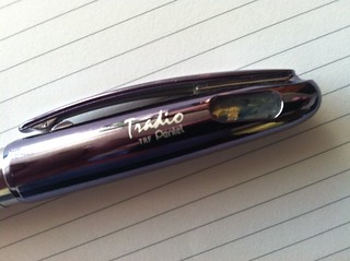
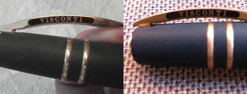
Those caught up in the gold trim versus chrome/rhodium trim (I usually prefer rhodium or chrome trim to gold-colored trim) might be pleasantly surprised to find out that this pen has neither. The trim on my pen is pure bronze (Visconti has since come out with a version that sport stainless steel trim), which makes it very different. I've seen at least one vendor describe the color of the bronze as a rose gold color, but I don't think that's accurate, because there's no pink tint in the bronze.

The bronze has a nice shine to it when the pen is brand new, but it tarnished very quickly. Some people  prefer to call this a patina and say it gives the pen character. I call it tarnish and wish there was an easy way to shine up the bronze again. Within a month or two, the bronze was quite tarnished. Maybe living near the beach has something to do with that; the air here is hell on most outdoor fixtures, so maybe its enough to tarnish the pen quicker (even though it spends little time outdoors). Here's how it looked new versus what it looks looks like around seven months later:

Visconti Homo Sapiens Fountain Pen - Tarnished Bronze
The bronze is so shiny when new, but hard to keep that way.
I tried applying lots of elbow grease with the cloth that came with the pen, but it didn't get me very far. I'm hesitant to use any solutions, as I'm afraid they'll be absorbed by the pen and maybe discolor it.

The pen has since been released in a version with steel trim, which almost made me want to buy a second one (or sell mine to buy one).

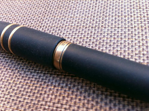
The Barrel and Section

Normally, I don't go for chunky pens. Most Deltas I've seen, for example, leave me cold. But somehow, a thick pen seems like the only kind of pen made that should be made from lava. It just fits somehow. This is not an absurdly chunky pen in any event. I don't have calipers to measure it, so it's hard for me to quantify its chunkiness, so let's just call it . . . masculine.

I think the pen has a masculine look built from a combination of the materials and its dimensions. I'd be curious about the ratio of men buyers to women buyers. If you're a female owner of this pen, how about letting me know in the comments and tell me what attracted you to it?

Visconti Homo Sapiens - barrel close-up
Porous, gray material - not black!

The barrel only looks black if you skim over a few photos of the pen. In reality, it's more of a dark gray, with some color variation, and it's quite porous.  Bronze is the perfect compliment to this texture, which really seems to take you back in time (and I'm not talking vintage pen time, I'm talking "Bronze Age" time, as is Visconti).

The Cap and Clip  — and the Flaw

The cap is large and, to my mind, is a huge part of the pen's masculinity. The two bands of bronze against the porous lava/resin mix make the cap look masculine and tough.

The cap incorporates the Visconti "my pen" system, which lets you replace the Visconti logo on the end of the pen with any number of designs available from Visconti, from gemstones to initials. The original end piece and any replacements are held magnetically, which means Visconti couldn't use bronze for this piece. Whatever it's made of, it stayed nice and shiny while the bronze tarnished severely. This mismatch in materials solved itself; about a year after I got the pen, I noticed that the end piece that came with the pen had fallen off. (Perhaps due to my rough treatment of this supposedly indestructible pen.) I looked at the available replacements, and decided everything but the initials clashed with the rest of the pen.

Here's the original (and shiny!) logo, the end of the cap after the logo came off, and the initials with which I replaced the logo.

Visconti Homo Sapiens Fountain Pen - the "My Pen" System
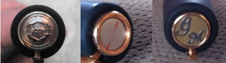
Same pen, three different looks via the "My Pen" system
I think the initials actually look better than the original logo, because their finish is a better match for the bonze. And, they were quite inexpensive — only $8 for the pair of initials from an eBay vendor. The gemstones and zodiac signs cost about twice that.

You're thinking that the accidental loss of the original Visconti logo is the flaw, right? No, that is not the flaw.

The clip is the typical springed Visconti "bridge" design. The clip is not designed to slide easily over things like your pocket, however, unless you pull the clip away from the cap a little with your fingers as you try to slip it over whatever you're trying to clip it to.

You're thinking that the clip is the flaw, right? No, the clip is not the flaw.

Locking Grooves on Visconti Homo Sapiens
I've really tweaked the exposure to get
these locking grooves to show up
Here's the flaw: the cap is supposed to secure with a grooved locking system, but . . .  it comes of quite easily, much too easily. Visconti touts this as very secure cap, requiring one to push down on the cap and then twist it to remove it, something like removing the top from a prescription drug bottle. However, one need only twist it, without pushing down at all, and it pops right off. In fact, I accidentally removed the cap twice in the first week or two I had the pen. That should not happen! (I haven't accidentally popped the cap since, probably because these accidents reside in my unconscious and guide how I handle the pen, notwithstanding its otherwise seeming indestructability.)

I took the pen back to the store to compare to others, and couldn't feel much difference, but I sent it in to Visconti anyway, just to have them check it out. When it came back a few months later, there was no explanation of anything they did. Other than getting the bronze nice and shiny for me again, nothing seemed any different.

This design flaw is not enough for me to regret buying the pen after the fact, but if I'd noticed it before I bought it, I might have thought twice. I'm really surprised I haven't seen this issue mentioned in other reviews. I recommend you check this out before you buy, to make sure it won't bother you later.

The Power Filling System

I'll confess, I have no idea how this works. I mean I know how to fill the pen, I just have no idea what the mechanism is doing inside when I do it and, since this isn't a demonstrator, there's no way to observe the mechanism. You can pretty easily find diagrams of the power filler design.

To fill the pen, you unscrew the blind cap behind the bronze ring at the end, and pull out the plunger. Dip the nib into the ink, push in the plunger, wait several more seconds, and presto! Your pen is supposed to be filled with ink.

(Right about this point in writing the review, I realized I had no pictures of the filling system in action. So here's a link to someone else's video review, which includes a demonstration of the power filler.)

I say "supposed" to be because the inability to see inside the pen also prevents you from knowing how well you've filled it (or how much ink is left). I've read some complaints that the power filler does not fill the reservoir unless the plunger is pressed at least twice, but I just don't know. Unfortunately, I don't write enough to be able to tell you whether it feels like the pen runs out of ink quickly.

What I can tell you is that the fill mechanism feels quite durable. The spindle on the plunger might look fragile and easy to bend, but it actually feels quite sturdy. I think it's made of titanium.
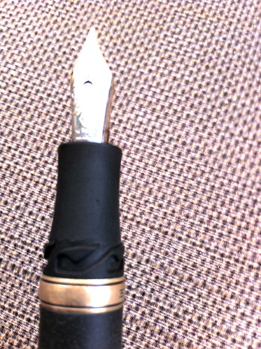
Medium Nib on the Visconti Homo SapiensThe Nib and Section

The section is quite short. Unless you have very small hands, your grip on the pen is going to include both the locking grooves for the cap and perhaps the bronze ring near the section. The short section made me wonder if the pen would be comfortable to hold, so I tried it out several times in the shop and at the pen show before taking the plunge. I don't find it a problem at all.

There's been some discussion at The Fountain Pen Network over whether the hygroscopic quality of the lava/resin combination will cause the section to absorb ink when dipping the nib to fill the pen, and eventually discoloring the section over time. I can see a very narrow band of darker color on the nib end of the section, but honestly, I don't know if I see it because people suggested there could be a problem or because there really is one. Wiping the section down thoroughly after filling seems the practical thing to do, but if the ink has already been absorbed by the pen, it seems like that wouldn't help much. I just try not to dip the pen very far past the nib, use a wet paper towel to clean the section, then hope for the best.

The 23k Palladium nib is quite fittingly called the "Dreamtouch" nib. It's remarkable. Smooth. Wet. Aesthetically beautiful. There's nothing to dislike about it. It makes me want to write.

This short Youtube video describes the extra fine version of the nib as "springy, but not flex," then really bears down on the nib to show how it bends. The thought of doing that with my pen scares the heck out of me, and I'm not about to try it to see how flexible the medium nib is. I'm not a flex guy, and I so marvel at the smoothness of the nib, I don't really care if its flexible or not.

Price

Let's talk about price. For some people, this is the flaw with the pen.

This is a crazy expensive pen unless (a) you have money to burn (that's not me) or (2) you're obsessed with the pen, lust after it on the internet for a year, then justify the purchase by telling yourself "Well, it's my only expensive pen this year, and it's on sale . . . and it's made of lava" (sucker — that's me).

Retail price is $595. On sale, I got it for $476 (20% off) which I suspect was the price at all those online vendors that used to tell you to call for the discounted price. Lately, I haven't seen it discounted anywhere, which is odd, because the fact that a vendor at the L.A. Pen show in 2011 offered me one for only $385 leads me to think it wasn't exactly flying off the shelves. Perhaps sales have picked up?

Conclusion

I love my Homo Sapiens. It is a real dream to look at, hold, and write with. And did I mention it's made of lava?

But I wish the cap didn't come off so easily. I highly recommend you try this pen out in a brick-and-mortar shop or at a pen show — everything from filling, to the cap locking system, to writing — before you actually buy one. If you live too far from any retailer to do that, I recommend you at least try out the cap and work the power filler a few times before you ink the pen and make it un-returnable.

As usual, there are more poor photos at my Flickr set for this review. You can see other reviews of this pen at:

Goldspot Pens
Sieze the Dave
Inky Journal


Share/Save/Bookmark

Thursday, July 5, 2012

This was inevitable

I figured this would happen either within the first few weeks of owning a fountain pen or about 20 years later. I didn't expect it to happen about two and a half years after my first fountain pen.


Lamy 2000 fine nib and Diamine China Blue ink on a
Croft & Barrows Easy Care sport shirt
It compliments the cornflower blue check pattern quite nicely, I think.

UPDATE: A comment made me aware that I need to clarify this post.

The comment, from ThirdeYe: "Yikes! Do you know what happened? Pen failure? Heat?"
None of the above. This was purely operator error. I don't post when I write, but on this occasion, I posted the cap for a moment to keep the pen from rolling away when I set it on the desk. A minute later, on my way out the door, I went to pick up the pen, and I must have assumed it was capped because the cap was on it (again, I never post).

What you see is the result of putting an uncapped Lamy 2000 nib-down in a pocket.

It is because this was a boneheaded move that I thought this was inevitable!

Share/Save/Bookmark

Sunday, May 20, 2012

Handwriting and the creative process

There is an interesting essay in yesterday's Wall Street Journal: The Powers That Flow From a Pen, in which writer Paul Theroux explains why writing with pen and paper is an essential part of his creative process. His advice to a woman who sought his comments on her typewritten novel is telling. He only got through the first 50 pages:
In the pages I read of the woman's novel I did not discern any close attention to a word or phrase. "How can I make it better?" she asked. I had the answer. I advised her to put her computer away and to get a pen and a good pad of paper, and then to sit down and copy the 50 pages in her own handwriting—slowly, studying each word.
This advice is unquestionably based on his own creative process. He notes, "The speed at which I write with a pen seems to be the speed at which my imagination finds the best forms of words." Granted, not everyone's mind works the same way, but there is something to be said about the theory that reliance on computers can result in users focusing more on the process than on the content.

Sometimes my mind is racing with so many ideas that I feel I must use a computer to capture them all. When I do, capturing the ideas and expressing them becomes a single step, but not necessarily for the better. Perhaps it would be better for me to brainstorm my ideas on paper, then make the attempt to express them in words a distinct second step. I have a feeling it will be much easier to keep these tasks separated, and to do a better job on the second, by using pen and paper.

It's a short essay, so I won't post any more of it here. Just go read the whole thing. It makes me think there might be hope for me to write something worthwhile.

Share/Save/Bookmark

Friday, May 18, 2012

Review: Kokuyo InspiraciĆ³n Notebook

Kokuyo InspiraciĆ³n Notebook - LogoA Japanese notebook with a Spanish name. Well, that's an interesting start.

The name of this notebook is the Spanish word for "inspiration," which makes it rather unsuitable for me, or at least to the use I put it to. I used it mainly to keep my timesheets — oh, how I hate tracking my time!—and occasionally for meeting notes. Nothing inspiring there. ("9:06 a.m.: telephone call from client re deposition scheduling." See what I mean?)

Well, if the Kokuyo InspiraciĆ³n Notebook doesn't provide inspiration, what does it provide? Plenty. And I know, because it took me about three months to fill this thing up and I really got a chance to evaluate it. Usually, I review new products while they're still new — this time, I can tell you how it holds up over the long haul.

Kokuyo InspiraciĆ³n Notebook
After three months, it's not too beat up
Start with sturdy cardboard covers that make it real easy to use in your lap or on the fly. The covers held up real well over the three months it took me to fill up this notebook, which include getting lugged back and forth to work everyday in my Levenger Briefolio and the occasional use on the road. You can see the edges are are still in fairly good shape.

The twin rings also held up fairly well. By the time I was done with the notebook, the end rings were bent a little, and a gap had started to develop, but the cover material is thick enough that it was never at risk of coming off the rings.

Jet Pens, from which I purchased this notebook, calls this "semi-B5" sized paper. It measures about 7 in. x 9.8 in. It's nice and portable, and very thin. Since I use a briefolio instead of a briefcase, space is at a premium, and this takes up very little space. Personally, I like the size 7 in. x 9.8 in. size, but it's always a little troublesome to put anything but letter-sized paper in a file. (I don't mind, but everyone in the law office has to use the same file, and odd sizes of paper can be tough to find.) I also like that the pages are perforated. Although I removed very few pages from this notebook, it was nice to have a smooth edge when I did. I hate handling non-perforated paper that's been pulled from a spiral or twin-ring notebook.

Kokuyo InspiraciĆ³n Notebook - Twin Rings
Inside the front cover is a two-sided document pocket, which I found very handy. In this size notebook, the pockets easily handle letter-sized paper folded in half, unlike the pocket in the back of a typical A5-sized hardcover notebook.

The the 7 mm - ruled paper resembles what I've seen in other Japanese notebooks. It seems a little thin, and very smooth. It handles fountain pen ink wonderfully. I must have used a couple of dozen pen and ink combinations, and not one of them bled or feathered. There is a good deal of show through, so if that bothers you, stick to the less saturated inks.but it is very smooth. And something else that seems common among the Japanese notebooks I've tried: some nibs will actually squeak a little on the paper. Weird.

The notebook is a bit pricey at $14.00. So I picked out a whole bunch of notebooks at Jet Pens and ordered them all at the same time to hit the $75 threshold for the 40% discount. At that price ($7.40), it is much more fairly priced.

Bottom line: this is a very nice notebook, and I like it while using it, especially the document pockets. If you're not bothered by showthrough, or tend to use lighter inks, it's got a lot going for it.

Share/Save/Bookmark

Saturday, April 14, 2012

You can only read this post if you promise not to laugh: My first Zentangle

It's tough having a fetish for pens and paper yet lacking any artistic talent at all. Seriously. I look at the other pen and paper blogs, and so many of them include nice sketches as part of their pen or ink reviews, or at least nice handwriting. Others write fiction. I can't do any of that.

I've read one book recently about writing, and I've got a few more to go, thinking maybe this will be the year I actually participate in NaNoWriMo in November. ( I modified that to ShoStoWriMo a couple of years ago, and actually got some stuff down on paper, but couldn't come up with much of a story.)

Drawing? Hopeless. Them somehow, I ran across something about Zentangles. (Here's a reminder I am an attorney: "Zentangle" is a registered trademark of Zentangle, Inc.) This is supposed to be art that anyone can create, based on very small, repetitive strokes creating patterns (each pattern in the piece is called a "tangle"), and the process is suppose to help relieve stress. (Believe me when I tell you that stress relief is something I can use.) Zentangle, Inc.'s trademark expression is "Anything is possible one stroke at a time."

Oh, yeah? They never met me.

Anyway, I bought a book on "tangling," the recommended Sakura Pigma Micron pen (oops, wrong tip size), and went to town this afternoon on a blank #12 R by Rhodia premium notepad.

This is what I ended up with after about an hour and a quarter:

First Zentangle
That patio chair backdrop makes for its own nice tangle pattern, It's a shame I didn't draw it.

Maybe it looks better on an oblique?

First Zentangle - Oblique
Leave it to me to put the worst tangle in the foreground!

If you want to go the whole tangling route, I suppose, you buy these Zentangle tiles, which I might get around to eventually, but I figured it would be better to start on notepads for awhile to see if I stick with it before spending money on the tiles, which run about $0.50 each. The No. 12 Rhodia pad, at 3.3 in. x 4.7 in., is about 25% larger than the tiles, which are squares 3.5 in. on a side.

After just one tangling session, I'm not convinced yet this will become a common way for me to relax. But the concentration required in drawing all those little lines sure shuts out the rest of the world, which is exactly what I was looking for.


Share/Save/Bookmark

Thursday, March 22, 2012

Review and Giveaway: Levenger Circa Dimensions Notebook

Levenger Circa Dimensions Notebook(UPDATE: The giveaway is now closed. Congratulations to our winner, Latonya Ramsey.)


 I soured on the Circa notebook system some time ago, at least for work purposes. The big obstacle to using it for work is the punched edge of the paper, which catches on everything once you remove it from the notebook and try to stick it in a file folder, run it through a scanner, or whatnot. I could cut off the edges, I suppose, but for now, it's not a realistic option for work. (If you're unfamiliar with the Circa disk-bound system, read about it here.)

That said, I haven't ruled out using Circa for some personal things, like an ink journal or some writing projects. And Daniel Marshall, Levenger's marketing manager, was kind enough to send me a bunch of sample notebooks and papers after he read about my beefs with (and praises for) various Levenger papers. So, I have to try 'em out! Then I have to give 'em away!

The Review

As Circa notebooks go, there are lots of cool things about the Circa Dimensions Notebook, and the paper's pretty good. Not perfect, but pretty good. I'll save the paper for the end and look at everything else first.

I know it's just a matter of taste, but the cover is probably the coolest I've seen on any Circa notebook. The outside looks like a carbonesque prism tape, though not quite as shiny (the inside is gray), and it's translucent. It has the kind of texture that makes a "zip" sound when you drag your fingernail on it.

Flexible Cover of the Levenger Circa Dimensions NotebookIt's also quite flexible. Consider this a soft cover notebook that requires a hard surface underneath it to write on comfortably. In fact, the cover — indeed, the entire notebook — can be curled around on itself. One bog benefit of the cover, in my opinion, is that it is so thin compared to the stiff leather covers, thus taking up a lot less of the disk when folded completely behind the notebook.

The cover seems way too big for the paper at first blush, extending quite a bit beyond the edge of the sheets (at the side only, not at the top or bottom). However, this is apparently to accommodate the use of tabbed dividers, and it's actually a good feature. The notebook comes with a single tabbed divider, nice and sturdy, probably to whet one's appetite for more.

It's almost impossible to tell the back cover from the front. As is typical, there is a Levenger logo at bottom center of the back cover, but it's so buried in the carbon fiber pattern that it's virtually invisible. You may need to reference the tab or put some mark on the cover to know which end is up.

Levenger Circa Dimensions Notebook
The beautiful designs of some of the Circa disks (Kyoto, Golden Tortoise, and the various aluminum disks) are what made me try Circa in the first place. The disks that come with this notebook are 3/4-inch diameter shiny aluminum and  are a perfect match for the cover. They really make the notebook stand out with a futuristic, hi-tech look.

The pages turn very easily. That could be due to the size of the disks (my experience is that pages don't turn as well on larger disks), the fact that they are aluminum instead of plastic (these are the first aluminum disks I've tried), or both. I can't be sure.

Levenger Circa Dimensions Notebook - Nice Cover and Disk Combination
Aluminum disk and carbon fiber pattern cover are a winning combination. Yes, those disks are solid, but the reflection makes it look like the paper is passing through rings.

Levenger Circa Dimensions Notebook - Paper Layout, top and bottomNow, the paper. It's what Levenger calls "annotation ruled", very similar to Cornell note-taking ruling. Levenger calls the paper "soft white," and the margin is shaded gray.

There are two blank fields at the top of each page (front side only), and a perpetual calendar at the bottom of the margin on the front of each sheet for circling the month and the date. It's not very intuitive for me, because the dates are arrayed like a calendar, and the actual date may fall on a different day than it looks like on the paper. On the perpetual calendar, it looks like the first is always on a Sunday, the second is always on a Monday, etc. I suppose one would get used to it over time. But the perpetual calendar hardly seems necessary with those two blank spaces at the top of the page, the smaller of which is just perfect for writing in the date.

The paper is very smooth, both to the touch of the hand — really a pleasure to handle — and the touch of the nib. It's fairly heavy (100gsm) but does not feel as sturdy as the paper in Levenger's notepads. I didn't really give the notebook a workout, so I can't say how durable the the paper will prove to be when it's been moved over the disks a lot or removed and replaced repeatedly.

The paper is far more hospitable to ink than the paper that came with the Circa sampler kit I bought around two years ago. Only the most saturated fountain pen inks bleed through. Dry writers and less saturated inks should do fine. And I didn't get feathering with any fountain pen, rollerball, or gel inks that I tried. The showthrough can be significant, though. Choose your pens and inks carefully.

At $39, this notebook strikes me as a little pricey, but consider that the disks alone sell for $22 and the refill paper goes for $16, and it's not out of line if you're a Circa fan. (The disks do not appear to be available separately at present. Update: I was wrong.)

As usual, you can find more photos of the product (in my trademark poor photography) in the Flickr photo set for this review.

The Giveaway

All you've got to do to enter is send an email with the subject line DIMENSIONS to me at notebookeresqATgmail.com. That's it! No blog comment, Twitter tweet, Facebook "like" or anything like that. Just a simple email. But the subject line must read DIMENSIONS, or your email might be left out of the drawing.

I'll keep the contest open to entries through at least Sunday night (March 25), maybe a little longer. The winner will be selected at random and will be notified by email. If the winner does not respond in three days, I'll pick an alternate. And so on.

Good luck!


Share/Save/Bookmark