From what I can gather,
TWSBI pens — or, at least the Diamond 530 — are manufactured in Taiwan according to designs from
The Fountain Pen Network and are available in the US
only on eBay. I heard about TWSBI some time ago but did not see any on eBay for quite a while, so when I finally saw the Diamond 530 available, I bit — and that was
before I found out that the Diamond 530 won by a mile in
Goldspot's Pen of the Year 2010 poll.

So, I had high expectations for this pen. Sure enough, I love most everything about it. Contrarian that I am, though, the one thing I was not impressed with was the quality it seems to be best known for. You'll have to read on to see what I'm talking about.
First Impressions
The packaging is nothing luxurious (see the
photos at eBay), but holds some pleasant surprises: namely, a small bottle of silicone grease (to apply to the piston and/or threads for water-tightness) and a wrench in case you want to disassemble the pen fully. Since I'm an engineer by education (but not profession), I couldn't resist taking it apart right away.
Having done so, I have a bit of advice for you should you decide to do the same: go slowly and be careful. I almost couldn't get it back together again. I kept getting a gap between the barrel and the knob one twists to move the piston. I'm pretty sure I only got it on right, eventually, by accident. (Some engineer, eh?)
Even though I took the pen part, I did not apply any silicone grease, because the piston appeared to have a healthy coat of it already.
I like the thoughtfulness that went into providing these little extras.
Design Aesthetics
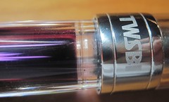
 |
The "jewel effect" with
Diamine Chine Blue ink |
What gives? There are no diamonds on the Diamond 530! Then again, it's $39.99. You can't even expect diamond chips at that price..
The one feature that made me somewhat reluctant to buy this piston-filler is that it's a demonstrator (a clear pen that allows you to see the internal operation). Demonstrators never appealed to me very much. To me, a big part of the beauty of any pen is its finish. Clear plastic just didn't do it for me.
Turns out to be one of the things I like best about the pen! I wouldn't want a whole pen chest full of demonstrators, but my inner geek really enjoys being able to see the workings in this pen.
In fact, this pen is more attractive
because it is a demonstrator, The barrel is faceted, so as the ink runs down a little and lets the light through, it gives the pen a jewel effect that is quite striking.
On the flip side, I find that the material on the pen tends to show smudges from fingerprints quite readily. So, while the "jewel effect" is nice, it can be somewhat dulled by fingerprints.
Until you fill the pen with ink, the only splash of color on the pen is the red button with the TWSBI logo on the top of the cap. Everything else is very understated. The TWSBI and Diamond 530 lettering on the cap ring are barely noticeable, and the clip is very plain.
The steel nib is engraved with the TWSBI logo but is not otherwise distinctive.
One unattractive feature, but not overwhelming, is the smoky color of the top of the cap. I don;t know why TWSBI went with a smoke color there, but to me it detracts from the looks of the pen. Perhaps it serves sme function, like preventing the nib from drying out, or maybe just an aesthetic function of hiding ink drops on the inside.
Design Features
I am very, very impressed by the piston filling mechanism in this pen. It is incredibly smooth. The twist knob moves very easily and with precision. It's much smoother than the mechanism on my
Noodler's Ink Piston Filler and my Lamy 2000. In fact, it's so easy to turn the knob that you can do so accidentally if you try posting the cap.
Flushing the pen between inks is very easy. First, since it is s clear demonstrator, you can see into the pen to see when the flush is complete. Second, I didn't even notice how many times I had to cycle the mechanism to get the reservoir clear, because it was so easy. When I'm flushing my Noodler's or Lamy 2000, flushing is a pain because the mechanism is so much stiffer, and I end up counting the number of times I cycle the piston with different inks.
The cap is threaded and requires nearly 1-1/2 revolutions to remove. That's slightly more than my other threaded-cap pens require.
If you remove the section when flushing the pen, be very careful to watch that you don't lose the o-ring that fits between them. It's quite flexible and its very easy to accidentally move it down the section so it's outside the pen when you've reassembled it.
Writing Experience
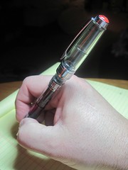 |
| Tall and top-heavy! |
The nib is steel and quite rigid. Flex lovers need not apply.
The one downer is the one thing everyone else seems to love about this pen: the smoothness of the nib. Like one guy said at FPN about the smoothness of the nib: "Not bad, but nothing special." (Then again, maybe he was jaded by
the other problems he had.) But I find the pen to have a somewhat waxy feel to it. (Of all my pens, my Waterman Harley-Davidson Freewheel Flames with medium nib — less than $18 at Overstock.com — remains my smoothest writer!)
Of course, that might be due to the ink. I've only tried Caran D'Ache Storm (which I find to be somewhat dry in any event) and just inked it with Diamine China Blue today, which seems to make for a slightly smoother feel.
I'm going to try one or two more inks in the pen to see if it smooths out at all. If not, I will consider exchanging it for another, because this does not seem to be the norm.
The cap posts, but the barrel only inserts a small way. That makes for a long and top-heavy pen when posted, so I write unposted with it.
Here's where those facets on the barrel have another nice effect: they keep the pen from rolling if you have to set it down unposted. That's probably not the intent of the design, but it's a nice side benefit, especially considering the cap is threaded. This way, you don't have to recap the pen to keep it from rolling away every time you set it down.
Summary
Overall, this is a nice pen and good value. The piston mechanism is absolutely fantastic. And I may learn to live with the nib. To the extent it's not just me, I apparently have the odd apple here.
Other reviews
Pocket Blonde
The Dizzy Pen
Fountain Pen Network 1
Fountain Pen Network 2
Update: If I had a proofreader, I'd fire him. My apologies if you got to this post before I fixed it!
Update #2: I'm happy to report that the nib problem
smoothed itself out, so to speak!

Are diamonds a fountain pen lover's best friend? Review of the TWSBI Diamond 530 fountain pen with medium nib (UPDATED: now with fewer typos!)