A technophile lawyer rediscovers the joys of pen and paper

Wednesday, December 29, 2010

How does my new Macbook Pro fit into my pen-and-paper world? (and other ruminations on 2010's digital-to-analog changes)

The title of this post is telling. As the year started, I was asking how pen and paper would fit into my digital life. Now, it's the other way around!

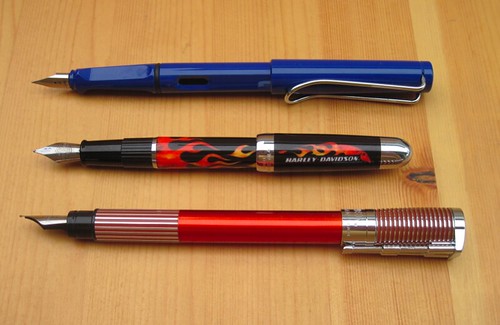
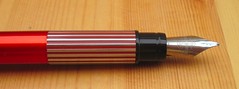
I bought a new Macbook Pro three days ago because the motherboard in my old Macbook died. A year ago, I would have been fidgeting with excitement all the way to Fry's Electronics. But yesterday, I think I would have been far more excited about buying a new high-end pen.

So, what are some of the other signs over the last year that pen and paper are gaining more influence in my life at the expense of digital devices?  Here's a partial list:

Calendar

Then: iCal, synced to iPhone.

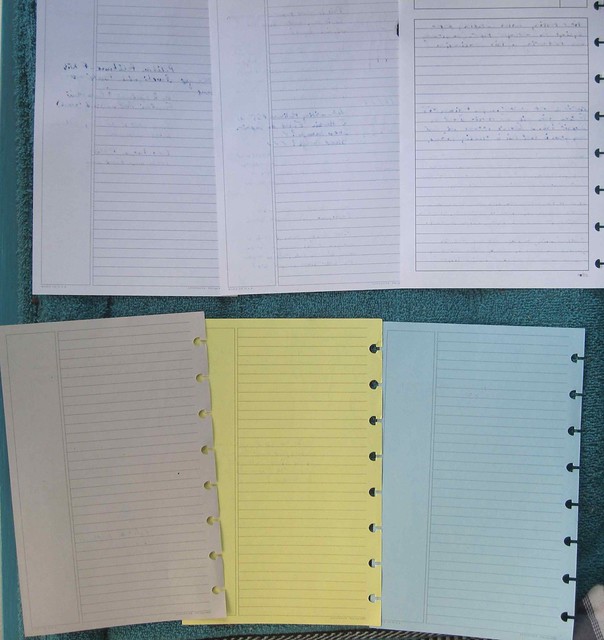
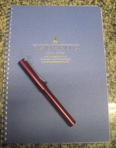
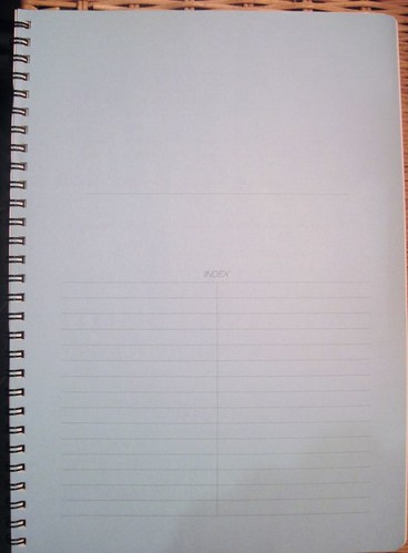
Now: Junior size Circa, in a Circa Master Zip Folio, using templates downloaded from DIY Planner. The office uses Amicus Attorney practice management software, so I just check my paper calendar against the office's electronic master calendar. For a helpful view of upcoming events, Amicus can't hold a candle to a monthly layout in my planner.

Task Management

Then: Pretty much driven off my calendar. Then, I tried implementing Getting Things Done (GTD). First, in Things. A trial run on Omnifocus. Then, when I had to use a PC at work and my Mac at home, I tried assorted web apps so I could keep things synchronized. I tried around a dozen different online task management tools, each for anywhere from a few minutes to a few weeks to a few months. The ones that didn't have too many bells and whistles did not have enough, and few satisfied me that their security was stringent enough for legal work.

Now: Junior size Circa notebook, with an on-again, off-again GTD-Booker hybrid system, without the overwhelming options presented by most online or installed applications. Definitely a work in progress, but easier to maintain than the digital applications and less prone to induce endless tinkering with the system. (I must confess that I keep toying with Remember the Milk. Like the theory that a monkey at a typewriter for an infinite amount of time will someday peck out the Great American Novel by accident, I keep thinking I'll stumble across the perfect task management setup in RTM. But the fact that I'm just playing around with it rather than trying to actually use it takes away a lot of the pressure.)

Contacts

Then: Address Book on Mac and iPhone.

Now: Address Book on Mac and iPhone. I'm not about to copy hundreds of contacts into a paper notebook when they're already in my phone. Score one for digital.

Correspondence

Most of my email is business. In fact, I almost never initiate personal emails, unless its for something akin to something I would make a phone call for, but want to be less intrusive.

To keep family up to speed, I've been writing letters. Mom loves the letters, but she still likes me to call on the phone. Moms are moms.

Magazines

Then: I devoured MacWorld and MacLife every month, going through each of them cover-to-cover, highlighting all those applications that were going to make my life better (worse yet, seduced by all the free utilities, actually downloading them, and even forking out dough for others), lusting after the latest release of a new line of computers.

Now: I don't read MacWorld or MacLife at all. Somewhere during the last year, I let both subscriptions lapse. I do not miss them. At all. I never would have believed it. I haven't subscribed to any pen magazines, though.

Blogging

Then: Political blogs. Lots of 'em. Even had one myself. I could spend hours on those things. Sad, isn't it?

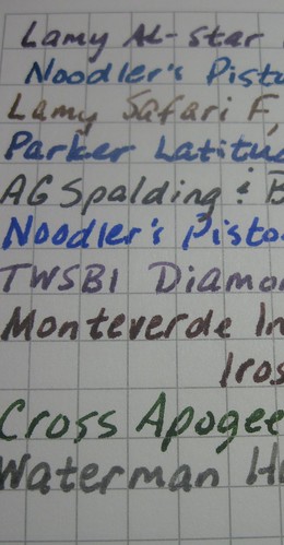
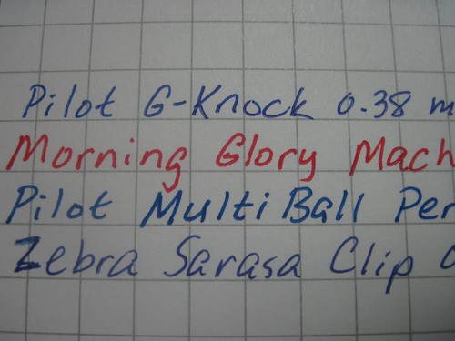
Now: Pen, paper, and stationery blogs. Lots of 'em. Even have one myself. I could spend hours on those things. Cool, isn't it?

Sleep (yes, sleep)

Then: hours every day on the computer, juggling emails, etc. left me fried, especially with several more "leisure" hours on the computer at home. Made me jumpy. Stayed up late.

Now: I was just kidding about all the hours on pen and paper blogs. I actually spend much less time on the computer when I am at home (and even less at work these days, too). That, and the fact that I find my letter-writing therapeutic, are two big reasons why I seem to sleep a lot better these days. I get to bed at least an hour or so earlier than I used to, on average. Then again, maybe I'm just getting old. Turned 50 this year.

Conclusion

Am I anti-digital? No. How anti-digital can you be if you have a blog? And I still have an iPhone capable of all sorts of things (but I mostly use it as a phone). Also, my dad gave me an Amazon Kindle for my birthday, and I use it all the time. I'm doing much more pleasure reading than I used to, with the e-books being so accessible and inexpensive. (All that reading is probably helping my sleep, too.)

I suppose it's always possible that I could still stumble across that magic software application someday, the one that will make everything come together. But that's unlikely . . . if it's out there, it will be hard to run across it, and if I do, I may not recognize it . . . because I'm not even looking for it any more.


Share/Save/Bookmark

Tuesday, December 21, 2010

Winner of the world's most overpriced memo pad is . . .

Stationery Traffic.

To whom, unfortunately, I have no way of sending the notebook. I think I have matched an email to Stationery Traffic, but I have not heard back and there is no email link on that blog. So, ST, I'll give you until midnight Google Standard Time (the time stamp on your email) on Wednesday night (Dec. 22) to email me at notebookeresqATgmail.com. If I haven't heard from you by then, the notebook goes to one of the other nine bloggers!

Share/Save/Bookmark

Saturday, December 11, 2010

A new pen blog with a great name

Thanks to Brad's Ink Links this week at The Pen Addict, I discovered a new pen blog this morning, with one of the best blog names ever: "Confessions of a Lady Quiller." Looks like she caught Brad's attention with her second post ever. That's getting her blog on everyone's radar very quickly!

As much as I love the name of her blog, I think "sieze the dave" still edges her out in the clever name standings, in part because his URL, while playing on the same theme, is different but just as clever. (But you'll have to click [or at least hover over] the link to see it.)

Share/Save/Bookmark

Friday, December 10, 2010

Blogger-only giveaway of the world's most overpriced notebook memo pad: Metaphys Blanc Fabric Covered 44113 Memo Pad (Updated with deadline)

Metaphys Blanc 44113 memo padThat headline tells you all you need to know about what I think of this notebook. Which is why I am limiting this giveaway to other pen/paper bloggers: I want a second opinion! So, as a condition of entering this giveaway contest, you must agree to post a review of this notebook within two weeks of receiving it from me.

Now, here's why I think this is the world's most over-priced notebook . . .

Metaphys Blanc 44113 memo pad end papersThis notebook sells for $10.50 at Jet Pens, and its tiny! It has to be the most expensive notebook I own, on a price per square inch of paper basis!

Actually, it's not a notebook. It's a memo pad with a cover and end papers. (To be fair, Jet Pens actually calls it a "memo pad." But the Metaphys site calls it a "notebook.") Granted, it's got really cool end papers -- black, giving it the stealth look of a Rhodia Webbie -- but neither they nor the durable cover transform this into a bona fide notebook.

The glue binding allows the pages to tear out very easily. If you want a memo pad, this is fine. But if you like to carry your notes with you for a few weeks, like I do, it's not so good. I can see these pages coming out accidentally very easily (though I didn't really put that theory to the test).

This notebook is small. Tiny. Here it is atop a stack of 3x5 index cards:

Metaphys Blanc 44113 memo pad

The paper is nice enough. Very smooth to the touch and when writing on it. It does bleed pretty severely with fountain pens, much less so with rollerballs and not at all with the gel pens I tried. But even the gel pens had pretty significant show-through. Probably not a problem for most folks, since there's really no practical way to write on the back, because of the reporter-style design of the notebook, unless you tear the sheet out first. There was no feathering with the rollerballs or gel pens, and only one or two of the fountain pen inks I tried feathered at all, and then very lightly.

The paper has a very faint grid pattern that's very difficult to see. however, it nonetheless seemed to aid my writing, as if I could see it subliminally even though I had to have the light just right to see it on the paper. From what I can tell, the vertical lines are solid and the horizontal lines are dotted.

The worst quality of the paper, to my mind, is that is feels so thin and delicate. I prefer a "substantial" paper. However, this reviewer at Jet Pens says the paper holds up as well in his wallet as a dollar bill!

The cover feels quite durable, both because of the weight and the fabric covering.

Another drawback for me is that I like to keep a pen with my pocket notebook, and there's no practical way to do that with this memo pad. My Zebra Mini T3 Ballpoint Pen slips quite nicely into my pocket-size Moleskine Cahier (my usual pocket notebook), and its pretty darn small, but there's no practical way for it to clip to the Metaphys:

Metaphys Blanc 44113 memo pad and Zebra Mini T3 ballpoint pen


I know what you're thinking: Booker, you knew how small this notebook was when you ordered it, so what are you complaining about? Well, I'm not complaining, exactly. I don't hate this memo pad. I just can't figure out why it should cost $10.50! In fact, that high price is what made me buy it . . . I just had to find out what made it special, but I still haven't figured it out. Maybe I'm missing something!

Available at Jet Pens for $10.50.  Also available directly from Metaphys directly from Metaphys for 765 yen ($8.78 US at today's exchange rate). More photos (including photos of the bleed-though) at the Flickr photo set for this review.

GIVEAWAY RULES:

To enter the giveaway, you must have a blog about pens, paper, notebooks, stationery, office supplies, or something similar. Leave a comment on this post with a link to your blog. A link to you Blogger, Wordpress, or Typepad profile will suffice, as long as it has a link to your blog. And, I need a way to reach you, so if your blog or profile page does not have an email link, shoot me an email at notebookeresqATgmail.com so I can contact you if you're the winner. (I will choose the winner by random selection of a comment using the random number generator at random.org.)

Remember: by entering, you agree to review this product on your own blog within two weeks of receiving it, so I can get my "second opinion." Perhaps you can even pass it on to another blogger!

Good luck!

UPDATE: gee, I should have set a deadline for entering, don't ya think? OK, Midnight GST Friday night (Dec. 17). Yes, you read that right: GST = Google Standard Time, meaning I'll use the time stamp on your comment.


Share/Save/Bookmark

Wednesday, December 1, 2010

What goes around, comes around

Usually one says that about something bad, but I'm saying it about something good. John at PencilWrap was kind enough in his Peanuts Special Edition Moleskine giveaway post -- learning from my comment that my giveaways are "cheap ploys for new readers" (I'm only talking about mine, not anyone else's) -- to link to me, so I am returning the favor.

Exit questions: Did Charles Schulz use a Moleskine? Would Snoopy?

Share/Save/Bookmark

Tuesday, November 30, 2010

Review: Diamine Maroon Ink

Just a few strokes into writing with this ink, I was already thinking, Maroon? Really? This just isn't what I think of as maroon, but maybe I don't have a good understanding of what maroon is. I expected it to be more of a burgundy color, but to my eye, this ink is more of a grayish-red. The color was somewhat unexpected.

If i was you, I'd trust that verbal description of the ink more than I'd trust my pictures. I did my best to adjust these scans so the color matched what I see on the paper, but I just cannot seem to get the hang of photographing or scanning ink colors correctly.

At work, I would probably use this ink only for editing. It's a little too red for me to favor for correspondence or notes, and I wouldn't sign anything with it. That's just me.

Otherwise, writing with this ink was pleasant. It seemed well-lubricated, neither particularly wet nor particularly dry. Flow seemed fine but, like several inks I've tried, it skipped severely with italic nibs on Rhodia paper.

On fountain-pen friendly paper like the Rhodia pad, the shading is significant in all nib sizes.

Diamine Maroon on Rhodia Paper
Diamine Maroon on Rhodia paper


On the Levenger wire-bound notebook paper, which is a little more absorbent, there was still a good deal of shading.

Diamine Maroon on Levenger Wire-Bound Notebook Paper
Diamine Maroon on Levenger wire-bound notebook paper


On the Tops Docket Gold yellow pad, the most absorbent of the three, the shading was far less. Then again, that's not really something I worry about when taking notes.


Diamine Maroon on Tops Docket Gold Legal Pad
Diamine Maroon on Tops Docket Gold legal pad


One feature of the ink that is undeniably cool (and I can capture in a scan regardless of whether I get the color right -- yay!) is that it tends to outline the strokes. Look at that close-up, and you'll see what I mean. It's like someone took an ultra-fine tip and a darker ink and outlined the writing. If I can find this quality in a color I like more, I will have found a winner!

Outliining Characteristics of Diamine Maroon Ink
Outlining of Diamine Maroon ink on Rhodia paper


Having tried this ink on three papers, I think I can see it does not bleed or feather much. Like most inks I've tried, it did not bleed or feather on the Rhodia pad at all (on which almost nothing does, which is why I tried more papers), but even on the more absorbent Levenger paper, through which some inks do bleed, there was no bleeding or feathering at all. I was writing some notes for court the other day and got halfway down the backside of a sheet before I realized I even was writing on the back side. What a pleasant experience, given the bleeding Levenger papers I have tried before (circa and a grid pad)!  Even the show-through was very, very light (photo). Only on the Tops Docket Gold legal pad did the ink bleed significantly (photo), but it didn't feather even there.

An overall nice ink with a shade that isn't quite my cup of tea.  If I could get used to the color, though, I'd love to use this for correspondence because of the outlining behavior.

Flickr photo set here.

Share/Save/Bookmark

Sunday, November 21, 2010

I love it when a pen comes together! *

I enjoyed two successful solutions this week to pen problems I noted in my last two posts. One success from pure luck, the other from excellent customer service.

First, the lucky one. In my review of the TWSBI Diamond 530 medium nib fountain pen, I complained that the nib just didn't seem to write as smoothly as all the reviewers said it should. I was on my third ink through the pen -- Private Reserve Midnight Blues -- still finding it to be a little dry/waxy feeling when, in the middle of writing, I heard a little "click" and saw a small metal shaving, covered with ink, left on the paper. The nib immediately felt smoother, which makes me think that the shaving was somehow lodged between the tines, blocking the ink flow and making the nib write drier than it should. Or maybe the shaving was already sitting there on the paper, I just ran over it, and I'm imagining the increased smoothness. Whichever the case, I'm now pleased as punch with the smoothness of the nib, and urge you not to let my initial dissatisfaction influence you away from getting a Diamond 530.

Now, for the success resulting from customer service. In my last post, I told you how disappointed I was in the extremely scratchy 2668 (firm medium) nib that came on my first-ever Esterbrook J. The seller happily accommodated my request for another nib, and the new 2668 nib indeed writes very smoothly, validating all the raving I read about the smoothness of Estie nibs. Can't wait to try a 9000 series nib!
_______________________________________
* Borrowing (and slightly modifying) Hannibal Smith's signature line.

Share/Save/Bookmark

Tuesday, November 16, 2010

So I bought my first Estie . . . (Updated)

My first Estie

Hadn't seen an Esterbrook in this finish before, it is fully restored, and there were few bidders, so I jumped on it for just $23. It's a beautiful pen.

I hate it.

So far.

I realize I didn't go top-of-the-line with a 2668 nib (firm medium), but geez, these thing is so scratchy I half expect it to cut right through the paper!

I know that the 2668 has no hard metal added to the tip of the nib and has the tines rolled under instead. Can these be made to write smoothly? Or am I going to have to fork out some dough for a 9000 series nib?

Until I find out otherwise, I'm going to assume the nib tines are misaligned. At least I hope they are. I hate to think this is the normal feel to this nib.

I know I've got that loupe around here somewhere . . . .

Update: I looked at the nib under a magnifying glass and could find nothing obviously wrong with it. Nonetheless, I asked the seller for a replacement nib, and . . . problem solved!

Share/Save/Bookmark

Friday, November 12, 2010

Are diamonds a fountain pen lover's best friend? Review of the TWSBI Diamond 530 fountain pen with medium nib (UPDATED: now with fewer typos!)

From what I can gather, TWSBI pens — or, at least the Diamond 530 — are manufactured in Taiwan according to designs from The Fountain Pen Network and are available in the US only on eBay. I heard about TWSBI some time ago but did not see any on eBay for quite a while, so when I finally saw the Diamond 530 available, I bit — and that was before I found out that the Diamond 530 won by a mile in Goldspot's Pen of the Year 2010 poll.

TWSBI Diamond 530 Fountain Pen

So, I had high expectations for this pen. Sure enough, I love most everything about it. Contrarian that I am, though, the one thing I was not impressed with was the quality it seems to be best known for. You'll have to read on to see what I'm talking about.

First Impressions

The packaging is nothing luxurious (see the photos at eBay), but holds some pleasant surprises: namely, a small bottle of silicone grease (to apply to the piston and/or threads for water-tightness) and a wrench in case you want to disassemble the pen fully. Since I'm an engineer by education (but not profession), I couldn't resist taking it apart right away.

Having done so, I have a bit of advice for you should you decide to do the same: go slowly and be careful. I almost couldn't get it back together again. I kept getting a gap between the barrel and the knob one twists to move the piston. I'm pretty sure I only got it on right, eventually, by accident. (Some engineer, eh?)

Even though I took the pen part, I did not apply any silicone grease, because the piston appeared to have a healthy coat of it already.

I like the thoughtfulness that went into providing these little extras.

Design Aesthetics

TWSBI Diamond 530 Fountain Pen - the "jewel effect"
The "jewel effect" with
Diamine Chine Blue ink
What gives? There are no diamonds on the Diamond 530! Then again, it's $39.99. You can't even expect diamond chips at that price..

The one feature that made me somewhat reluctant to buy this piston-filler is that it's a demonstrator (a clear pen that allows you to see the internal operation). Demonstrators never appealed to me very much. To me, a big part of the beauty of any pen is its finish. Clear plastic just didn't do it for me.

Turns out to be one of the things I like best about the pen! I wouldn't want a whole pen chest full of demonstrators, but my inner geek really enjoys being able to see the workings in this pen.

In fact, this pen is more attractive because it is a demonstrator, The barrel is faceted, so as the ink runs down a little and lets the light through, it gives the pen a jewel effect that is quite striking.

On the flip side, I find that the material on the pen tends to show smudges from fingerprints quite readily. So, while the "jewel effect" is nice, it can be somewhat dulled by fingerprints.

TWSBI Diamond 530 Fountain Pen
Until you fill the pen with ink, the only splash of color on the pen is the red button with the TWSBI logo on the top of the cap. Everything else is very understated. The TWSBI and Diamond 530 lettering on the cap ring are barely noticeable, and the clip is very plain.

The steel nib is engraved with the TWSBI logo but is not otherwise distinctive.

One unattractive feature, but not overwhelming, is the smoky color of the top of the cap. I don;t know why TWSBI went with a smoke color there, but to me it detracts from the looks of the pen. Perhaps it serves sme function, like preventing the nib from drying out, or maybe just an aesthetic function of hiding ink drops on the inside.

Design Features

I am very, very impressed by the piston filling mechanism in this pen. It is incredibly smooth. The twist knob moves very easily and with precision. It's much smoother than the mechanism on my Noodler's Ink Piston Filler and my Lamy 2000. In fact, it's so easy to turn the knob that you can do so accidentally if you try posting the cap.

Flushing the pen between inks is very easy. First, since it is s clear demonstrator, you can see into the pen to see when the flush is complete. Second, I didn't even notice how many times I had to cycle the mechanism to get the reservoir clear, because it was so easy. When I'm flushing my Noodler's or Lamy 2000, flushing is a pain because the mechanism is so much stiffer, and I end up counting the number of times I cycle the piston with different inks.

The cap is threaded and requires nearly 1-1/2 revolutions to remove. That's slightly more than my other threaded-cap pens require.

If you remove the section when flushing the pen, be very careful to watch that you don't lose the o-ring that fits between them. It's quite flexible and its very easy to accidentally move it down the section so it's outside the pen when you've reassembled it.

Writing Experience

TWSBI Diamond 530 Fountain Pen - Giant when posted!
Tall and top-heavy!
The nib is steel and quite rigid. Flex lovers need not apply.

The one downer is the one thing everyone else seems to love about this pen: the smoothness of the nib. Like one guy said at FPN about the smoothness of the nib: "Not bad, but nothing special." (Then again, maybe he was jaded by the other problems he had.) But I find the pen to have a somewhat waxy feel to it. (Of all my pens, my Waterman Harley-Davidson Freewheel Flames with medium nib — less than $18 at Overstock.com — remains my smoothest writer!)

Of course, that might be due to the ink. I've only tried Caran D'Ache Storm (which I find to be somewhat dry in any event) and just inked it with Diamine China Blue today, which seems to make for a slightly smoother feel.

I'm going to try one or two more inks in the pen to see if it smooths out at all. If not, I will consider exchanging it for another, because this does not seem to be the norm.

The cap posts, but the barrel only inserts a small way. That makes for a long and top-heavy pen when posted, so I write unposted with it.

Here's where those facets on the barrel have another nice effect: they keep the pen from rolling if you have to set it down unposted. That's probably not the intent of the design, but it's a nice side benefit, especially considering the cap is threaded. This way, you don't have to recap the pen to keep it from rolling away every time you set it down.

Summary

Overall, this is a nice pen and good value. The piston mechanism is absolutely fantastic. And I may learn to live with the nib. To the extent it's not just me, I apparently have the odd apple here.

Other reviews

Pocket Blonde
The Dizzy Pen
Fountain Pen Network 1
Fountain Pen Network 2

Update: If I had a proofreader, I'd fire him. My apologies if you got to this post before I fixed it!

Update #2: I'm happy to report that the nib problem smoothed itself out, so to speak!


Share/Save/Bookmark

Wednesday, November 10, 2010

Eco-mania: Are fountain pens as eco-friendly as aficionados claim?

This post was triggered by Heather's recent self-labeled "rant" at A Penchant for Paper, in which she took issue with the "green" claims made for a pen made of recycled water bottles.  She urged persons concerned about the environment to use fountain pens, pencils (especially those made of recycled materials), or pens made with biodegradable plastics. While I don't agree with everything in her post, I agree wholeheartedly most of her final paragraph:

Don't be sucked into buying an item (a pen or anything else) just because the manufacturer has labelled it as "green."  If the environment is that important to you (and I hope it is!), think carefully before you buy and remember that the old fountain pen and ink may still be the best option.
Like Heather, I'll ask you to excuse me if this post likewise turns into a bit of a rant.

Let's start with this: I do not use fountain pens because they are eco-friendly, and I do not know if they are or not. What bothers me is blind acceptance of "green" claims.

Here's the problem: nobody thinks about trade-offs. There are trade-offs for everything. Everything. Ev... er...y...thing. (Including the options Heather advocates.) That's what engineering is about, folks. Compromise. I may have barely passed in my electrical engineering major, but I learned that much.

Let's say an engineer is trying to build a better widget by giving it more tensile strength. No engineer can just think, "How do I design more tensile strength into this widget?" Instead the engineer has to ask, "How do I design more tensile strength into this widget without unacceptably increasing manufacturing costs, reducing other good qualities, or introducing or increasing bad ones?" Maybe you can increase tensile strength quite easily, but at exorbitant cost in money or at the cost of losing flexibility, which you also need, or at the cost of increasing undesirable qualities like size, weight, or susceptibility to corrosion.

Trade-offs. If we didn't have them, we could design a perpetual motion machine.

So, let's take a closer look at the eco-friendliness of fountain pens.

The good: 

Re-usable. Re-fillable. Non-disposable. (I guess those are all the same thing.) I think that's about it.

The bad: 

Water. You need water to flush them between inks. With some pens (I'm thinking piston fillers), quite a bit of water. And I live in California, so huge amounts of energy are used to get that water to me. 

Metal. Famously anti-green mining activity was required to make at least part of each of my pens. Even if the barrel isn't brass, that steel or gold nib didn't just pop up out of a dispenser. In fact, if it's steel, it required a steel plant to form the steel after the iron was mined. And if your barrel is brass, then odds are the copper for it came from an open-pit mine, a huge scar in the earth.

Plastic. Use cartridges or a plastic converter? There's a 99% chance the plastic was synthesized from oil. 

Multiplicity. Lots of fountain pen users like to collect them. Real eco-friendliness would mean owning one pen. Count me among those who own several and will buy more. (On the other hand, this desire to acquire and own is the same thing that keeps us from throwing them out, so that's good.)

I'm not saying that fountain pens are NOT eco-friendly. I have no idea whether they are or not. I'm just saying we shouldn't assume they're eco-friendly just because they're refillable.

In fact, I'd love to hear from others about any eco-friendly facts I missed.


Share/Save/Bookmark

Thursday, November 4, 2010

An untimely review? Levenger Full-Page Grid Pads (Junior size)

I say "untimely" because even though I just bought a three-pack of these pads from the Levenger Outlet on eBay, I can't seem to find them on the Levenger website, leading me to believe they are no longer offered. But, since I've already been trying out these pads for a few days and putting them through the wringer for a review, why let a little thing like the fact they're discontinued get in the way?

Levenger Annotation
1/4 grid ruling
Junior Size
Besides, I'm pretty sure that Levenger paper in its pads, notebooks, and Circa refills is all the same — or supposed to be all the same, with the only difference being the ruling.

That difference is a big one, though, especially when it comes to pads in junior size, which is only 5 inches wide. (The pad is 8 inches long, but each sheet is only 5 x 7.5 inches once torn from the pad.)

The only ruling I can find in junior size pads on the Levenger site at the moment are annotation-ruled, which leaves a blank column running down the left side of the paper so you can annotate notes taken in the ruled portion of the pad. (See picture at right for the annotated ruling version of the grip pad.) To my mind, that leaves too little real estate to be of much use.

Levenger Full Page Grid Pad - Junior

The pads I bought extend that grid to the left, so you end up with a sheet that has grid ruling over its entire surface except for the header boxes at the top 1-1/4 inches and very slender 1/4-inch margins on the sides and bottom of the grid area, which measures 6 x 4.5 inches.

You may be wondering why I bought these pads given how I panned the Circa refill paper just a few weeks ago, which is supposed to be the same weight, smoothness, etc. There are two reasons: (1) I wanted some heavy paper that I could punch and place in my Circa junior-sized notebook in order to keep relevant notes near their corresponding dates and/or tasks (and without having to trim the paper); and (2) the deal from the Levenger Outlet was good enough that I wouldn't have been too bummed out if the paper was terrible.

Turns out there are quite a few things I like about this notepad.

The paper indeed feels heavy ("substantial," Levenger often calls it) and quite smooth. I love that it does not feel flimsy once pulled off the pad, and therefore feels almost as pleasant to write on when a single sheet is on a hard surface as when writing on the pad. Writing was pleasurably smooth with all the pens I tried — rollerball, gel, and fountain.

Bleed-through of the Levenger Grid pad
Hey, who's worried about
a little bleed-through?
Booker, you're thinking, you're crazy. That's the same paper you were complaining about just a few weeks ago when it came in Circa refills. But I don't think I complained about the sturdy feel and smoothness of the Circa paper, only the bleeding and feathering, neither of which bother me when using the pad as opposed to paper in my Circa. With the Circa paper, I needed to be able to write on both sides, so the bleed-through wasn't acceptable. But I only need to write on one side of this note paper. I want to jot down a few notes from a phone call or short meeting, tear off the sheet, punch it, and put it in my Circa notebook so I can keep the notes close to their corresponding appointment or task (I'm trying to use Circa to implement Getting Things Done — my variant of it, anyway.)

Fountain Pen Ink feathering in Levenger Grid Pad
The feathering is mild and varies by ink.
The overall effect is that the lines simply
look wider than they should, rather than feathered.

Is the paper too absorbent? For fountain pen purists, you bet it is. But despite bad bleed-through with fountain pen ink, feathering with fountain pen ink was very mild — the effect of the paper is more to widen the line of the ink rather than actually feather it. Plus, there's a benefit to that absorbency: fountain pen ink dries very, very quickly, so there's little to no smudging even when handling the paper immediately after finishing up my note. (Opinions on the fountain pen-friendliness of Levenger paper are all across the board, leading me to believe Levenger must not consistently use the same vendor all the time, so your mileage may vary.)

Besides, who uses fountain pens all the time? The rollerball and gel pens I tried did not bleed or feather at all and wrote very smoothly.
Crisp, clear rollerball and gel inks on Levenger Grid Pad
Crisp, clean lines with gel and rollerball inks. Top to bottom: Pilot G-Knock 0.38 mm. gel pen (blue);
Morning Glory Mach Pen II rollerball (red); Pilot Multi-Ball Permanent Marker (blue);
Zebra Sarasa Clip 0.4 mm gel pen. 

There was one other big difference between fountain pen inks and the others. Take a look at the close-up pictures again. See the difference yet? The gray ruling seems to repel the fountain pen ink. Look closely and you'll see that the rollerball and gel inks wrote over the gray lines, but the gray lines show right through the fountain pen writing. It's an odd effect when using a fountain pen, and noticeable enough to be distracting initially, but I got used to it.

Finally, I really like the size of the ruling. The 1/4-inch spacing of the grid lines is very comfortable for my natural writing size. If, like me, you find the 5mm grid spacing in Rhodia and other European pads to be too small to write on each line and too big to write every other line, you may like the spacing on these Levenger pads.

At first, I thought the pad could be improved by making it longer and wider so a torn-out sheet would match the junior size Circa paper (which is 8.5 x 5.5 inches), but after a few days of use, I discovered that I preferred my inserted notes to be on slightly smaller paper than the preprinted calendar and notes sheets in my notebook. It makes them stand out better, reminding me I have something to act on.

Could the pad be improved? Of course.

Less obtrusive ruling would be a big plus. I love the spacing, but the lines are a little thicker and darker than they should be. A paler gray would be nice, and thinner lines would minimize that fountain ink repellent effect I described earlier.

And it could be friendlier with fountain pens, surely.

Bottom line: I wouldn't want this quality of paper in a full-size pad or notebook for extended writing or for any application that required writing on both sides. But the writing experience is so pleasurable, and the negative effects of the paper so minimal considering the use I make of it, that I like this pad quite a bit, and would buy more . . . if Levenger carried them.

Share/Save/Bookmark

Pen vs. Macbook

I've been thinking lately about how I have been reducing technological intrusions in my life and concentrating better by sticking to pen and paper at times, when, via Inkophile, I came across this hilarious piece at TechCrunch: NSFW: Yep, Montblanc Killed my MacBook Pro Today. Definitely worth checking out. And while you're there, take a look at the permalink URL. All in good fun!

Share/Save/Bookmark

Monday, November 1, 2010

Platinum Plaisir Giveaway Winner

Congrats to winner Doug D., winner in my latest cheap ploy for new readers giveaway.

Several commenters congratulated me for an honest review that didn't sugar-coat my view of the product.  I have two things to say in response.

First, to the extent I did not like the writing experience, I chalk it up to getting the odd bad pen. I love the Preppies I own, which appear to have identical nibs, so I don't know why the Plaisir wrote so much squeakier.

Second, if you like honest reviews, stick around. I've got a bone or two to pick with Pelikan: Newbie pen and paper blogger takes on revered German pen maker. Film at 11!

Thanks to all who entered. Don't be strangers!

Share/Save/Bookmark

Thursday, October 28, 2010

ShoStoWriMo

Many of you are probably already aware that November is "NaNoWriMo," short for National Novel Writing Month. Full details are at the link, but the basic idea is to get a 50,000-word novel written in 30 days by emphasizing consistent daily writing without worrying about quality as you go. Hey, that part sounds fun!

A 50,000 word novel seems somewhat — make that very — ambitious for me. I haven't even come up with an idea yet! But a short story . . . well, that sounds "do-able."

Thus, for me, November will be Short Story Writing Month: "ShoStoWriMo."

Share/Save/Bookmark

Two-pen giveaway! Red Platinum Plaisir Fountain Pen, Medium nib and Red Platinum Preppy, Medium Nib

Platinum Plaisir Fountain Pen with Cap Posted
The Platinum Plaisir: the Japanese pen with the French name

Plaisir is the French word for "pleasure," and I was expecting the $20 Platinum Plaisir fountain pen in a red finish to be a pleasure to look at and a pleasure to write with. It turned out to be neither, but maybe that's just me. Somewhere out there is a good home for this pen, where someone will appreciate it, so I am giving it away (paired with a red Platinum Preppy, for reasons I explain below). Entry instructions are at the end of this post.

First Impressions

Platinum Plaisir Fountain PenIf you are looking for a fountain pen that is sure to be noticed whenever you whip it out, look no further than the red Platinum Plaisir. I cannot convey how bright the red finish on this pen really is. My pictures do not do it justice . . . even the photos at Jet Pens, from whom I purchased it, make it look dull in comparison to what it looks like when you're holding it in your hand. Make no mistake: this pen is to red what the Monteverde Invincia Stealth is to black. Vivid, bright and glossy.

Which is why I am giving it away. I bought it expecting a more understated finish, and every time I look at it, I am reminded of a giant lipstick. This particular finish, to my mind, in combination with the trim, makes for a distinctly feminine look, which did not come through at all in the photos.

Just looking at those photos again, though, I have to wonder, What was I thinking? But I remember exactly what I was thinking. I was thinking that an inexpensive red pen would be perfect for keeping inked up with a red ink for editing documents at work. And I probably spent too much time looking at the photo of all the pens together, in which the pen's finish looks more dull. The final factor in my purchase was probably my penchant for purchasing entry-level pens from high-end pen manufacturers.

In any event, I'm glad I have this blog, because I know this pen can find a good home. If I kept it, it would not come out of the drawer again.

Other design features

Once you get past the red finish on this pen, there are some other design characteristics of note.

The stripe down the center of the clip is color-matched to the finish of he pen barrel. The nib is likewise color-matched, but of course is not the same finish.

Platinum Plaisir Cap Ring
The busy cap ring
The cap ring is very, very shiny — I don't know if it is likewise aluminum or is instead plastic, but I'm sure it could blind you at just the right angle in sunlight. Its design is a little too busy for my tastes. It's broad, which is fine, but it looks like Platinum felt compelled to squeeze as many engraved design elements in there as it could. The Plaisir name is engraved on the cap ring directly below the clip in an outlined font; 180 degrees opposite that are the Platinum logo and the words "Platinum Japan," and the gaps in between are filled with what looks like a chain pattern. Above and below that lettering are hash mark borders, and finally a solid section on the top and bottom of the ring.  That's a lot of engraving packed into that ring.

Overall, the outside of the pen gives the impression of a much more expensive pen, but the plastic section and colored nib are clues that this is a budget model.

Construction

Platinum Plaisir and Preppy Sections and Nibs Side-by-Side
Left to right: Preppy, Plaisir
The nib, plastic section, and feed on the $20 Plaisir appear to be identical to those on the $3 Platinum Preppy. They look identical in a side-by-side comparison and the section of one fits perfectly in the other.

The cap posts very securely, but it's another feature of the cap that appears to be the Plaisir's claim to fame. From the product page at the Jet Pens website:
Everyone has experienced the inconvenience of pens drying up after a long period of unuse. It is even more problematic for fountain pens, which require almost daily use to prevent drying. The Plaisir has a specially designed cap which prevents ink from both drying and evaporating even with no use for a whole year. As talked about in Yahoo, World News, and other news sources, this new development makes fountain pens suitable for both everyday and occasional uses. In addition, the ink is preserved without waste.
I'm afraid I don't have the patience to test that claim.

Writing Experience

I have three or four Platinum Preppy fountain pens with fine nibs that I really like to write with. I figured my Plaisir would be an even smoother writer because it has a medium nib, but my experience was exactly the opposite.

It isn't scratchy so much as it's . . . squeaky. The Apica twin-ring notebook I was trying it out in has exceptionally smooth paper, but I tried a couple of other papers, too, just to make sure it wasn't the Apica notebook to blame. It squeaked on Office Depot recycled multipurpose paper and in a Piccadilly notebook. It did not squeak in a Rhodia Webbie or a Moleskine. I also tried a Levenger ink (Shiraz, I think) and Noodler's Navy, one of the most lubricating inks I know. Still got squeaking on some papers. Finally, I took a medium nib from a red Preppy and installed it on the Plaisir, and . . . still squeaky!

I realized then that I had barely used the red Preppy, because I found the "red" ink to be pink. So I tried the Preppy, and it squeaked, too. Which is weird, because I like the fine-nibbed black, blue-black, and blue Preppies I have just fine. Maybe there's something about the red nibs?

I thought about trying to tweak the nib into better performance, but as soon as I decided to give the pen away, I thought I'd better leave the tweaking to the recipient.

As usual, there are more photos in my Flickr photo set for this review.

The Giveaway

To tell you the truth, I've lost track of whether the nib on the Plaisir is the nib that came on it or is the nib from the Preppy. (I feel a little like Dirty Harry.1) So I am going to send them both to the winner. You can mix and match the sections and nibs to your heart's content if you are the winner.

If I haven't talked you out of wanting this pen, here's how you sign up for the giveaway:

1. Leave a comment.
2. Send me an email at notebookeresqATgmail.com. The body of the email must include the name you used to comment and the subject line of the email must read exactly:

PLAISIR GIVEAWAY

I need the email so I can be sure I can contact the winner. If you leave a comment without sending an email or email me without leaving a comment, you will not be entered.

I must receive the comment and email no later than midnight on Halloween night (October 31); the time stamp on the comment and email will be the "official" times of your submission.

Platinum Plaisir Giveaway Package
The Platinum Giveaway Package: red ink cartridges, Preppy fountain pen,
Plaisir fountain pen, and ink cartridge adapter


Good luck, everyone!
-------------------------------------------
1"I know what you're thinking. 'Did he fire six shots or only five?' Well, to tell you the truth, in all this excitement I kind of lost track myself." — Clint Eastwood as "Dirty Harry" Callaghan in Dirty Harry.

Share/Save/Bookmark

Thursday, October 21, 2010

My struggle with Circa, part 2: What's up with this paper?

Judo European Championship 2010
If you've been reading my blog a while, then you may remember that I posted a very short version of my frustrations with Levenger's Circa notebooks. That post triggered some comments from those who love their Circa, and from others who likewise found them frustrating. I promised to keep trying it out. I am discovering some good, some bad along the way.

In any event, I thought those of you that commented might be curious to see how the experiment is going.

As the title gives away, this post is about the Levenger pre-punched Circa paper. Now, I don't see any explicit claims on the Levenger website that the Circa paper is fountain-pen friendly, but: (1) I have seen reviewers make that claim; (2) Levenger has at least one picture of a fountain pen on a Circa product page; and (3) the pre-punched Circa paper is insanely expensive. With all that, you'd expect it to take fountain open ink well, but I'm here to tell you: if you want to use a fountain pen regularly in a Circa notebook, you should count on buying a Circa punch so you can buy some decent paper for doing so, because the Circa paper I checked out stinks.

I started with a letter-size and junior size Circa starter kits. The paper felt nice and smooth, and its darned heavy (60 lb.) paper. But after trying a variety of pens on it, I was asking myself how they managed to engineer such a thick, smooth piece of paper into a bloody mess. That ink has to travel a long way to bleed through, but this paper apparently makes the trip easy. I tried Rolla brand paper from Staples, too, and it was just as bad.

Circa paper bleed-through
Levenger Circa paper bleed-through


Rolla Paper bleed-through
Rolla brand paper bleed-through
 Curiously (or maybe not so curiously?), the colored Circa papers — grey, yellow and blue — performed much better:

Circa paper colors - bleed-through test
Colored papers did better; Rolla brand paper at top right
Honestly, my office's everyday copy paper performs better.

So there I was, about to write off Circa forever just because the Circa paper did not take fountain pen ink well. The I started reading around Fountain Pen Network and DIY Planner and saw that lots of people are in search of better paper and plenty of people are willing to offer their advice.

Then I realized: I'm not going to be writing with fountain pens in any event. I mean, I love fountain pens, but for my everyday work notebook, keeping track of projects and my calendar, a nice gel pen is fine. But I did not like the layout of the CIrca paper, either. So I settled on some 32 lb Wausau paper, very slick to the touch. My Zebra Sarasa Clip gel pens slide across it like skates on ice. (It doesn't take fountain pen ink all that much better than the Circa paper, but at least I can print my own layouts on it.) So, I''ve kept going with Circa, and will post more about my ups and downs as I go.

And wouldn't you know, just as I get around to bitching about the Circa paper, Biffybeans announces at FPN that Levenger will be carrying Rhodia 90 gsm paper for their letter-sized Circa notebooks. Genuine letter-sized rather than A4? That would be great, except I use a junior size Circa (5.5 in x 8.5 in). But let's give it time and see what develops. (UPDATE: And here it is. But is 90 gsm heavy enough to stand up to repeated page turning and extraction/insertion?)

Share/Save/Bookmark

Friday, October 15, 2010

Let's ride! Booker's review of two Waterman Harley-Davidson Fountain Pens

A different kind of Harley V-twin
Left: Waterman Harley Davidson Horizon Orange Fountain Pen
Right: Waterman Harley-Davidson Free-Wheel Flames Fountain Pen
Ok, they may be kitsch. But they're good kitsch (if there is such a thing). I'm talking about two Harley-Davidson-branded fountain pens from Waterman: the Horizon Orange and Free-Wheel Flames models, both with medium nibs, both of which I saw at ridiculously low prices (I think) at Overstock.com: $23.49 for the Horizon Orange and $17.49 for the Free-Wheel Flames. I couldn't resist!


Waterman and Harley may seem like an odd pairing. A French Harley-branded pen? But Harleys are a world-wide phenomenon. Twenty-five years ago, I was a Marine stationed in Keflavik, Iceland, and was amazed to see on a trip into Reykjavik that the cops there rode Harleys!


Let's start with what's the same between the two, then go into their differences.

So far as I can tell, the nibs are identical in construction, size, and performance. They are very large, and these medium nibs (I'm not sure they come in any other sizes) write broader than my Lamy Safari mediums.

They are also fairly wet writers. This, combined with the nib size, makes them extremely smooth writers. These inexpensive pens probably glide more smoothly across the page than any of my other pens. (I've read, but not confirmed, that the Free-Wheel is essentially a Phileas with Harley branding; if that's true, I now know why there are so many Phileas fans at FPN.)

Nib Sizes Compared
Left to right: Harley Horizon, Monteverde Invincia Stealth,
Harley Free-Wheel Flames
Just how big are the nibs? Well, they're the first I've seen that give my Monteverde Invincia Stealth a run for the money in size. Both nibs have the full Harley-Davidson badge and shield logo, including lettering.

The only other similarity I've observed is that the barrels and caps of both seem to be plastic, but each has a very different feel. The Horizon is a larger and much heavier pen. Despite the plastic body, the Horizon has quite a bit of heft, and feels a little top-heavy with the cap posted. The Free-Wheel, on the other hand, is quite light. It also feels less substantial, more delicate.

The Free-Wheel is slightly more compact than a Safari, and the Horizon slightly larger. With caps posted, though, the Horizon is longer than the Safari because of the Horizon's short relative cap length and the way it posts.

Waterman Harley-Davidson Fountain Pens size comparison
Top to bottom: Horizon, Safari, Free-Wheel
Horizon Pen CaseThe presentation of the Horizon is fun: it ships in a plastic case that is shaped like the teardop of a motorcycle gas tank. (Hey, if you're going to be a little kitschy, why not go all the way?)

The three pens compared with caps posted
Here they are posted
(and shuffled around from the other photo, just to keep you on your toes)
Let's take a closer look at the aesthetics and feel.

Waterman Harley-Davidson Free-Wheel Flames Fountain Pen
Fuzzy letter graphics, but the flames are better

The Free-Wheel flames are a clever idea, and surely more fitting than the Wayne Campbell's flames, but the execution is a little lacking. I think the pen has the right amount of flame (wow, how do you measure that?), but the fuzzy lettering graphics next to the flames kin of bring the overall look of the pen down. I'm not sure one has a right to expect any better for $17.49, but if you are considering the purchase, you should be aware of this.

This pen is very light and easy to write with, but the plastic body does feel a little cheap. The best way I can describe it is that it feels sturdier than a Noodler's piston-filler but not as sturdy as a Lamy Safari. I'm not sure it's a good pen for slipping into your jeans pocket as you walk out the door.

There is nice detail on the cap ring, which bears both the "Waterman Paris" and "Harley-Davidson" marks.

Waterman Harley-Davidson Horizon Orange Fountain Pen

There is quite a bit more detailed relief in the design of the Horizon Orange pen. Unfortunately, by modeling the cap after a cylinder, they had to give up the classic V-twin design (though I seem to remember Harley made a thumper back in the bad old AMF days).

Horizon CapHorizon sectionI don't particularly like the section on this pen. Where it steps up in diameter is placed so that your grip has to take into account that step, unless you grip the pen a long way from the nib. I have seen this design on other pens and don't quite get it. It just doesn't seem like it would be comfortable for anybody. Is there some trick to gripping it that I am missing?

The detailing on the cap is quite nice. It includes a bar and shield logo on the end of the cap.

Of these two pens, I use the Free-Wheel more because I can grip it more comfortably.

So there you have it. These pens aren't nearly as exhilarating as a real bike, but they are as close as I will come for a while!

As usual, I have more photos in my Flickr photo set for this review.

Share/Save/Bookmark

Friday, October 8, 2010

Review: Apica Twin Ring Notebook (7 in. x 10 in.)

Apica Twin Ring Notebook Cover
Add caption
UPDATE: Welcome, Pen Addict readers, and thanks to Brad for the link!

I bought this 7 x 10 inch Apica Twin Ring Notebook precisely because I don't generally like ring bindings.
Huh?

Yes, I bought this Twin Ring Notebook because I don't generally like ring bindings. I don't like the way they get snagged on things, so I really don;t like rings that seem larger than they need to be to accommodate the pages (especially if I'm going to be removing pages from the notebook anyway, which means the rings will get more and more oversized compared to the remaining pages).


So, when I saw the rings on this notebook seemed to be just big enough to accommodate the pages, I decided to try it out . . . and it turns out my one complaint about this notebook is that the rings are too small. There's just no pleasing some people, eh?

I'll get to the problems with the rings later. Let's cover the things I love first . . . which is pretty much everything else.

The cover is nothing special. It's a somewhat rough cardboard texture. I know this notebook is available in several other colors, so maybe some of them look more impressive. The cover is stiff enough to function as a cover, but not built for durability (though I haven't really tested it in that regard). I think this is a notebook you're going to want to keep at your desk or in a storage pocket in your briefcase rather than popping it loose into your backpack and taking it everywhere with you. I'm not sure it could stand up to that.

I do like the words on the cover, which I've seen on most Apica notebooks.:

MOST ADVANCED QUALITY 
GIVES BEST WRITING FEATURES
& GIVES SATISFACTION TO YOU 

There is an odd cadence and not quite right syntax there . . . just enough to let you know that English is not the native language of Apica (these notebooks are from Japan), and I find the effect somewhat charming.

The back cover is the same weight and texture, without the writing. There is no inside pocket on it. When the notebook is folded over on itself, the resulting stiffness isn't quite like writing on a clipboard, but it will do as a writing surface in a pinch.

Apica Twin Ring Notebook - Index PageThe first page is a light blue (could be other colors in notebooks with different colored covers) and ruled for an index. Odd that the index ruling only covers the bottom of the page. A nice odd, though, if you're the artistic type and want to use the top half of the page for designating the contents of your notebook in some fancy lettering or with a drawing.

Apica Twin Ring Notebook Rings - Full Page ViewFollowing the index page are 40 pages of off-white pages with gray ruling. The outside top corner of each page has a space for numbering and dating each page. The top two rules and bottom rule on each page are somewhat heavier with tick marks spaced along them at 1 cm intervals. The ruling is 6.5 mm spacing (near a I can measure), which is just a tad narrower than the ruling in a Rhodia Webbie.

I couldn't find specs on the paper, but it is very smooth to the touch and I'm guessing its in the 80-90 gsm range. It feels thinner than the 90 gsm paper in the Webbie or Quo Vadis Habana but heavier than the 80 gsm paper in my Rhodia pads. It somehow feels more delicate.

It feels delicate, but boy, can this paper handle the ink. I tried LOTS of inks, including some of my wettest fountain pen nib/ink combinations, and this paper took it all with no feathering, no bleeding and almost no show through. Drying time is similar to my Webbie. Some inks dry a little faster in one, some a little faster in the other, but overall, they are very close.


Writing in this notebook is a dream. The pen glides across the page like an ice skate on ice.


There are no perforations on the pages. If you remove them, you're going to have the ragged edges unless you trim them. I like perforations in spiral notebooks in order to avoid that problem.

So, back to the rings. They're actually too small in diameter, in my opinion. The too-small size has the same effect as if you try to jam too many pages into a three ring binder. The inside edges don't have room to turn and they get folded over or don't travel all the way along the ring when you close it.

Apica Twin Ring Notebook Rings - Too Many PagesApica Twin Ring Notebook Rings - Bent Page Edges
Still, that's a very minor gripe. It's easy enough to prevent that problem if you keep in mind the size of the rings and exercise care when closing the notebook.

Everything else on this notebook is stellar, at least so long as you don't require ruggedness. At only $4 to $6, depending where you buy it, this is a solid value.

If you're interested, I have a few more pictures in my Flickr photo set for this review.


Share/Save/Bookmark

Tuesday, October 5, 2010

Fountain Pen at the Water Park

An unlikely combination, wouldn't you say?

You're probably thinking I tested the durability of my Lamy Safari by taking it down a water flume, but I'm referring to something I saw when my family and I visited Knott's Soak City in Palm Springs in August. Imagine my surprise at the fountain pen design of this fill station near the center of the park:

Soak City Fountain Pen
Fountain Pen art at the Soak City water park
 
Around the base of this "pen" are spigots for filling water shooters, along with a button for shooting water out the top of the "pen." It was my wife that pointed out the fountain pen nib design near the top (thanks, sweetie). As I took the picture, I wondered how many people looked right at that design without any clue as to what it was supposed to imitate.

My guess? Upwards of 95%. But I'm a cynic.

Share/Save/Bookmark

Sunday, October 3, 2010

Noodler's Navy Ink Sample Winners


Winners were picked using Random.org's random number generator. Congratulations to the following, each of whom has until midnight on Monday, October 11 to claim his or her ink simple by emailing me his or her mailing address:

Julie (Okami)
Joyce
Christina
Erin C.
Alex

Use the the Gmail badge in the sidebar to email me. I may not be able to mail the samples until this weekend, so please be patient.


Share/Save/Bookmark

Friday, October 1, 2010

Noodler's Navy ink review, ink sample giveaway . . . and disclosure of a deep, dark secret (updated with winners)

Noodler's Navy Ink Bottle Label
Nothing particularly "Navy" about that catfish!
I've been sitting on two bottles of ink Jet Pens generously provided me for free for reviews. Here's the first one: Noodler's Navy.

Odd they decided not to call it Navy Blue, but I guess the "blue" is obvious. Nobody's going to think it's Navy orange. Which could explain why they went with a catfish on the label instead of something navy-related. I'll have more to say about "navy blue" when I reveal the secret near the end of this post, and instructions for entering the ink sample giveaway are at the very end of this post.


So, you all know that I'm still earning my ink review chops, but I have a couple of very general observations to make here.


The Review


I did not like this color at all the first time I tried it. It seemed boring, especially compared to my then-favorite blue, Iroshizuku Tsuki-yo. But this ink has really been growing on me. The shading is attractive, and the blue is such a deep midnight color.

Noodler's Navy Ink Writing Sample with auto-adjust applied

You'll see some skipping toward the end of that line written with the 1.5 mm italic nib, but I'm pretty sure that was the fault of the nib, which needed a good soak. This ink has flowed exceptionally well in all three pens I've tried, and it seems well-lubricated. It even made my dry-writing Pilot Knights feel comfortable to write with. It's a wet-writing ink that also tended to make my pens write a little broader than they do with other inks. But the comfort made it worth it, and you just have to remember that characteristic when you ink up.

I must say that I think Noodler's Navy stacks up well against other deep blues in appearance. The deep, deep midnight color is quite attractive.

Noodler's Navy Ink Color Comparisons

I really don't think I've done this ink justice with these photos. Hopefully I'll have a working scanner again by the time I write my next ink review.

The Secret

Now, to make up for these cruddy pictures, it's time for me to let you in on that secret. While this color does indeed resemble what most people think of as "navy blue," there is no "navy blue" in the Navy. I spent four years at the Naval Academy and another five years in the Marine Corps, where I spent plenty of time around squids sailors, and I can tell you on good authority that every Navy uniform you think is blue is . . . black. Not dark, dark, dark, dark blue. Black. Noodler's Heart of Darkness black. Peacoats (which we called "reefers") and overcoats: black. Ties: black. That dark band around the white caps ("covers") and shoulder boards: black. Those double-breasted suit-looking uniforms ("service dress blue"): black, black black.

The dungarees, of course, are blue, as are the ball caps worn with them. And the stripe around the edge of a plebe cover at the Naval Academy ("dixie cup" -- I've still got mine around here, somewhere!) is also blue  . . . but that's about it.

Somewhere in naval history, there must have been more blue. Or maybe the color is named from someone else's navy. Whatever the case, Noodler's Navy is a pleasing deep midnight blue. At least, that's what I call it.

The Giveaway

Jet Pens sent me this bottle of ink for free, and I'm going to share the good fortune by giving away five -- count 'em, five -- ink samples of 2-4 ml each. To enter yourself in the giveaway, all you've got to do is leave a comment on this post before midnight Sunday night, October 3. The time stamp on the comment will determine the timing of your entry. I'll select five comments at random and post the winners here and in a new post on Monday, October 4. Winners will have one week to email me their mailing address.


It helps if you use a distinctive name or leave some unique comment. If three guys named Dan leave a comment, that makes it easier to distinguish the Dan that is the winner.


Update: The Winners!


Winners were picked using Random.org's random number generator. Congratulations to the following, each of whom has until midnight on Monday, October 11 to claim his or her ink simple by emailing me his or her mailing address:


Julie (Okami)
Joyce
Christina
Erin C.
Alex

Use the the Gmail badge in the sidebar to email me. I may not be able to mail the samples until this weekend, so please be patient.


Share/Save/Bookmark