Thursday, September 30, 2010
Noodler's pen reviews updated
I've added new updates to each of my Noodler's pen reviews. Read about the leaking problems I've had with the eyedropper model here.(The update is at the end of that post.) Click here to read about a pitfall of the piston filler. (Search for "9/30/10" in that post to quickly find the update.)

Thursday, September 23, 2010
What has Hollywood got against pens?
 |
| Jackie Chan in "The Spy Next Door" |
The first movie I saw this in was The Spy Next Door, with Jackie Chan. I was looking forward to the movie because I think Jackie Chan is an absolute riot. (And he did not disappoint in this movie, or in the outtakes, which were hilarious.)
Chan plays a super-spy who has a cover identity as a pen importer. From that statement and the action outtake of Chan at left, you might think, Cool, a pen importer who's a super-spy. What a great image for pen importers!
The problem, of course, is that his two identities are portrayed as polar opposites. The super-spy persona isn't meant to be a great image for pen importers. The pen importer persona is meant to be a negative image for a super-spy! That's not a huge surprise, I guess. But the kids in the movie don't like him, and are upset that their mom is dating him, because they think he's a "boring" pen importer. As if that's a bad (or at least a boring) thing. They only warm up to him once they learn he's a spy.
Now, maybe I'm a boring guy, but . . . man, would I love to be a pen importer! Some days, at least. Compared to the grind of litigation some days, pen importing sounds downright glamorous.
There was a second movie that painted a pen salesman negatively, but for the life of me, I can't remember what it was. Next movie I see like that, though, the studio is getting a nasty letter!
Just call me Tim G
After all, that's the first name and last initial of the name engraved on the Waterford Kilbarry Edge fountain pen I just purchased from the Levenger outlet on eBay. Why buy a pen engraved with someone else's name? How does roughly 75% off retail grab ya? I picked it up for $31 plus shipping, barely a quarter of its usual $116 price on the Levenger website.
Plus, it definitely passes the "are you worthy of your pen" test. You can hardly be out to impress others with a pen with someone else's name on it. Then again, if they don't know who you are . . .
Plus, it definitely passes the "are you worthy of your pen" test. You can hardly be out to impress others with a pen with someone else's name on it. Then again, if they don't know who you are . . .
Saturday, September 18, 2010
Booker Poll: Can I interest anyone in giveaways of some lightly used stationery products? (UPDATED with Results))

Since my fountain pen - ink - notebook fetish is rather young, I haven't really settled into too many favorites and am trying an awful lot of different stuff. Some of it I won't ever use again because it doesn't suit me. Or because I've bought so much or so many that I won't be able to go through them all during my lifetime. A good example of that last category: Notebooks. Ink will join the list if I don't get a handle on my compulsion soon.
I've thought about putting up giveaway contests for products I review but don't keep, but almost nothing I review is sent to me for free. I buy most of it, so I buy only one (usually), meaning I don't have a brand spanking new one to give away. If I want to sponsor a giveaway, it has to be of a slightly used product: a lightly used pen, a notebook with some pages written on it, etc.
Rather than throw these items in a drawer or the trash bin, I'd rather find them a good home. But posting used items for giveaways seems . . . cheap. Offering a giveaway of a product I've just panned in a review doesn't seem sporting, either. Then again, what doesn't suit me might be perfect for someone else.
Anyhow, take a look at this list, and let me know what you might be interested in. Select as many categories as you like, then click the "cast your vote" button at the bottom. (UPDATE: With 8% of precincts reporting, it looks like voter turnout is only about 16% (9 voters out of 55 visits to the blog this morning). That may be because I left out the most important option: "none of the above." It's there now, at the very bottom.)
Then make sure you check back here once in a while (or subscribe to my RSS feed) to see what I'm giving away!
Feel free to give me your thoughts via a comment on this post, too.
UPDATE -- RESULTS (10/5/10)
Well, voter turnout was even lower than your typical odd-year special election for local offices . . . probably in the single digit percentage of unique visitors over the 2.5 weeks the poll was up. That said, here are the results, with thanks to all who participated:

For a long time, notebooks led the way, but slightly used fountain pens eclipsed notebooks with the last 5 voters or so. I gave away ink samples last week, and I've got some products identified for giveaways soon, so keep your RSS readers tuned!.
Thursday, September 16, 2010
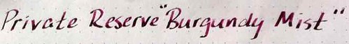
How I screwed up my first ink review — oh yeah, with a review of Private Reserve's "Burgundy Mist" ink thrown in!
This is my first ink review, so you'll have to cut me some slack. Perhaps you'll be more inclined to do so if you understand that tortured journey that brought me to this first review. If you don't care to read this part, skip to the heading "The Review" below.
The Struggle
About four months ago, I bemoaned the unhelpfulness of many ink reviews, due not to the inadequacies of the reviewers, but because of all the variables involved in performance. Really, all a review can do it tell you how the ink wrote in the particular pen(s), on the particular paper(s), with the particular nib(s) used in the review. On top of that, everything from writing pressure to humidity will cause variations even with a particular pen/paper/nib combination, and then you've got to wonder how closely the depiction on your monitor resembles the color of the ink when its right in front of you.
So, I set out to write the world's best ink review, even though I only started using fountain pens consistently last February. Such is my hubris, I suppose. I had grand plans of comparing entire color families in a single review, with the objective of helping readers choose the perfect gray, or perfect red, or perfect what not for their tastes.
I failed utterly.
Through the convenience of ink samples available through Pear Tree Pens and Goulet Pen Co., I started by comparing 6 different grays before settling on and purchasing a full bottle of my favorite. But I never got around to writing the review because all the sheets of writing I had in front of me at that time made the project too daunting.
So humbled, I set about trying to review one ink at a time, figuring I could at least design the perfect review format, with a consistent form that would provide readers with everything they needed to know about the ink. (There's that hubris again.) I'm sure there must be a name in the psychological literature for the symptoms I displayed in that difficult quest — but I believe the layman's term is that I "couldn't see the forest for the trees." I got so bogged down in minutiae (it is an exaggeration, but not a great one, to say that I was considering buying an anemometer, barometer and hygrometer so I could take wind speed, air pressure, and humidity into account) that I finally gave up.
Humbled yet again, I've decided to wing it with one or two good ideas that survive from my experience, and to refine my technique as I go. Why deprive my readers of my unenlightened ink commentary? I mean, they come here for my unenlightened commentary on everything else, so why should inks be excluded?
As a result of all that, Private Reserve Burgundy Mist became the subject of my first review merely because I got tired of trying to do it right with some other colors, got fed up, and posted this out of exasperation.
But enough about my personal problems. On with the show!
The Review
I like this ink. A lot.
I should write a little more.
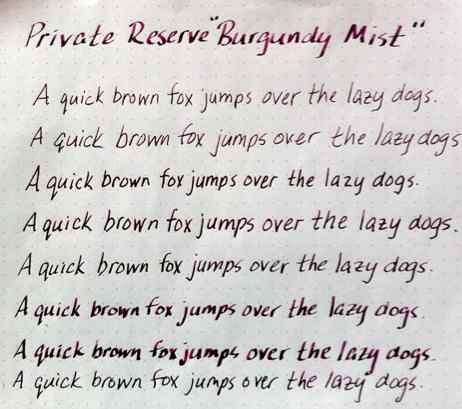
Like I said, I came up with at least one ink review idea that I think is pretty good. That is to show how
the ink looks from different nibs. So, I went online and ordered extra nibs for my Lamy Safari and Al-Star. Then I thought I'd also feature the ink in a "guest pen," i.e., something other than the Safari or AL-Star.
In the photo below, you can see the same line of text written in progressively broader nibs on the Safari, starting with XF on the top, on Rhodia Dot Pad paper:
 |
| Top to bottom: Lamy Safari with XF, F, M, B, 1.1 mm italic, 1.5 mm italic, and 1.9mm italic nibs; Cross Apogee F nib at bottom |
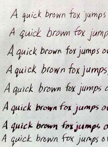 |
| Shading is most visible in the italic nibs |
Not much more help, is it?
I tried photographing the writing samples in flat outdoor light (both in and out of the shade on a cloudy day), next to a brightly lit window, even under a few different types of artificial light. None of the photos satisfactorily shows the differences in color and shading among the different nibs, but I ultimately used the photos taken next to a sunny window and applied the "enhance" function in iPhoto, which took me closest to the actual color of the ink. The best depiction of the shading is probably the enlargement at the beginning of this post.
Here, I've written next to some Burgundy Mist test squiggles in Visconti Burgundy with a Lamy Safari medium nib, and you can see that Private Reserve and Visconti have very different ideas of what "burgundy" is:
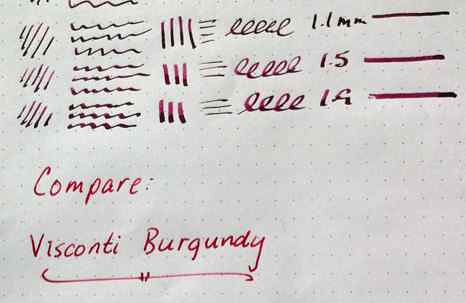 |
| Visconti Burgundy looks red compared to PR Burgundy Mist |
I wonder if they would see eye-to-eye on burgundy wines.
I didn't do extensive testing on flow, feathering, bleeding, etc. For one thing, these samples were written on a Rhodia Dot Pad, an insanely fountain pen-friendly medium, on which I don't expect any ink to bleed or feather. However, on less friendly papers the bleeding and feathering seemed modest, considering that my squared Moleskine bleeds inks so badly that I half expect it to cause a graphite pencil line to bleed through the paper.
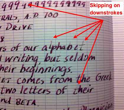 |
| I don't blame this skipping on the ink |
That, too, is a canvas especially friendly to fountain pens, but this is not the first ink I've had skip a lot in it. That, combined with the fact that the nib seemed a little loose, makes me think that the ink is not to blame here.
So, there you have it. These photo enlargements don't look too good. I'm going to see if I can get better resolution photos up, so if you liked the review but didn't like the photos, try checking back in a week or so.
Sunday, September 5, 2010
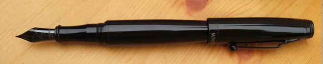
Pen in Black: Review of the Monteverde Invincia Stealth Fountain Pen

When I first ran across Monteverde's Invincia Stealth Fountain Pen online, I thought it looked really, really, cool. But not quite as cool as the Invincia Titanium. I kept coming back to the pictures at hisnibs.com, where you can see them side-by-side, and my eyes were drawn more and more to the
Stealth. I had just bought two rather expensive pens, so I didn't need to buy this. But I liked the look, the price suggested it better be a pretty good steel-nibbed pen, and so I eventually caved.
I purchased the pen from Norman Haase of hisnibs.com for $64, and the service was great.
First Impressions — and Lasting Ones
 First impressions out of the box (which was very nice, by the way): Black. Very, very black. Thick. Heavy. Big Nib. Very large nib. Huge nib. Also black. I like it! Overall, I like the look as much in person as I did in its pictures online. Maybe even a little more, even though it looks thicker "in person" than it does online.
That's important, because I bought this pen almost exclusively for its looks. I didn't even look very hard for any reviews. I'll have more to say about the cosmetics as I evaluate each part of the pen.
I think a few other folks must have been impressed, too. Goldspot Pens said that this is one of the Top 5 Pens of 2010 thus far.
Now, the most negative of my first impressions: posting the cap. Or, rather, the difficulty of posting the cap. I'll cover this in more detail in the "Cap & Barrel" section of the review below.
Style and Finish
 |
| The only parts of the pen with non-black finish |
I'm not sure I agree with the statement by Monteverde (repeated by almost every retailer, it seems) that its Invincia collection has "a surprising under the radar modern design." Even in an all-black finish, it hardly seems understated. Yes, the black finish makes it less flashy than many other pens, but the triple-layer lacquer finish is so glossy and the nib is so large that it's hard for me to agree that this design is "under the radar." Sure, put it in a dark room, and it's awfully hard to see:

But this pen is hardly "under the radar" in the sense that it won't get noticed. This pen screams "Look at me!" With a cigar-thick barrel, blindingly glossy finish, and a nib that can't be missed, this pen is not shy. In fact, it stands out even against many things I always thought were black, but apparently are not. Take a look at the Stealth against these so-called "black" items, and tell me you'll ever use the word "black"casually again:

The only downside I can see to the finish is that it is so uniform and glossy that nicks and scratches are likely to show more readily on this pen than on a pen with a patterned finish. This is a pen I will not transport unless I have it stored in a case, because I want to preserve that finish! (If you think you see any blemishes in these photos, however, it's probably just dust.)
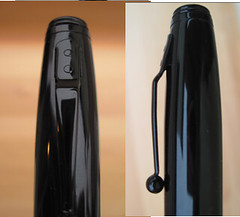 |
| Cap and clip detail |
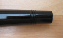 |
| Rings near end of barrel |
So, while some (including me) might say that the pen would have been stealthier with more rounded ends, a smoother barrel, a sleeker clip, and a matte black finish, this pen has plenty enough stealth feel to please me (and, as readers of my webbie review know, I like stealth looks). I don't mind the glossy finish on this pen at all. It's stealthy but glamorous. "Glam stealth," let's call it!
Nib/Feed/Converter
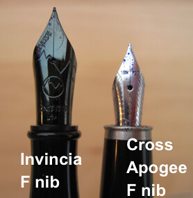 The nib is big. Really big . . . Did I mention that the nib is big?
I don't know if size has anything to do with performance (stop snickering) in this pen. I know it can't generally, because the nib on my Cross Apogee is tiny and writes quite nicely.
If the purpose of the nib size is to make a statement, then this nib succeeds. Nobody around the conference table is going to miss the fact that you're using a fountain pen when you pull this out. The size of the nib also makes it easy for you to see the detail in the engraving on the nib. You hardly have to squint! (Office Supply Geek has a great photo comparing the nib to an aircraft.)
A big nib means a lot more surface for ink to creep, but I noticed very little nib creep in any of the four or five inks I've tried in this pen. Maybe it was the inks, maybe it was the nib. Again, I don't know if this is due to any fine tuning Norman did to the nib or not.
The nib is also black, but not the same black as the rest of the pen. In fact, compared to the rest of the pen, the nib almost looks blue-black. But it nonetheless contributes to the stealth look of the pen.
A big nib also means a big feed. It took me quite a while to rinse clean when I changed inks, so if you dislike the ink changing process, I'd suggest you buy the Stealth only if you plan to keep the same ink in it all the time. (Understandably, I'm on the verge of making black the permanent ink in this pen.) On the plus side, the capacity in the feed should keep you writing for quite a while once the converter runs dry.
The converter . . . what do they make these things in anything but clear plastic? This one's green. Not a big deal, certainly, but I like to see the color of the ink in the converter.
The nib does affect the writing experience, not because of the nib's performance, but because of its size alone. I'll cover that in "Writing Experience" below.
Cap and Barrel
The barrel is thicker than I expected it to be, but that's fine. A lot of the attractiveness of the pen comes from the contrast between its thick barrel and much narrower section. I also like, as a matter of style, the way the section bows in, though it does make the section a little thinner than I'd like it to be.
This is my first pen with a threaded cap (I got this pen long before I got my Noodler's piston filler, but it's taken me a long time to get this review done), and I was a little worried about that, but it turned out not to be a problem. You wouldn't know it from looking at the threads, but it takes less than one full revolution of the cap to remove or replace it, so it's no big deal. In fact, I got used to this threaded cap in an afternoon, yet I've been using my Cross Apogee for more months and still can't get used to how tightly the friction fit cap fits.
The clip is functional, if not sleek. That big ball at the end of the clip is one reason for its functionality, so that look is growing on me.
The big negative - - the un-postable cap.
When I first got the pen, I could rarely post the cap securely. I asked Norman Haase if there is a trick to doing so, and he recommended a twisting action as I posted the cap. That worked . . . sometimes. But posting the cap was still very much a hit-or-miss proposition, and even on those occasions where I got it to post, it was a temporary success. The impact of setting the pen down, even gently, would invariably jar the cap loose. It would even come loose just from moving the pen in my hand. I was hoping that the fit of the cap just needed some working in, but it never got any better. I almost had to use trick photography to get this picture.
On to customer service . . .
So, I called YAFA customer service to exchange the pen. When I told them the problem was that the cap would not post, the service rep said something like, "Yeah, it doesn't post," as if that were the design of the pen! But it was clear that she meant they get that complaint a lot. She might have even said so outright, but it's been so long, I can't remember. (Office Supply Geek said in his review: "When posting the cap it, there is not a completely tight or locked in feel, but the weight of the cap and the depth at which it sinks onto the body leave you confident that it wont come off while you are writing." He must be one of the lucky few.)
Anyway, customer service told me to send in the pen and they would replace it with another. The rep even promised me she would test some out and try to pick one for me on which the cap posts fairly well. Excellent!
Turnaround was swift, I eagerly opened my new pen, and . . . the dang cap would not post. If anything, it was worse than my original one! I have to give customer service an A+ for responsiveness, but every picture you see of this pen on the web shows it with the cap posted, and that seems to be a mirage. I would have given some thought to buying another Invincia (like I said, the Titanium caught my eye), but the un-postable cap ruled that out for me, especially since reviewers of this pen and other Invincia models noticed the same problem, as did a lot of folks at The Fountain Pen Network.
Everybody makes mistakes, but this seems like such an glaring design flaw that it gives me pause about buying other Monteverde pens, too. (Joon says it has very few repair requests for Monteverde products, though.)
Writing Experience
The pen writes very smoothly with the several inks I've tried thus far. The fine nib seemed to be somewhat of a dry writer with some inks. The medium (which arrived on the replacement pen when I exchanged the original) lays down a nice wet line without getting sloppy. I prefer it over the fine nib because it gives a smoother writing experience.
I've not experienced skipping with any ink. There was, however, some initial hesitation in ink flow if the pen was left uncapped for a few minutes. I don't know how fair it is to expect anything different. Pens that start up instantly have proven to be the exception so far. (I have to do more reading about fountain pen ink flow; I'm a little hazy about that course in fluid mechanics I took 30 years ago.)
Monteverde describes the nib as "flexible steel," and it's plated with titanium. It doesn't feel particularly flexible to me, but it didn't feel like writing with a nail, ether. Norman writes at his site that the nib sizes on this pen ten to write a little smaller than the same size on most European pens. I'd say the fine nib on my Stealth writes somewhere between the fine nib on my Lamy AL-Star and the extra fine nib on my Lamy Safari.
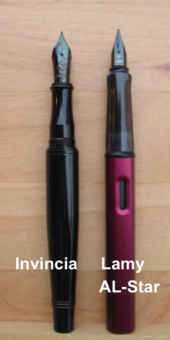
If you don't like a heavy pen, forget the Stealth. I don't know how it measures up against other metal-barreled pens, but it's certainly the heaviest in my collection: twice as heavy as my Lamy AL-Star, a third again as heavy as my Pilot Knight. Even uncapped, the Stealth is a third again as heavy as the AL-Star. Monteverde's website doesn't say what it's made of, but it simply feels much too heavy to be carbon fiber like the rest of the Invincia line appears to be. My guess is that it's brass.
The heaviness is a new experience for me. Still, I seemed to get used to it pretty quickly, at least unposted. With the cap posted (which is not easy — more about that later), the pen felt quite top-heavy.
Another thing that felt weird at first was the section. This is my first pen with a metal section, and I was wondering if that would make the pen either uncomfortable to hold (I'm still fighting my tight grip) or slippery. Neither proved to be an issue. If anything, the harder surface might unconsciously train me to relax my grip a little. The metal section might prove slippery if you're trying to use the pen outside on an August day in Orlando, but I live on the central coast of California, so the only times I sweat are when I'm nervous (a very rare occurrence) or working out (sadly, an even rarer occurrence). If anything, the difference I noted in the section from those in my other pens is that its concave shape made it seem a touch narrower than some of my other pens. That took more getting used to than the fact that it's metal.
There is one other thing about the design that I am still getting used to. I tend to hold most writing instruments very close to the tip. The size of the nib on the Stealth and the rings at the bottom of the section make it impossible to do so with this pen. If you are uncomfortable gripping your pen a little further away from the tip of the nib, the Stealth may not be for you. I'm getting used to it, but it makes writing with this pen different than writing with any of my other pens.
There is one other thing about the design that I am still getting used to. I tend to hold most writing instruments very close to the tip. The size of the nib on the Stealth and the rings at the bottom of the section make it impossible to do so with this pen. If you are uncomfortable gripping your pen a little further away from the tip of the nib, the Stealth may not be for you. I'm getting used to it, but it makes writing with this pen different than writing with any of my other pens.
Bottom Line
The Monteverde Invincia Stealth is a great pen for someone looking for their first pen that is past "entry level" in price and usually writes unposted. It writes well, is sharp looking — really, really sharp looking— and costs well under $100 ($80 retail, $64 at hisnibs.com and many other sites). Unless you're turned off by its cosmetics or are even more bothered than me by being unable to post the cap, I think you'll find it money well spent.
For some other reviews, see:
Office Supply Geek
sygyzy (Believe the Lie)
Thursday, September 2, 2010
J. Herbin Orange Indien and the conservative lawyer

Having tried it out, all I can say is: this is going to take some getting used to.
Let me explain why orange ink is a tough sell for me. First, I'm not about to use it in the office. Too flashy. Second, I'm not even likely to use it in correspondence. So, what's left?
Art. And believe me, I am no artist.
Which probably explains why I was less than overwhelmed by this ink. At first, anyway.
The most surprising thing about it is that it initially struck me as a dry-writing ink, unlike every other J. Herbin I've tried. It actually rendered by Lamy AL-Star extra fine nib scratchy on a Rhodia dot pad. Even in my wettest writer, the Pelikan P55 Future, the line was not what I'd call very wet.
The color didn't do anything for me, either. Like I said, I have no interest in an orange ink. I was, however, hoping at least to be wowed by the color. But even evaluated in the abstract rather than for utility, the color was a disappointment.
 |
| The lighting in this photo really doesn't give you a very good idea of the shading. |
But the second day, the ink flowed more readily. The line laid down was wetter, the color much richer. Maybe some water had been in the feeds when I inked the pens the day before. Whatever the reasons, the richer color on the second day really looked quite nice.
So, I won't rule this out for correspondence, after all. But it's still not likely to get much use around the office, except perhaps for marking up drafts.
I'll do full review some time in the future. If you're reading this, you've probably already read at least one review of Orange Indien, but in case you haven't, here are some you can check out:
Rhodia Drive
Office Supply Geek
Rants of the Archer
Passion du Jour
Seize the Dave (one of the best blog names evah)
Subscribe to:
Posts (Atom)


