A technophile lawyer rediscovers the joys of pen and paper

Monday, December 26, 2011

An unexpected Christmas pen!

In the spring of 2010, just as my pen addiction was kicking in, I was showing my wife's Uncle Bryan (whom I see only once every year or two) the extent of my collection. If I recall correctly, at the time I owned only two fountain pens: a charcoal gray Lamy Safari and a Pelikan P55 Future. Might have been a Lamy AL-Star in there, but I can't remember.

He was interested because he is an artist (pretty darn good, too), and he tried sketching with one or two of my pens.

Anyway, this year we got a Christmas package from Uncle Bryan, which included a cigar-shaped object wrapped in brown paper with a note to me that read, "I bought this pen about 30 years ago. Enjoy." Perhaps, I thought, it's a pen he experimented with in his art way back when he bought it.

So, I opened it, and . . . it's a Mont Blanc Meisterstuck 149. Whoa.


It's a little worse for wear -- there are stains on the star at the end of the cap, and there is a dimple in the resin of the cap. There's some brown residue at the base of the nib. But it otherwise looks like it just needs a little cleaning and buffing.


There is an "M" engraved in the star in the nib, which I presume means it's a medium. To my untrained eye and hand, the nib seems to be either a stub or cursive italic, with a slight right-foot oblique (or merely mis-aligned tines):


I'll be shipping this pen off to a restorer pronto, but I couldn't resist taking the nib for a spin first, so I dipped it in Noodler's Red-Black, and later filled it with Noodler's Purple Martin, and here's what I got on some Clairefontaine Triomphe:


Whatever it is, it's very broad and gushes like a fire hose. I did get some line variation, but maybe that's just misalignment of the tines. I took it to work today, and the first time I unscrewed the cap and gripped the pen to write with it, my fingers were covered, but the ink did not resemble Purple Martin. Instead, it was the color of the brown residue at the base of the nib.

I suppose I should get it restored to ship-shape condition and try it again before I decide whether I want a nibmeister to put a new grind on it it. Might make a good signature pen once the nib is adjusted. (I know, using it for signatures seems like a waste, but medium is about as wide as I go with everyday writers, and this writes much larger than a medium.)

While I'm eager to get it in shape, I hate parting with it so soon after receiving it. Perhaps there are a few more dips in store before I ship it off.

Thanks, Uncle Bryan!

UPDATE: Thanks for the link, Speedmaster!

Share/Save/Bookmark

Thursday, December 15, 2011

From GTD to ZTD

When I started this blog, I wanted to include posts about implementing David Allen's "Getting Things Done" system for managing tasks. I have tried that several times over the years, always running into obstacles but I thought, this time, for sure.

Something just wasn't gelling. So, I downloaded Leo Babauta's "Zen to Done" eBook. Best $10 I have spent in a long time.

In ZTD, Babauta goes through some of the reasons that GTD doesn't work for some people, and I found myself saying "Yes!" over and over again as I read through those issues. ZTD doesn't trash GTD. In fact, Babauta admires it and incorporates a lot of it, but at the same time offers suggested modifications — simplifications, really — that make GTD more user-friendly for people who have run into trouble implementing it.

At least, in theory. It remains to be seen whether I find it any more user-friendly in practice.

You can read Babauta's synopsis of ZTD at his blog.
Enhanced by Zemanta


Share/Save/Bookmark

Wednesday, December 14, 2011

A Levenger Paper Summary and Semi-Rant

I have a beef with Levenger. I don't write this post out of frustration, though. Not entirely, anyway. It's just that I've tried out quite a few Levenger papers, intending to review them all — and I will, eventually — but I thought it would be helpful for folks to see a summary of my experiences in one post. Think of it as a bunch of mini-reviews rolled up into a single post.

Levenger does a wonderful job of describing their paper products (all of their products, actually). A photograph of a paper tablet won't inspire desire in a lot of people, but the description of the paper's luxurious feel, fountain pen friendliness, and sturdy weight . . . well, that will get the hearts of me and a lot of my readers racing.

Levenger generally describes their various papers quite similarly in these regards, and while they all feel great and are indeed sturdy — I love how thick their papers are — they have proven to be incredibly inconsistent in performance and even appearance.

Generally, here's what I've found (with fountain pens only — I haven't tried other pens):

White Pads. Most nibs wrote smoothly, but the paper tend to absorb ink, resulting in severe bleedthrough and nibs tending to write broader lines than on other papers, but without the ink actually feathering much. As I wrote in my review (which, technically was of some discontinued pads that may differ from the current Freeleaf variety), for the limited uses I had for the pads, I could live with the bleedthrough, so that performance deficit was outweighed by the smooth writing experience.

Multicolored Freeleaf Pads and Multicolor Notebooks. Great, heavy paper. But I don't like writing on these at all. The paper is smooth, but performance otherwise varies a lot by the color of the paper. Sometimes, the paper repels the ink so much it looks like I've tried writing on wax paper; the ink doesn't so much skip as bead up and bubble.

Circa Paper. Horrible bleedthrough with a variety of inks when using fountain pens. (Not the Rhodia refills, of course).

Wired Notebook Full Page Ruled. This one is a standout. The white paper has great weight, smooth feel, great performance. No bleedthrough even with heavily saturated inks delivered through juicy nibs. This is awesome paper.

Desk Journal Refills. This is what I use for my journal (if you can call six entries in as many months a "journal"). I love it. Very heavy paper, no bleeding, no problem at all writing on both sides no matter what ink I use.

Notabilia Notebook. This probably has the most luxuriously smooth feel of the products I've mentioned in this post. It is a pleasure to write on, with great resistance to bleeding. So soft to the touch, but not up there with the R by Rhodia line.

In short: when its good, it's great; when its not great, it's pretty bad. There is very little in between. I am a very happy owner of some Levenger leather products and some pens, and I know Levenger is generally a stickler for quality control. So I just can't figure out why their paper is all over the place.


Share/Save/Bookmark

Monday, November 21, 2011

The Rhodia premium notepad winner is . . .

. . . IvanR, who happens to have a cool Flickr photostream if you're a pen-and-paper enthusiast. Congrats, Ivan.

Share/Save/Bookmark

Sunday, November 20, 2011

Raise your hand if you hate counterfeiters as much as I do

I bought a Chinese fountain pen on eBay recently. The pen is nice enough. It has a really unique look and writes smoothly. Not a bad pen at all for the price. I'll be reviewing it shortly.

But I am still unhappy with the transaction, because the package included an insert that featured a lot more pens for sale, all of which were knock-offs (the one I purchased was not). Bad enough that the pens copied others of far greater quality. But in this insert, the pens were not only look-alikes, they were actually labeled in the ad with the trademarks of well-known pen makers.

Now, neither I nor anyone who reads this blog regularly is going to think he's buying a real Mont Blanc or Pelikan for $25. Heck, no one who is not a pen-and-paper nut is going to think he's buying a real Pelikan or Mont Blanc for $25. But the whole idea of trying to pass off one's product as someone else's really ticks me off. It's one of the reasons I enjoy enforcing intellectual property rights as a lawyer so much.

I won't be buying from that seller again. I know my decision isn't exactly going to bring the seller to his knees. But I can't reward a counterfeiter with further business.

Am I the only one who reacts so viscerally to this?

Share/Save/Bookmark

Saturday, November 12, 2011

While we're on the subject of giveaways . . .

There's a huge one going on at I am the diva - Certified Zentangle Teacher (CZT®). The Diva is giving away three different packages of art supplies in celebration of her 200,000th hit. Congrats, Diva!

Zentangles appeal to me because, as I've mentioned before, I'm no artist, and zentangles are supposed to be achievable even for those without any real artistic talent. That's not a knock on zentangle artists, I'm merely repeating one of the selling features I've seen touted, such as this one from Zentangle, Inc.:
With Zentangle, anyone can create beautiful images from repetitive patterns. This method is easy to learn and easy to do. And even though it is a specified series of steps, it results in a creative expression that transcends its own rules.
They even use the trademark phrase, "Anything is possible ... one stroke at a time."

Like 99% of lawyers, I deal with a lot of stressful situations in my work. Creating zentangles is supposed to be a good activity for relieving stress. So, zentangles seem like the perfect pastime for someone like me: a pen-and-paper enthusiast whose profession doesn't allow me to use my pens and papers that much (so much of my work being done on the computer), who has no idea how to start writing prose, and who can't draw much beyond stick figures. About the only workout my stationery gets is letter-writing, notes in church, notes during the occasional meeting at work, and quick notes to my assistant.

I need a creative outlet! Since winning one of these packages might be a good way to get started as a zentangler zentanglist zentanglerator at creating zentangles, you can bet I am entering. (Update: I browsed around on The Diva's blog a little more, and it appears the correct term for a zentangle artist is "tangler.")

Share/Save/Bookmark

Review and Giveaway: No. 16 R by Rhodia Soft Touch Premium Notepad

The Review

Lovers of Rhodia pads must always be thinking, "What will they come up with next?" When the product seems perfect, it's hard to imagine improvements.

A few years ago, Rhodia managed to top itself when they came out with their Dot Pad. In my opinion, they've topped themselves yet again with the R by Rhodia line of premium "soft touch" notebooks.

The classic notebooks have 80 sheets of 80g, bright white paper with purple ruling (and a left margin line in the lined notebooks). R by Rhodia have 90g, very pale ivory paper with grayish ruling and no margin line. I'd like ruling that's a little less obtrusive, but I like the color combination in the premium notebook more than the classic line. I like the bright white paper of the classic line, but I've never been a fan of the purple ruling.

Clasic v R by Rhodia Premium
Left: the classic notebook - bright white 80g paper, purple ruling. Right: premium notebook - cream-colored, 90g paper
The 90g paper is thicker than the paper in the classic, so you get ten fewer sheets — 70 — in the premium notebook, making it just about the same thickness as the classic (pic).

I'll give you the short version on performance. Awesome. The paper is smoooooooth. I used some pens with wet-writing nibs to slather on some super-saturated inks: not even a hint of show-through, let alone bleeding. No feathering. So, then I swabbed on some Aurora Black, and the paper still didn't bleed, and the only reason the show-through was noticeable was because the paper puckered where the ink dried.


Some other reviewers seem to think that inks dry faster on the premium pad than on the classic or on Clairefontaine's 90g Triomphe stationery (which I use all the time), but I didn't get a chance to test it.

For me, there's more to a product than its performance. I like nice aesthetics. Give me a choice between a product that performs magnificently but is utilitarian in appearance and a product that performs not quite as well (but still very well) and is beautiful to behold, and I'll go with the beautiful product every time.

And this pad is beautiful. That might seem a bit strong for a notepad, but I see real beauty in this pad.

The beauty is in the cover. Rhodia orange it is (also comes in black), but it is not glossy like the classic Rhodia covers. Touching it is like touching velvet. How did they do that? The black inside of the cover is just as smooth. The cover is so nice, it would almost be a shame to put this pad in a pad holder and cover it up. Unlike the classic notebook, the cover of the premium line is orange outside, black inside.

Classic vs. R by Rhodia Premium
The "R" mark at bottom right is the most obvious thing setting sets the premium apart, but the cover is also less glossy


Classic vs. R by Rhodia Premium
Classic cover is same color inside and out; premium is orange outside, black inside


OK, that's it. I'm keeping this short because: (1) there have been so many good reviews of this pad already, and (2) I haven't posted in nearly four months, and it's going to take me awhile to get back in the swing of things (patience, please!). Some other reviews are at The Missive Maven (lots of pictures), Ink Nouveau (with video!), Gourmet Pens, and Spiritual Evolution of the Bean.


The Giveaway

Here's the part where you'll be glad you didn't unsubscribe from my RSS feed just because I hadn't posted in nearly four months.

This pad was sent to me gratis by Karen at Exaclair, and I'm really tempted to keep it, but one good turn deserves another, so I'm passing it on to one of my readers. To enter the giveaway: (1) leave a comment on this post, AND (2) send me an email with the subject line RHODIA PREMIUM at notebookeresq@gmail.com, telling me the name you used to comment. You must do BOTH (1) and (2) to be entered in the giveaway. I will allow new entries through 11 p.m. Pacific time on Thursday, November 17.

Good luck!

(UPDATE: In case any of you are wondering, I did not write "Iroshizuku something-or-other" in my test of the paper to make fun of the ink's Japanese name. I honestly don't know which blue that is, I only know it's an Iroshizuku ink.)


Share/Save/Bookmark

Thursday, July 21, 2011

Dot Grid Webbie Winner . . .

The winner of the dot grid webbie is . . .  Shangchin.


See how easy that was? In fact Shangching could have won even if the comment merely said: "--".  The content of the comment does not matter. You don't have to butter me up -- in fact, you can tell me I'm crazy, if you like -- the winner is completely up to the random number generator at random.org.

I'll be hosting another giveaway in a week or two. Keep checking back!


Share/Save/Bookmark

Wednesday, July 20, 2011

My pen-less vacation

Well, "vacation" is probably an exaggeration. But I stretched last weekend into four days spent with family about 500 miles away.

I had grand plans of relaxing with some pens, paper and new ink samples. My wife drove up ahead of me, and I made sure to send the ink samples with her so I wouldn't risk having them confiscated at the airport security checkpoint when I flew up later in the week. I made sure I had some completely empty pens to take with me on the plane. I packed stationery and notebooks.

I didn't use any of them while I was there. But I did get some peace and quiet, which is probably what I was planning on with the pen and paper. I played two rounds of golf with my brothers in surroundings that were beautiful and very, very peaceful.

Now, I have to brag to the golfers out there. I hadn't played in two years. Yet, on the first day, I was putting for eagle on no. 18 (missed, but sunk the birdie putt), and the second day I had the game of my life off the tee. I must have hit 10 fairways. My scores? No idea. I didn't keep score (but I do know that I was a combined one over par on the top four handicaps on the second day).

All that excitement, you might think I forgot about the pens. No, I remembered they were there. There just wasn't enough down time to get to them.

Share/Save/Bookmark

Friday, July 15, 2011

I hate to admit it, but digital is making a comeback

I remember a partner at one of the big firms I was at in the 90s. She reminisced about how much nicer it was to practice law in the 70s, before opposing counsel could send nasty demands via email and fax, demanding immediate responses. She thought it was bad in the 90s? It's much worse now. The flow of information for a modern lawyer is torrential.


So, recently my paper calendar succumbed to digital. I've migrated my calendar from paper to iCal, making it accessible from any computer, my iPhone, and my iPad. Carrying my phone or the slim iPad is easier than the bulky Circa notebook I was using for my calendar, and it is much easier to check my calendar.


I still think analog management of my projects makes sense. I work so much more effectively from a piece of paper than a screen. But finding things and keeping everything straight? Well, digital has its advantages. I'm hoping to stay with analog tracking, then maybe electronically archiving my projects so they are searchable later
But I've also been dabbling with Microsoft OneNote and Remember the Milk again lately. I'll probably end up tasks tracked digitally but reference material stored on paper.

This is all a work in progress. I figure I'll get the perfect system in place about 5 minutes before I die.

Share/Save/Bookmark

Thursday, July 14, 2011

Review (and Giveaway!): Rhodia Large Dot Grid Webnotebook (Update - Giveaway entries are closed)

Large Rhodia Dot Grid WebnotebookThanks to the generosity of Karen at Exaclair, I was able to take a Rhodia Large (A5 size) Dot Grid Webnotebook for a spin recently. And, I am forwarding Karen's generosity on to one of my readers by giving this puppy away! Details on the giveaway at the end of the post.

There's been a lot of excitement about the dot grid "webbie" after the runaway success of the original webbie and the Rhodia Dot Pad. The Dot Grid Webnotebook is a combination of the best of both worlds.


The Review
 The heart of any notebook is its paper and, as you'd expect, the paper in this notebook does not disappoint. Silky smooth, as always (too smooth for some people), and wonderful for fountain pens. Even with heavily saturated inks, you have to really let you pen nib linger before you'll see any bleedthrough. Only the darkest inks show through to any noticeable degree. And feathering? Fuggedaboutit. All this means the paper also has the same drawback you're used to: slow drying times. If you insist on using a fountain pen, this is not a good notebook for on-the-go writing, because closing the notebook too soon after you've written in it is going to result in lots of ink transfer to the opposite page . . . unless you use a sheet of blotting paper for a bookmark.

Dot Grid Webbie Writing Sample
Great ink handling at the price of slow drying time. Note the dot grid ruling.


So, tell you something you don't already know, right? OK, let's start with the purely subjective stuff.

I gotta say I liked the orange cover a lot more than I thought I would. It looked much too loud to me when I saw it on the website, but when I opened the package from Karen, I said, "Cool!" For me, the color would be quite practical if it was to make this my work notebook. That orange really stands out on a messy desk! Like the black webbie (version 1, anyway), the end papers, ribbon bookmark, and elastic closure all match the cover, so there's an awful lot of orange. Not sure you'll like it? I say try it!

As much as I like the orange cover, I'm not as thrilled by the ivory paper. It looks way too yellow to me, but that seems to be an effect of all the orange around it. When I placed this notebook side-by-side with my first generation webbie, it looked like the paper colors were identical.

Webbier Paper Comparisons
Old ivory and new ivory appear identical side-by-side, but can look different based on cover color.

The dot spacing, like the grid lines on Rhodia graph pads, is 5mm, so it's very easy to adapt to if you're used to the pads. This is a very frustrating spacing for me and my writing style — too large for me to write every other line, too small to write every line — but that's just me. The dot grid is for more than just writing, anyway. The unobtrusive dot pattern provides just enough guidance for spacing drawings, diagrams, or doodles without getting in the way.  (Does one ever need precise doodle spacing? That's taking OCD to the next level!) I don't draw much, though. My notebooks are full of boring text.

The notebook has the standard back pocket, but the gussets on this one appear exceptionally sturdy. Same soft leatherette cover, same embossed Rhodia logo on the cover, as the old webbie.

One surprise is that this webbie did not lie particularly flat, because that was supposed to be an improvement over the first generation. When I looked at the picture I took, though (I'm finishing this post away from home and the webbie), it appears I did not have the binding flat on the table, so who knows how flat this thing lies. All I know is that it will break in, as even my old webbie lies pretty flat.

Overall, a great notebook!

The Giveaway

To enter, do BOTH of the following:

1. Leave a comment on this post, AND;

2. Email me at notebookeresqATgmail.com. Your email must give the name you used for commenting and the subject line must read EXACTLY:

WEBBIE

I do it this way to be sure I can contact the winners and so I can set up an email filter to group all entries as they come in. I will keep the giveaway open through at least midnight Pacific time on Tuesday, July 19.

The winner will be selected using the random number generator at random.org.

Good luck!


Share/Save/Bookmark

Monday, July 4, 2011

A very TWSBI Fourth of July

OK, so the top one isn't actually white, but this is as close to red, white and blue as I could get with my pens — my three TWSBI Diamond 530s in red, clear, and blue:


To those of you wondering about using pens from Taiwan to commemorate American Independence Day, let me point out that fireworks were invented by the Chinese!

Happy fourth, everyone!

A Fourth of July fireworks display at the Wash...Image via Wikipedia
Enhanced by Zemanta


Share/Save/Bookmark

Sunday, July 3, 2011

Fountain pen nibs as apparel?

Honest.


Pen Nib Dress from John Nussey on Vimeo.

Thanks to Geeks are Sexy, which explains the movement of the nibs.

Share/Save/Bookmark

Friday, July 1, 2011

Quo Vadis Habana Winners

Quo Vadis Habana Notebook v. 2.0 - rear pocketCongratulations to Economy Pens and Carmen, winners of the large and small Quo Vadis Habana notebooks, respectively. Look for another notebook giveaway after the fourth of July!

Share/Save/Bookmark

My vanishing Pilot Vanishing Point

That is not a typo in the title of this post.

I refer to my "vanishing" Pilot Vanishing Point because (1) at the moment, I can't find it (unfortunately, my relatively newfound fastidiousness has slipped a bit lot of late); and (2) it is vanishing . . . from my collection; I'm about to sell it. Point 1 will take care of itself in time. Let's concentrate on point 2, and figure out why I am putting this pen up for sale on eBay or Fountain Pen Network.

There's nothing really wrong with this pen, but I think I bought it for the wrong reasons.

What sold me on it was the clickable nib. I thought it would be convenient because even though I do almost all my work on a computer, I probably pick up my pen between 50 and 100 times a day between notes to my assistant and keeping my timesheet.

Aside from the click nib, there was nothing else calling out to me from this pen. I don't find it particularly beautiful. In fact, I find it somewhat ungainly; with that clicker on the end, it just doesn't look right. The nib doesn't write as smoothly as some of my other pens. In short, it didn't hit any of my hot buttons. It seemed to have so many devotees on FPN, though, that I figured I'd grow to love it.

A clickable fountain pen nib?
What will they think of next?
I've had it two months, and I remain very "meh" about it. It writes great, and unlike some, I haven't found the placement of the clip to present any problems for my grip on the pen. And the click nib is not only functional and convenient for the reasons I mentioned above, it has a sort of geeky wow! factor to it. (When I first saw a VP last year, I thought to myself, what will they come up with next? Then I learned the pen has been around for more than 40 years.)

But I'm never drawn to pick up this pen, except to try it "one more time" to figure out what I don't like about it. I have to keep forcing myself to use it. I shouldn't feel that way about a pen that retails for $160. I'm sticking to my hot buttons from here on out.

So, it's going up for sale. When I get it posted on FPN or eBay, I'll update this post with the link, so keep checking back if you're interested in it. (I figure to price it around $110.)

UPDATE: (1) Found it! (I'd left it with my notebook-loving colleague to try for a few days.) (2) The sale listing is up on FPN. $110 with box and converter, includes shipping to USA address.

Share/Save/Bookmark

Monday, June 27, 2011

Don't throw away that old pen yet! (Corrected. Again.)

Make sure you take a picture of it first. Australian stationer NoteMaker is sponsoring a "Pen Amnesty" through June 30 July 30 July 15. Send them a picture of your old, beat up pen and get your choice of a free Delfonics ballpoint or a voucher for 25% off your next pen from NoteMaker, plus a free Rhodia notepad with your next order.

But, Booker, NoteMaker is in Australia. Aren't those deals usually only good for Aussies? That was my first thought, too, but this particular deal is good for individuals worldwide (workplace entries are limited to Australia and New Zealand).

Don't take my word for it. (Seriously, don't take my word for it. I could be screwing this up.) Instead, read the full terms and conditions, then go to the photo upload page to invoke amnesty.


Share/Save/Bookmark

Thursday, June 23, 2011

Review (and Giveaway!): Large Quo Vadis Habana Lined Notebook

Quo Vadis Habana Notebook v. 2.0UPDATE: Giveaway Entries are Closed. Winners will be posted and contacted on June 30.

This is "version 2.0" of the Habana that I reviewed here. All the great quality remains, but fans of the old Habana need to be aware of changes in the color, ruling, and weight of the paper.

Instructions for entering the giveaway are at the end of this post, and there's even a consolation prize!

The Review

The old and new versions both have 80 sheets of Clairefontaine's legendary paper. As always, it is silky smooth to the touch and a dream to write on. So smooth, in fact, that I've read complaints from some Fountain Pen Network members that the paper is too smooth and makes them lose control of their pen! I love the smooth writing feel, but there is a price to pay for it: ink drying times tend to be slow. If you write with a fountain pen, you're going to wind up with lots of ink transfer to the opposite page unless you give time for the ink to dry (which could be 30 seconds or more, depending on the ink and nib combination) before closing the notebook or you use a sheet of blotting paper as a bookmark.

But the paper is otherwise quite different from the original version of the Habana:


Original U.S. Version
New Version 
(reviewed in this post)
Paper Weight
90 gsm
85 gsm
Paper Color
bright white
ivory
Ruling width
8 mm
5.5 mm
Lines per page
26
40
Distance from top of page to first rule
24 mm
9 mm
Distance from bottom of page to last rule
14 mm
9 mm
Rules
light gray solid lines
light gray dotted lines


Unfortunately, none of my photos accurately captured the color of the pages. The closest would probably be this one. When you see "ivory," you shouldn't confuse it with "off-white." I've seen this paper described as "off-white," but the paper is far darker than that. From what I can tell, it is about the same color as the paper in my Rhodia webnotebook.

The 5.5 mm ruling is very narrow. People who typically write with finer points and tend to write small anyway will love it. But if you like to write big and bold, this notebook probably only makes sense for you if you're going to write on every other line. Large writing would bunch lines much too closely to read comfortably. Fans of the old ruled Habana are going to have a hard time adjusting to this one.

Quo Vadis Habana Notebook v. 2.0 - ruling comparison
What a difference in ruling! Old version on left, new version on right.
Top-most group of lines on rights is same as number of lines on left.
Provided you use every line, the new ruling is going to save you money over the older version. By narrowing the ruling and leaving less blank space above and below the ruling at the top and bottom of the page, each page now has 40 lines for writing instead of the 26 on the previous version. That's more than 50% more lines on the same size page, or the equivalent of adding 40 sheets to the notebook!

Another nice plus to the changes is that between the color of the paper and the dotted lines, the the light gray dotted rules are virtually unnoticeable on the written page. There's just enough there to guide your writing as you go, and it is almost invisible once you've written on it.

Another change in the ruling is that unlike the older version, the ruling does not extend the entire width of the page from the binding to the edge. Instead, there is a border of "white space" a few mm wide at both the binding and page edge.

The paper in this generation of Habana is a slightly lighter weight than in the first generation U.S. version. This apparently was a compromise between the weight in the U.S. version and non-U.S. version of the first generation Habana so that a single version of the second-generation Habana could ship everywhere.

The lighter weight is not really noticeable to the touch, nor does it result in a noticeably thinner notebook, but the lighter paper did allow some ever-so-slight and occasional bleed-through with two of the fountain pen inks I tried. Show-through actually seemed about the same or slightly better on the lighter ivory paper than on the heavier white paper of the first generation, probably on account of the color. Needle-point pens seemed to leave a significantly deeper impression in the lighter paper (though I can't guarantee I wrote with the same pressure in both versions, so this observation may be a result of writing with different pressure in each notebook). A light touch may be needed with those pens to keep from introducing too much texture to the reverse side of the page. There was no noticeable feathering with any of the fountain pen, gel, or rollerball inks I tried.

Quo Vadis Habana Notebook v. 2.0 - rear pocket
Sturdy, fabric-like gusset on the large
back pocket suggests durability
Other than changes in available colors, everything else about the Habana seems pretty much the same as the original. The cover is still a "hard flexible" cover that's firm enough for writing when away from your desk but has some give that might let you stuff it in a bag that has no room for a stiffer cover. The cloth bookmark is still there, as is the back pocket, complete with the fabric-like gussets that suggest to me that this pocket can put up with heavier use than most.

Which is a good thing, because this pocket will see more use if I use a Habana for work. Because the dimensions of the large Habana (6.25 in x 9.25 in.) are larger than the typical A5-sized notebook, it will accommodate a letter-size sheet folded in half, which the pockets of A5-size notebooks simply can't.

Quo Vadis Habana Notebook v. 2.0 - size comparison - 3 views
Three views comparing the large Habana to a typical "large" notebook. The smaller notebook I used here, however, is about 1/4 inch narrower (when closed) than a large Moleskine.
As usual, you can view more photos at my Flickr photo set for this review.

The Giveaway

Quo Vadis Habana Notebook v. 2.0 - rear pocket
Left: New version large Habana. Right: Old version pocket Habana.
I was tempted to keep this as my work notebook, but seeing as how Karen art Exaclair supplied the Habana gratis, I thought it more appropriate to spread the love and give it away.  And, to the runner-up, I will give a small first-generation black Habana with blank pages. I believe the small Habana has 64gsm paper, but I'm not sure. (I bought it long ago and failed to review it.) Both the large and small Habanas will have a page of my test writing in them, but they are otherwise mint.

To enter, do BOTH of the following:

1. Leave a comment on this post, AND;

2. Email me at notebookeresqATgmail.com. Your email must give the name you used for commenting and the subject line must read EXACTLY:

HABANA

I do it this way to be sure I can contact the winners and so I can set up an email filter to group all entries as they come in. I will keep the giveaway open through at least midnight Pacific time on Tuesday, June 27.

The winner will be selected using the random number generator at random.org.

Good luck!

Share/Save/Bookmark

Thursday, June 16, 2011

Review: Cross Autocross Double Brown Pebbled Leather Pen Case

Cross Autocross Pebbled Leather Double Pen Case
What the heck am I doing reviewing another product that is no longer in the manufacturer's line-up? Some people might call it procrastination; I prefer to think of it as letting the ideas for the review percolate in my head until they are ready for publication. In any event, I don't think the delay makes much difference in this instance. I bought this case through Amazon in Spring of 2010, and I'm pretty sure that even then it was no longer available through Cross. But you can still find these from time to time if you look around, so I figured I'd do the review before these disappear completely. (Some tips and links for finding them later in this post.)

Anyway, on to the review.

This case appealed to me because it seems relatively unique and an improvement over the typical pen case. Most of the cases I'd run across seemed to have the leather flap that goes over the tops of the pens and then gets tucked under a strap to stay in place. Those cases typically have the pen sleeves visible, almost like the leather had been shrink-wrapped around the pens. You know the ones I'm talking about. (If not, click here for an example.) No offense to anyone that has or sells cases like those, but I find them terribly ugly, and they make me think of cigars more than they make me think of pens. Also, it seems like it would be a pain to thread that leather flap through the strap.

This case, as you can see, has a nice, smooth exterior (i.e., no visible pen sleeves) and a convenient snap closure. The holes in the leather, which cover the inner flap and most of the back, make me think of racing gloves or the leather on a steering wheel in an expensive sports car.

Everything about this design says "sleek" and "fast" to me. Honestly, it gives me a little thrill every time I pull it out of my breast pocket. While it is certainly handsome and likely to get a reaction around a conference table crowded with Bic Stic users, the thrill I get is not from impressing others (I've sworn off pen snobbery, remember?), but from . . . well, it's a really cool pen accessory! Isn't that enough? (Besides, you'll only impress some people; the rest will think you're eccentric for even carrying your pens in a case, and they'll think you're absolutely insane when they find out what they cost. Or they'll just think you're trying to show off.)

Cross Autocross Pebbled Leather Double Pen Case
Levenger Golden Tortoise True Writer and Waterman Expert in the case
There is plenty of function to go with this case's style. The snap closure makes for very fast opening and closing. Only one snap shows when the case is closed. At first, I thought that gave the case a somewhat off-balance look, but it serves a purpose: with the case closed, you still know "which way is up" — the nibs are at the same end of the case as the snap, so it's easy to know that you are placing the pens in your pocket nibs up. There is a flap  that covers the top of the pens to keep them from sliding out. Curiously, almost none of the stock marketing photos I've seen for this case show the flap going over the pens.

Though you wouldn't know it from these pictures, the sleeves are quite tight when the case is new, making it difficult to remove and put away your pens. I try to put only threaded-cap pens in it, because the fit is so snug (even on slim pens) that it's easy to pull a snap-cap off when trying to remove the pen. I imagine the pockets will stretch out over time and be more snap-cap friendly, but I doubt they will ever get so loose that your pens are in danger of scraping against each other.

Presentation is a mixed bag.  The hinged box with elastic strap is utilitarian but lacking elegance. Yet, open the box and you find the case inside a satin-like fabric sleeve, a touch you'd expect to find in a fancier gift box.

Cross Autocross Pebbled Leather Double Pen Case
Presentation: nicer on the inside than the outside

My only beef about the case is that the leather seems to wear rather quickly. I know bright shiny leather never stays that way (at least, not without a lot of tender loving care), but I am already seeing some significant cracking, and I don't think I've had this case out of the box more than half a dozen times. (I only use it when I'm wearing a suit.)

Cross Autocross Pebbled Leather Double Pen Case
Close-ups of leather wear
This is quite a handsome and functional case. I paid only $25 for it new through a seller on Amazon, which I consider to be quite a deal, but I typically see it listed for $35-$40. Amazon had one of these left in "red" (burgundy), one in silver, a single-pen version and a 3-pen version. (It appears the 3-pen version only has loops inside, rather than sleeves.) Try this Google search, and you'll find eBay listings, too. Or, you could just go with Cross's current line-up, in which the cases are not quite as sleek as this one but still feature the holes (I know there's got to be a better name for that race-car leather look) and an easier closing mechanism than most other cases (magnetic flap rather than a tuck-in flap).

As usual, more pictures at the Flickr photo set for this review.

Share/Save/Bookmark

Tuesday, June 7, 2011

The June Carnival of Pen, Pencil and Paper

All these posts can make a person dizzy! (Photo courtesy of publicdomainpictures.net)
Welcome to the June 7, 2011 edition of the Carnival of Pen, Pencil and Paper. I'm both excited and embarrassed to be hosting this month. Excited because, well, it the Carnival, which means lots of cool posts and probably means higher traffic than usual for me. Embarrassed because all that traffic is going to hit after several months of very little posting here. Nonetheless, feel free to poke around while you're here. Let's hope this kick-starts my posting motor.

And, we're off!

editor's picks

Science or art? 

Two regular ink reviewers consistently put an unusual amount of artistry into their reviews, and this month is no exception: David Garrett presents ink review - sailor jentle blue black posted at seize the dave, the best-named blog on the net! Clement Dionglay presents Ink Review: J. Herbin Diabolo Menthe at Rants of the Archer.

Do-it-Yourself:

DIY enthusiasts will enjoy Nrepose's write-up of the Noodler's Friction Fit Pen at Unposted. (Not quite a Noodler's pen, but you'll understand the name of the post soon enough.) And, take a moment to get in on the ground floor of Alex Witte's Nib Grinding Project on $3 Pilot Varsity pens at Economy Pens.

Decisions, decisions:

Most people wouldn't call this a brain-teaser, but we're not most people, are we? Snarky's Machine challenges us to choose favorites in Desert Island Pens: Which 10 Pens Would You Take? at Does this Pen Write? That might have some of us thinking for a few hours . . . or maybe days. Whatever you choose, don't forget the paper. That tree bark will wear your pens down something awful.

Ink. It's not just for pens anymore:

Ink Nouveau guest blogger Jamie Williams Grossman explains that the artistic use of ink isn't limited to pens in Beyond the Pen: Fountain Pen Ink as Watercolor Wash, while Ink Nouveau's founder Brian Goulet goes his guest blogger one better, skipping the pen and the brush altogether and taking the ink straight to the water: Ink in Water Pictures at Ink Nouveau.  (I share Brian's fascination with this, especially when the ink looks like an entirely different color outside the pen than it looks when flowing from the pen.)


penmanship

Whodaman presents 4 Steps to Improving Your Handwriting - However Bad it is posted at Smarter to Smartest.

Cheryl from Writer's Bloc presents Do I need a left-handed nib on my fountain pen if I’m a left-handed writer? at the Writer's Bloc Blog.

notebooks, paper, and journaling


Moleskine Releases New Cahier Planners for 2012 posted at Journaling Arts.

Dolly once again offers help for the journalist struck with writer's block, with Journal Writing Prompt #21 — Right Now at Journal Addict.

Father's Day is coming, and Nole has some card suggestions for you in Father's Day Card Round-Up and Father's Day Card Round-Up, Part 2 at Oh So Beautiful Paper.

Last week, yours truly introduced you to Unquestionably the coolest notebook I've ever seen, right here at Note Booker, Esq.

office supplies

Nrepose presents The Classroom Friendly Pencil Sharpener at Unposted.

ink and art

Oh, how I envy artists!

Inkophile helpfully leads us to several examples of pen art in Links to Artists Who Put Pens to Good Use at An Inkophile's Blog.

Carnival founder Nifty shows us a recent favorite piece in Moleskine Monday: “Weekly Moleskine” at Notebook Stories.

AK lets us in on the Inside: A Ukranian Sketchbook at Notebook Loves Pen (next month's Carnival host).

The Trone presents Trone Art posted at The Trone blog, saying, "My own art! Only five pieces now but I have many others that I will post on a regular basis (daily or bi-daily). I hope you enjoy and browse my blog!"

You might think that carving up a Moleskine with a razor blade should be punishable by prison time, but you'll probably change your mind when you read The Book Surgeon at Moleskinerie.

Heather at A Penchant for Paper provides some interesting Art Journal Prompts, Part 1.

ink reviews

Peninkcillin presents Noodler's Burma Road Brown (V-Mail) Ink Review at Peninkcillin.

The Classicist reviews Waterman Black at Penned House.

pencils


M. Meckel wonders if yesteryear's factory seconds are better than some of the cheap pencils that pass quality control today, in Seconds at Bleistift.

Thinking pencils? That's what Palimpsest writes about in Brainstorming with Pencils at Palimpsest

pens


Multi-pens, anyone? Diane B presents Uni-ball Jetstream 3 Color Multi-Pen posted at Pocket Blonde, and Yochanan introduces his new blog, Multi Pen Dimensions, with Why multi pens? Welcom aboard, Yochanan!

Here's a "two-fer" from Alex Witte at Economy PensZebra AR7 Blue and Kaweco Sport Classic.


Millie presents Product review: a new Lamy and a new ink posted at Planet Millie, saying, "The new aquamarine Lamy and a review of Caran d'Ache Caribbean Sea ink. It's all very aquamarine!"

Maria Fallas presents Moleskine Rollerball Pen posted at Pen and Paper Hoarder, another very young blog.

Julie (O-kami) presents Edison Pearl at Whatever.

Some of us are constantly on the quest for the "perfect" pen. Dowdyism reminds us that sometimes the search involves more than shopping, with Pen Hack: Zebra Sarasa Clip to Pilot Hi-Tec-C Cavalier at The Pen Addict.

miscellaneous

Julie at Peaceable Writer presents more samples of her too many inks in Writing Down the Ink #6. I'm having a little cognitive dissonance trying to process the concept of "too many inks." Who knew that was possible?

Another year, another National Stationery Show missed. Rats! But Office Supply Geek was there, and brings us his 2011 National Stationery Show Highlights.


next month

That concludes this edition. Next month's carnival will be hosted by Notebook Loves Pen.

Submit your blog articles for the next edition of carnival of pen, pencil and paper using the carnival submission form. Past posts and future hosts can be found at the blog carnival index page, and you can read about the Carnival's origins at Notebook Stories.

Don't be strangers!


Share/Save/Bookmark

Wednesday, June 1, 2011

Unquestionably the coolest notebook I've ever seen

Cool Indian Notebook - Close-Up
Close-up: top right of cover
Granted, I've only got about 18 months of the notebook bug under my belt, so I've seen a lot fewer notebooks in my time than Nifty has. But I find the coolness factor of this notebook is off the charts.

I bought it at Flax in L.A. last month. Joan, the proprietor at Flax, said once the salesman showed then to her she bought all they had —and she only had 5 left when I bought this one.

The notebook is from India and appears handmade. Joan didn't know what language that is on the cover, and I don't, either. Hindi? Punjabi? Bengali?

Let's start with the cover: part leather, part canvas, with a rough-hewn interface between the two and around the edges.
Cool Indian Notebook - Front and Back
Front and back views
The pages are heavily textured, and likewise finished roughly around the edges, and it has a very narrow leather bookmark. It seems like this notebook should be used only for important things. Forget about daily to-do lists. That just wouldn't seem right.

Cool Indian Notebook - Edge Views


Everything about this notebook — the rough edges of the paper, it's texture, the materials (the cover is part leather and part canvas, the bookmark is leather), the stamp and writing on the cover — screams "Old World." Sitting down with it, I feel like a British Lieutenant leading an expedition or manning a remote outpost in colonial India or South Africa, keeping my log in this notebook, writing in the heat as I sweat under my heavy red tunic.

But, that's just me.

Share/Save/Bookmark

Wednesday, May 11, 2011

Booker wants you for the June Carnival of Pen, Pencil & Paper!

Public domain photo courtesy of PDphoto.com
Yours truly will host next month's Carnival of Pen, Pencil and Paper on June 7. You can't win any stuffed animals at this carnival, but it will be lots of fun for my regular readers and anyone else that cares about what they write with! In the words of carnival founder Nifty of Notebook Stories, the carnival is a "traveling monthly collection of the best blog posts about notebooks, pens, pencils, paper products and anything else deemed relevant by the editors."

If you're unfamiliar with the carnival, you can check out the current edition of the Carnival at Economy Pens or go here and click on the "past posts" tab of the widget for links to all of the past carnivals.

Please use this form to submit posts for the Carnival (link repeated in the final line of this post); do not email me directly. Submit as many posts as you like, and there's no rule against submitting your own. (I won't tell.) I'll do my best to include all but spam submissions, but I can't promise everything will make it in.

I know it's only May 11, but there haven't been many submissions so far, and I'm starting to worry a little. So get crackin', everyone! Make me look good.

Is there anything in it for you? Not really, unless you submit one of your own posts. And you'll have a warm, fuzzy feeling knowing that someone will see your submission that might otherwise have missed it.

Submit posts at this link

Share/Save/Bookmark

Friday, April 29, 2011

What's better than getting a bunch of ink samples in the mail?

Ink TenpinsGetting a bunch of full bottles of ink, that's what! I think this order from Goulet Pens just about doubled my ink collection so far.

The reason for ordering so much ink at once? I decided I needed some dark inks for my new Visconti Homo Sapiens. I had some dark ink samples, but I wasn't able to fill the pen from any of the sample vials because the nib is too large to submerge. So, I tried out some of the inks in other pens, then bought eight colors that I thought fit the personality of the Homo Sapiens (though I'll certainly use them with other pens, too)..

Four of those colors are purples: Diamine Damson, Noodler's Purple Martin, Noodler's Nightshade, and Private Reserve Ebony Purple. Why four shades of purple? Because you never know what purple you're going to need. That's just common sense!


But I also got two deep greens — Private Reserve Ebony Green and J. Herbin Vert Empire — and Noodler'sRed-Black, which is what the Visconti is currently inked with, and which looks great flowing out of the pen. The J. Herbin Cacao du Brésil is an interesting color because it's hard to categorize.


I rounded out the order with J. Herbin Rouge Hematite and Noodler's Bad Belted Kingfisher. The former is not only a good ink, it has one of the coolest bottle designs ever (special because it is the 340th anniversary ink - see the middle bottle in the top photo). And Bad Belted Kingfisher, besides having a bitchin' name, is a great blue-black and replaces my old bottle, which I lost in an "ink incident" that is still evidenced by stains in the caulk near the sink.


By buying ten bottles, I got a 10% discount, to boot!

ALL SWABS COURTESY OF THE GOULET PENS SWAB SHOP.

Share/Save/Bookmark

Monday, April 25, 2011

Review: Cross Apogee Fine-Nibbed Fountain Pen with Frosty Steel Finish

An "apogee" is the point of orbit of a heavenly body in which it is furthest away from the center of the object around which it is orbiting. So, I take it Cross intended the name of this pen to mean a pen that has reached the highest standards.

I'd say that's about right in this case. I like almost everything about this pen. Pens being so personal, of course, I found a thing or two I don't particularly like, but my complaints are mere quibbles.

Cross Apogee - What color is Frosty Steel?
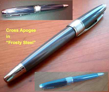
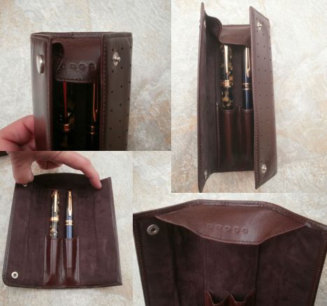
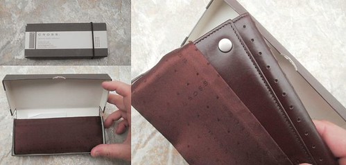
I could not capture the true color of this pen. See the Flickr photo
set at the end of the post for some better pictures.


First Impressions

Usually, I have this "first impressions" section because the pen I'm reviewing was ordered online and I haven't seen it up close before. This pen is an exception, because I saw and tried the pen at Flax in L.A. before buying it there. A first impression at Flax is a little different than a first impression opening a package at home, because Flax does such a beautiful job of presentation. It looks like you're viewing jewelry in the display cases . . . Joan could probably display a charcoal gray Lamy Safari in a way that would make it look worth hundreds of dollars!

Even out of the display case, though, this pen in "blue steel" finish is quite stunning. The name of the finish is probably meant to connote blue tint to the gray/silver color. The Cross website, describes the finish as "pale blue translucent European lacquer over guilloché-etched chrome." The resulting color, in my opinion, is  more of a bluish silver than a silvery blue, and certainly less blue than the pen appears online on my monitor. The true color is somewhat of a hybrid of the three views in the picture above. If color is important, I recommend you first see one up close.

The pen has a somewhat odd, but not unattractive, outline, with a very wide variance between its widest and narrowest points. A pen this thick (0.49 inches) usually doesn't narrow toward the end of the barrel as much as this one does, and you'll note that the contour of the barrel is far narrower than the contour of the cap.

Cross Apogee - Frosty Steel - Guilloché EngravingFinish and Appointments

At first glance, the finish resembles a very tight carbon fiber weave, or maybe scales, but on closer inspection — I looked at it under a 14x loupe — the barrel has a series of longitudinal wavy lines engraved into the barrel, spaced so the raised ridges narrow and broaden along their length. This is very difficult, if not impossible, to see with the naked eye.

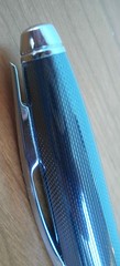
The sleekness of the pen is broken up by a very wide cap band. The appointments are chrome plated, but the cap band has polished chrome only on its borders, with a satin finish over most of its width. The cap and barrel ends are all polished (no satin finish) with engraved rings that also tend to break up the sleek outline. This is one of my quibbles: I think the pen probably would have had a sleeker look if the cap ring was all polished chrome or the cap and barrel ends did not have the engraved rings. This, of course, is purely a subjective factor.

Cross Apogee - ClipCap

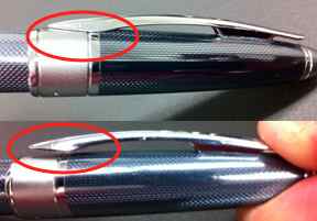
The cap is not threaded, and goes on feeling like it will just be friction fit until it's almost on, when you finally get the somewhat soft click that tells you its seated. This is not a sharp click like you get on a Lamy Safari or Lamy 2000. It's a little mushy, and even more so when removing the cap. Not what I'd prefer, but there's no mistaking when the cap is seated.

Which brings me to another of my quibbles, this time a a functional one. The spring-loaded clip requires you to squeeze the top of it to open it before sliding it over your pocket. The clip is so tight against the cap and and shaped so there's just no way it will slide over a pocket without opening it first. I think Lamy Safaris have spoiled me on clip functionality forever.

Nib, Feed, and Section
Cross Apogee nib and Lamy AL-Star nib side-by-side
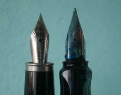
Cross Apogee nib om the left;
Lamy AL-Star nib on the right

The nib is rhodium-plated 18k gold. It's not particularly distinctive, except in size: it's tiny on such a large pen. I think it's even smaller than the nib on my A.G. Spalding & Bros. mini fountain pen. Given the size of the pen, the appearance is somewhat the equivalent of a person with a noticeably small head. At right, it is compared to a Lamy AL-Star nib. (Check it out compared to the giant nib on the Monteverde Invincia Stealth here.)

The section has a plastic cover on it, so those of you that avoid metal pens in order to avoid gripping metal need not worry. The section is comfortable and has never felt slippery.

I know nothing about the feed except that you don't push the converter straight onto it. The converter is threaded, which I really like. Some of my other converters get lose after many uses, but the threaded converter stays in place with no wiggling, so I'm hoping that the actual connection to the feed stays tight for a long time.

For a while, I had a difficult time with ink leaking into the cap between uses, even when I wasn't carrying the pen around with me. That seems to be a thing of the past, though. I'm assuming that certain inks will and most won't.

Writing & Feel

Someone on the Fountain Pen Network has three maxims in his signature, one of which is: "Chase the nib, not the pen." I don't know whether to attribute the pleasurable writing to the nib or the feed, but I can tell you the one obvious benefit to writing with this pen that distinguishes it from most others I own: it doesn't skip even with quick changes of direction and long, fast lines. Many of my pens tend to skip a little if I make a quick circle or long line, but this one never does.

The fine nib is probably a little broader than the fine nib on my Lamy Safaris and Waterman Expert. It is wonderfully smooth and wet. This tends to smooth out the writing even on textured paper; you'll get less feedback from the texture with this nib than with some other fine nibs. I don't know if those characteristics are standard or a fluke, but I like 'em!

People not used to metal pens may find this one a tad top heavy when posted. I started writing with fountain posted, because that's the way I always wrote before using fountain pens, but that's because everything I wrote with was plastic. I now write mostly unposted with this pen and my other metal pens, and I find it more comfortable that way.

Bottom Line

As I said, I like almost everything about this pen.

Pros: Smooth, skip-free writer, threaded converter, nice aesthetics.

Cons: squishy cap closure and difficult to use clip.

Maybe you've been toying with $30 to $40 pens and want to see if a more expensive pen is worth it. If you're willing to spend around $200 (a little less at discount retailers), this pen is a fine choice.

As usual, more photos at the Flickr photo set.

Share/Save/Bookmark