A technophile lawyer rediscovers the joys of pen and paper

Sunday, February 27, 2011

Taking a shot at Chancery Italic Script

I've managed to improve my daily printing a great deal over the past several months by practicing italic handwriting using the lessons in Write Now! by Barbara Getty and Inga Dubay. I haven't exactly mastered daily handwriting, and I haven't even moved on to cursive italic yet, but, because I've found italic nibs so much fun, I've decided to start on Chancery Italic Script, using the letter forms presented in this FPN thread but using lessons (i.e., grouping the letters and using the writing exercises) in Getty and Dubay.

Before I remembered to consult Getty & Dubay (who say simply writing the same letter over and over does little good), I spent my first practice session on lower-case As and Bs and my nom de blog, with the following results:

Chancery Handwriting Lesson 1a

Chancery Handwriting Lesson 1b

I had a hard time with nib size and lettering height, switching back and forth between a 1.1mm italic and 1.5mm italic (both on a Lamy Safari). According to the guidelines I read, the 1.1mm italic should be just about right for using the 5mm spacing on the Rhodia pad as a baseline and waistline, but I thought the lettering looked too spindly. The 1.5 mm should make for very chunky writing using the same 5mm spacing for waistline height, but I didn't think it looked too chunky — most of the time, anyway. Nonetheless, I may have to print out some graph paper with customized spacing if I want guidelines that yield a good look with these nibs.

The step-looking marks you see are me checking the nib widths against the line spacing. The Xs are where I was checking for the right nib angle. This is a bit of a challenge on the Safari, because my natural grip on the ergonomic section of the Safari does not place the nib at the correct angle with the paper at mu usual angle. I'm going to have to experiment with the angle of the paper a bit, and the line of the writing compared to my hand is going to be different.

I was pleasantly surprised at how consistently the nibs wrote. They are very prone to skipping on smooth paper if proper contact is not maintained. You may have seen that before in my ink reviews, especially with the 1.9mm nib (which I did not try in this lesson).

I don't think I'll be using Chancery Script to take notes in court anytime soon. ("Your honor, could you slow down a little bit? I'm having trouble keeping the wedge open on my lower case letters with you talking so fast.") But I think this is going to be fun!


Share/Save/Bookmark

Thursday, February 24, 2011

My trip to the L.A. Pen Show

I can't believe it's taken me so long to get this post up!

I went to the L.A. Pen Show Sunday and had a blast. I had never been to a pen show before, but I sure plan on going to more. There were some fun highlights, a disappointment or two, and some lessons learned to make my next pen show even better.

People Highlights

The first highlight had nothing to do with pens, oddly enough. I saw my favorite radio host, Dennis Prager, walking around and checking out pens. Would love to sit down for a beer with that guy.

One of the first tables I stopped at happened to be for The Write Shoppe in Annapolis, Maryland. Quite a coincidence, considering I went to school there (Canoe U) and I wasn't expecting to see a shopkeeper come all that way.

I was able to keep my promise to Karen of Exaclair to say hello on her behalf to Sam and Frank at the Pendemonium table.

I met Speedy of TWSBI. Impossible not to like him right away.

I had a chat with Brian Gray of Edison Pen Company (another nice guy) about the merits of steel nibs. (See his article, In Praise of Steel Nibs.)

Product Highlights

I'm still a relative pen newbie, so I'm sure there were a lot of fascinating things I overlooked. And what caught my attention might be mundane to a lot of people.

It was nice to see some products up close that I had previously seen only on the internet. In fact, the one pen I bought (that's right, just one!) caught my attention at the show because it looked so sharp, whereas it really hadn't done anything for me when I saw it on the website. That pen is the Monteverde Prima fountain pen, which I bought in the brown stripe pattern. I haven't found a picture online yet, including any at the Monteverde website, that does it justice.

It was also fun to discover new products. For example, I thought the Rosetta North Star and Rosetta Magellan were quite nice. Probably would have bought a North Star if I had not bought the Prima.

At the higher end of the spectrum, the fountain pen that really caught my eye was another one I hadn't seen anywhere before, including online: the Diplomat Excellence Rhomb. Love at first sight for me, but a little pricey for an impulse buy: $275 with a steel nib. It's on my wish list now. I know looks aren't everything, but they don't hurt.

The temptation of the day was the Visconti Homo Sapiens. I've been drooling over that one for a while, and a vendor offered it for only $395. (Are they selling that poorly? Retail is $595!)

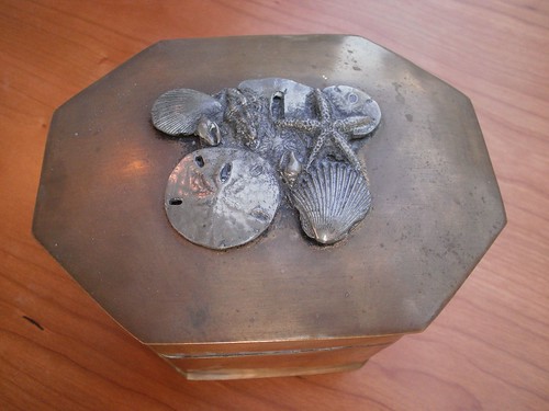
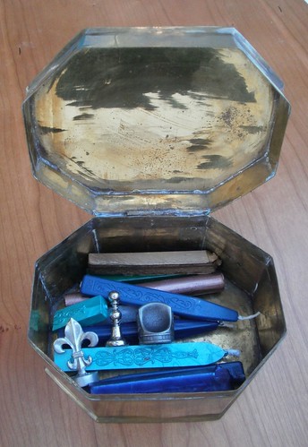
Oh, then there was this novelty:

Quite a deal . . . if you like the ink!


If, for some odd reason, this picture does not satisfy your curiosity about the show, try Brian Gray's photo gallery and this FPN thread (that link also courtesy of Brian).

Disappointments

The show was not without its disappointments. It would have been nice if the show handed out a map or at least a list of exhibitors. Finding what you wanted was a little tough (but I would have browsed everything anyway). Also, there was very little in the way of pen-related products. For example, I looked for a loupe, without success (there were a few, but not the kind I was looking for).  I was also hoping for more stationery, but there were only a few displays, and they consisted mostly of the Rhodia and Clairefontaine products I'm already familiar with.

Now I want to go to the National Stationery Show. I'm beginning to think that's my last hope for locating some masculine stationery. Unfortunately, I can't justify a trip to New York just for the show. Anyone out that way need some California legal advice that would benefit from a face-to-face meeting?

Lessons Learned

I've got to brush up on vintage fountain pens. There was table after table of vintage pens, which I didn't spend much time at because there are so many contemporary pens I'm interested in. This means I missed out on about half the show.

Next year, I'm going earlier. This year, I only spent about four hours there. I was able to keep it that short because I wasn't checking out the vintage pens and I wasn't really shopping for a pen (but I bought one anyway). Next year, I'll probably be doing both, and I'll need more time.

See you there next year!

Share/Save/Bookmark

Thursday, February 17, 2011

What have you found at a thrift store? I found a new home for my wax and seals

I've been trying to find a good place to keep my wax sticks and seals. Something fireproof, preferably, so I wouldn't have to worry about putting a wax stick in the receptacle too soon after putting it out.

So, the Booker clan hit the thrift store after church a few weekends ago, and I ran across the perfect thing:

Wax seal storage box

A new home for my wax and seals

My wife's the one who usually makes the good garage sale and thrift store finds, so I was quite pleased to spot this for $2.

I'm not sure what it's made of. From the patina on the outside and the shine on the inside of the lid, I'm guessing brass, but I've never seen brass hammered this thin. The seashell ornamentation is a bonus, since we live near the beach.

This is the first thing I've looked for at a thrift store or garage sale to indulge my pen and paper habit. I wonder what I might find in the future.

If you've made a great garage sale or thrift store find for your pen and paper habit, tell us about it in the comments!

Share/Save/Bookmark

Review: Levenger Initialize Letterpress 3 x 5 Cards & Envelopes

Levenger Initialize 3x5 card
I've been leery of Levenger's personalized paper products. My experience with Levenger paper has been very hit-and-miss (when it's good, it's fantastic, but some of it is absolutely terrible), personalization is usually quite pricey, and I've read some very critical reviews of their personalized note cards.

Then I ran across the reduced price on the Initialize Letterpress 3 x 5 Cards & Envelopes. They were reduced from $13 to $8.95, so I scooped up a pack.  Levenger must be clearing them out, because they're down to $4.95 this week.

For that, you get 10 cards of very sturdy 110-lb. Forest Stewardship Council (FSC)-certified cover stock. I really wasn't prepared for how sturdy these are. Between their sturdiness and very smooth finish, they have a very high quality feel to them.

As usual, my crappy photography doesn't convey the color; the cards are off-white. In my opinion, Levenger's photography makes them look whiter than they are, and the blue initial, though described as Navy, has a slightly purple cast.

This is also the first letterpress product I've bought, and I must say I like the letterpress imprint. Some descriptions I'd read of the process made it sound like little more than using an ink stamp, so I wasn't expecting much, but the initial looks quite good. The letterpress process leaves an imprint in the paper — the opposite of engraving. So, like engraving, it give the card texture that conveys something special.

The letterpress initial and sturdy, quality feel are sure to impress . . . provided you use the right pen and ink combination. As much as these cards delight with their weight and feel, they disappoint with how they handle ink.

Gel inks and rollerballs worked fine, but most of the fountain pen inks I tried feathered rather severely. All of the bottled inks were terrible. Much better were my $4.50 Pilot Petit1s in Wine Red and Mandarin Orange. The best, without any noticeable feathering at all were my $3 Platinum Preppies and Pilot Varsity!

Inexpensive pens and inks worked best!
Bottled inks feathered so much I expected the card to take flight! (Worse than this picture conveys . . . click on it for a better idea.)

Gel inks and rollerballs worked fine, but most of the fountain pen inks I tried feathered rather severely. All of the bottled inks were terrible. Much better were my $4.50 Pilot Petit1s in Wine Red and Mandarin Orange. The best, without any noticeable feathering at all were my $3 Platinum Preppies and Pilot Varsity!

The envelopes, on the other hand, took most inks quite well. The envelopes also have a textured finish.

At their old price of $13, I probably would not have recommended these cards.  But at $4.95, it might be worth buying two or three packs. Just count on using up a few in the process of figuring out the best inks to use.

Share/Save/Bookmark

Thursday, February 10, 2011

My new colleague thinks I'm a geek because I like pens

The firm added a lawyer a short time ago, and yesterday, during the course of a brief conversation on our way out, she said I was scary, then said I was approaching geekdom, then said I'd gone way over the line and was definitely a geek.

All because I like pens. Or, at least, I think I like pens. She thinks I have an unhealthy obsession with them. Just because I can look at pens (in a store or online) for hours, spend a lot of time reading pen-and-paper blogs, and plan on going to the Los Angeles International Pen Show over Presidents' Day weekend (and take my Waterman Expert with me to perhaps drop it off for nib adjustment), she thinks I'm a geek. Imagine that!

The irony of this is that the whole reason we started talking was because I noticed a new notebook on her desk and asked about it. Turns out she's addicted to notebooks. Can't go to Staples for anything without stopping by the notebook aisle. Hard to imagine that someone who is such a notebook junkie would find a pen interest/obsession/addiction "geeky."

Share/Save/Bookmark

Wednesday, February 9, 2011

J. Herbin Lie de Thé Ink Winners

Winner's of the J. Herbin Lie de Thé ink giveaway are almost at exact opposite positions in the commenting string. A little freaky, considering I used random.org to generate the winning comment numbers.

Runner up River, who gets a 2 ml ink sample, was the last commenter to enter.

The rest of the bottle goes to Patty, who was the second person to enter.

Congrats, you two. For the rest of you, check back for another giveaway the week of February 14. (And, hey, would it kill you to check in once in a while before then?)

Share/Save/Bookmark

Quite possibly the last review in the entire world of the first generation Quo Vadis Habana notebook (large U.S. version)

This is embarrassing. What is it with me and Exaclair products? The legendary Karen at Exaclair is kind enough to send me a couple of samples, and I wait until each one of them is nearly obsolete before I review them. I posted Quite possibly the last review in the entire world of the second generation Rhodia Webnotebook just before the third generation one came out, and now I find myself in the same position with the Quo Vadis Habana. I guess the good news is that I can tell you what I think of the upcoming changes at the same time.

By now, there is very little original to say about the Habana. Plenty of good, detailed reviews have been written (see the end of this post for links). Let's get the basics out of the way, straight from the Exaclair website:
  • Clairefontaine paper - extra white, exceptionally smooth satin finish
  • 90 g, acid-free and pH neutral paper (for desk size and pocket blank)
  • 80 sheets
  • Firm cover for writing support
  • Elastic closure, ribbon bookmark
  • Inside pocket for notes and cards
  • Elegant round corners
  • Sewn binding for extra security and flexibility
  • 6 1/4 x 9 1/4"
The large Habana is significantly larger
than the large Rhodia Webnotebook
(pictured) or Moleskine
Love, love, love the paper. Extremely fountain pen friendly — Noodler's Baystate Blue and Noodler's Baystate Concord Grape were the opnly inks I tried that bled or feathered — smooth as silk, and the bright white paper makes an excellent testing ground for trying out new ink samples or to show the true color of your favorite inks. The only thing I would change about the paper is to make the ruling narrower. The current 8mm spacing is too wide for my typical handwriting.

Unfortunately, it is what I love most about the notebook that is changing — the paper is going to be off-white in the newer version, and slightly thinner (85 g).  The thinner paper is supposed to be just as fountain pen friendly, but I will miss the bright white paper, which is somewhat of a standout feature in notebooks.

Apparently, the change is intended to make the paper identical in Habanas worldwide. The announcement from Quo Vadis is here. Goulet Pen Co. proprietor Brian Goulet shares what he learned from Quo Vadis and his hopes for the new notebook at Ink Nouveau.

My sample was taupe. Some months ago, I read a review (that I can't find now) in which the reviewer thought the taupe cover looked just plain brown. Odd, because to me, it looks quite pink!

The Habana opens nice and flat when on a table, and is easy to write on when you're away from any surface to put the notebook on. Its somewhat larger size lets you rest your hand on the page longer than in a smaller notebook, and the leatherette cover, though uniquely flexible, is firm enough to serve as a writing surface.

Rear pocket gusset
The pocket inside the back cover impresses for two reasons. First, because of the size of the notebook, the pocket easily accommodates letter-sized or A4 paper folded in half. Second, the gusset appears to be some kind of fabric-reinforced paper rather than plain cardboard.

The leatherette cover is uniquely flexible, yet stiff enough to provide a firm writing surface if you're away from a table.

Flexible cover, anyone?
Assuming the paper's fountain pen characteristics remain the same, one thing you'll need to look out for in both the old and new versions is the trade-off for the smoothness and fountain pen friendliness of the paper: drying times for most fountain pen inks that are longer than on many other papers. If you're in the habit of closing your notebook immediately after writing in it, this may not be the notebook for you, at least not if you use a fountain pen. If you do, you may want to use a sheet of blotter paper as a bookmark so your writing does not smudge when you close the notebook.
  
So far as I can tell, the only thing changing is the paper, so if you find any of the other aspects I've described appealing, and the new paper lives up to its billing, this may be just the notebook for you.

Other reviews:

DIY Planner
Takenotesonthis's Blog
Reciprocal Crap Exchange
Everyday Correspondence
Unposted
Plannerisms
Passion du Jour
Black Cover
The Orchard
Lady Dandelion
Rants of the Archer
Spiritual Evolution of the Bean

I'm barely scratching the surface there. I'm not kidding that this may be the last review ever for this version of the notebook!

Share/Save/Bookmark

Saturday, February 5, 2011

A serious backslide?

The top and sides on an iPhone 4.Image via WikipediaThis blog is supposed to be about my experience rediscovering the joys of pen and paper after a long (but ultimately unfulfilling) love affair with technology in legal practice.

So, why did I buy a new iPhone 4?

Until a few months ago, I still had the second-generation iPhone (that's two versions ago). With the upgrades in OS without an upgrade in hardware, it was starting to get really slow. 10, 15, even 20 seconds could pass between pressing a button to launch an application and it actually being ready to use. This new one is much zippier.

Ironically, the Apple web page for the phone highlights as a feature what I see as a problem with lots of technology. The link to the page on the new multi-tasking (running more than one application at the same time) feature of the phone: Multitasking. Give everything your undivided attention. Clever slogan, but if you ask me, the only way to give everything your undivided attention is to do things one thing at a time.

So, with the new tech gadget comes the urge to test its uses . . . but I've been heading in the other direction, back to pen and paper, for several months. What to do?

Find the right role for each tool, that's what. There are things I accomplished with an iPhone in minutes that a truck full of high-en fountain pens couldn't have helped me with. (Hmm, the thought of having a truck full of high end fountain pens just hit me . . . let me savor that for a moment. . . . just a minute longer . . . OK . . . done!)

So, my iPhone is for phone calls, occasionally checking gmail accounts, and keeping records of my contacts. Once in a while, reading my Kindle eBooks. The iPhone 4 may be overkill for that, but I'm sure I use it for other things from time to time. But it's my pocket Moleskine Cahier for jotting things down on the go, keeping a list of errands and the like.


Share/Save/Bookmark

Wednesday, February 2, 2011

Ink Review and Giveaway: J. Herbin Lie de Thé


Lily at Jet Pens was kind enough to send me a bottle of J. Herbin Lie de Thé to review here. As in my review of the Noodler's Navy she sent me, I'm sharing the freebie by making a giveaway part of the review.

The Review

This almost became the Internet's first ink review without any representation of the ink. No matter what I do, I can't seem to adjust my scanner to scan with results even approaching what my inks actually look like on the page, and it's very difficult to capture with photography, too. This color proved particularly difficult.

The net result is that even with these lame pictures I am including, you're going to have to depend mostly on my description to get an idea of the color. There is, however, one way for you to know exactly what this tea looks like: enter and win the giveaway! (Instructions to enter at the end of the post.)

The skipping with the italic nibs is not the fault of the ink.
I am still having trouble holding italic nibs to the paper correctly.


So, let's start with my opinion that this may be the world's most appropriately named ink. According to Google Translate, "lie de thé" translates to English as "dregs of tea." Since "dregs" means "the remnants of a liquid left in a container, together with any sediment or grounds" (according to Google Dictionary), I'd say J. Herbin really nailed it with this name: if you imagine what you'd end up with by dipping your pen into the liquid that leaks out of a teabag after you remove it from your tea and lay it on a saucer, then you have a pretty good idea of the color of this ink.

The ink shades quite heavily (yet another characteristic I have not managed to convey in the pictures). So heavily, in fact, that to me, the shading is not interesting, but distracting, as if someone watered down an ink that was supposed to be richer in color.

I'll leave it at that, my subjective opinion of the color, rather than get into things like lubrication, etc., because (1) I'm still learning my way around inks, and (2) since I tested this on a Rhodia Dot Pad, it seems pointless to comment on the lack of feathering or bleedthrough, because almost nothing I've tried so far  feathers or bleeds on Clairefontaine/Rhodia paper. (I'll tell you about the exceptions in future posts.)

The giveaway

Now, if you got the idea that I don't really care for this color, you're right. It's not my  . . . don't say it, Booker . . . not my . . . Booker, fight it! . . . not my . . . Oh, Booker, I can't believe you're going to say it! . . . not my cup of tea. (Ouch!) So, instead of giving away just samples, like I did with the Noodler's Navy, I'm giving away the remainder of the bottle to the giveaway winner, and a runner-up will receive a 2ml sample. I've used this ink rather sparingly, so I'm guessing the winner, after the sample for the runner-up, should still end up with more than half a bottle.

The usual giveaway sign-up procedures apply:

1. Leave a comment.

2. Send me an email at notebookeresqATgmail.com. The body of the email must include the name you used to comment and the subject line of the email must read exactly:

DREGS

I need the email so I can be sure I can contact the winners. If you leave a comment without sending a proper email or email me without leaving a comment, you will not be entered.

I'm not setting a deadline. How long I let the entry period run depends on the number of entries, traffic, and whether this giveway makes it into this Saturday's "Ink Links" at The Pen Addict. I'll pick a winner and runner up when I'm ready.  Good luck!

If you're unlucky in the giveaway but still want this ink, J. Herbin Lie de Thé is available in a 30ml bottle for $9.00 from Jet Pens. While you're there, load up your cart with a few more goodies — orders over $25 ship free. That's the lowest free shipping threshold I've seen.

UPDATE (2/9/11): The giveaway is closed, and the winners are announced here.

Share/Save/Bookmark