Before I remembered to consult Getty & Dubay (who say simply writing the same letter over and over does little good), I spent my first practice session on lower-case As and Bs and my nom de blog, with the following results:
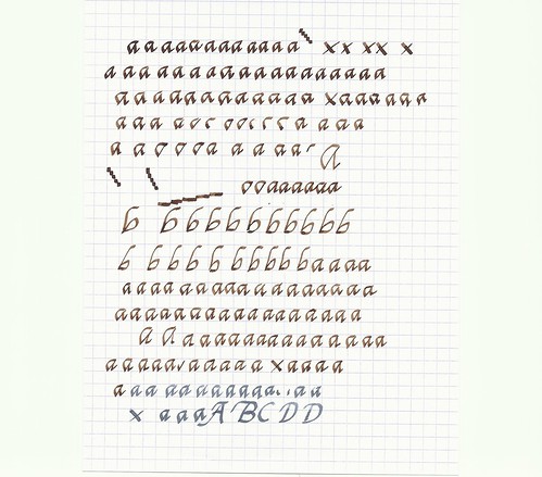
I had a hard time with nib size and lettering height, switching back and forth between a 1.1mm italic and 1.5mm italic (both on a Lamy Safari). According to the guidelines I read, the 1.1mm italic should be just about right for using the 5mm spacing on the Rhodia pad as a baseline and waistline, but I thought the lettering looked too spindly. The 1.5 mm should make for very chunky writing using the same 5mm spacing for waistline height, but I didn't think it looked too chunky — most of the time, anyway. Nonetheless, I may have to print out some graph paper with customized spacing if I want guidelines that yield a good look with these nibs.
The step-looking marks you see are me checking the nib widths against the line spacing. The Xs are where I was checking for the right nib angle. This is a bit of a challenge on the Safari, because my natural grip on the ergonomic section of the Safari does not place the nib at the correct angle with the paper at mu usual angle. I'm going to have to experiment with the angle of the paper a bit, and the line of the writing compared to my hand is going to be different.
I was pleasantly surprised at how consistently the nibs wrote. They are very prone to skipping on smooth paper if proper contact is not maintained. You may have seen that before in my ink reviews, especially with the 1.9mm nib (which I did not try in this lesson).
I don't think I'll be using Chancery Script to take notes in court anytime soon. ("Your honor, could you slow down a little bit? I'm having trouble keeping the wedge open on my lower case letters with you talking so fast.") But I think this is going to be fun!


Great link to the FPN thread. Thanks for posting it.
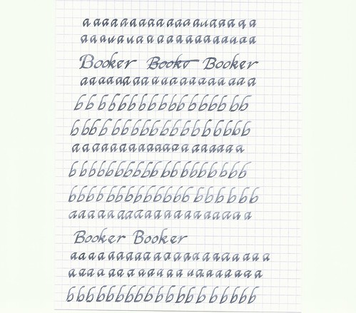
ReplyDeleteI always struggle with the spacing between the letters. You can flub the width of the letters themselves and it won't look too terribly wrong. But if you flub the space between the letters it looks like a disaster. I've created a lot of disasters. (sigh)
Looks very nice to my untrained eye. Coincidentally I just received a calligraphy book in the mail today. I've got all 3 italic Lamy nibs and can't wait to put them through their paces but I need to change the ink in my AL-Star to something darker (currently Diamine Orange).
ReplyDeleteWhat inks did you use? I really like them.
'Cillin,
ReplyDeleteThe brown ink is J. Herbin Lie de Thé, which I developed a fondness for right after I sent the bottle off in a giveaway (didn't care for it before then). The blue-gray is Iroshizuku Fuyu-syogun, available at Jet Pens and a few other online vendors. I haven't made up my mind on that one.
I have been using the Getty Dubay books for a while now. My problem is... I get side tracked, fall into bad habits, and have to start all over. Great Post!!!
ReplyDeleteHow good to see a blog-post (by a fellow writer of Italic, no less) about — and in — handwriting.
ReplyDeleteI've just started a handwriting blog of my own (though have yet to accompany with samples its mere two posts) — http://www.pubwages.com/author/kategladstone