As promised in
my over-the-top tribute to Karen at Exaclair, I am finally getting around to reviewing the second generation large Rhodia Webnotebook (or "Webbie") I received from her more than four weeks ago. I mention that in the interest of full disclosure, but I also wish to stress that Karen made it clear that no review, let alone a favorable one, was necessary for me to receive the sample.
Since
the third generation webbie is due soon, this may well be the last review ever published of the "2.0" version. The. Last. Review.
Ever.
So, with that overly dramatic beginning, I might as well give an overly dramatic summary of my review:
They can have my Rhodia Webnotebook when they pry it from my cold, dead fingers. That's how much I like this notebook.
Though other bloggers have already covered many of these features, I'll go over them anyway, for a couple of reasons. First, several other bloggers reviewed the pocket size version instead of the large notebook. Second, you might be running across this review first. And third, why not make the most of having the last word before the Webbie 3.0 arrives?
Let's cut to the chase: the paper. The luxurious, fountain pen-friendly Clairfontaine 90g paper that feels smooth as a baby's skin, produces a line true to the size of the fountain pen nib, and shows not a hint of feathering or bleed through. You'll pay a price in drying time, but for most fountain pen lovers, I'm sure it's worth it. And those qualities make the writing more pleasurable even with a rollerball or gel pen. Show-through is barely there, even for the most saturated inks and wettest nib/ink combinations I tried:
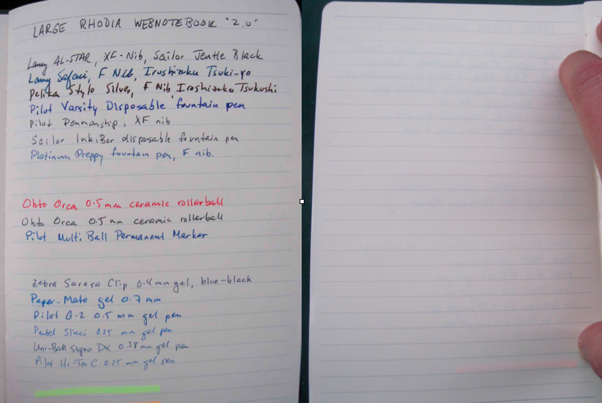
Look carefully at the right of the above composite, and you'll see the only significant show-through is from an orange Platinum Preppy highlighter that my brilliant composition skills actually cut out of the left side of the photo. I looked really, really close at these inks, and I found no feathering or bleeding at all. You can't even see feathering in this magnified view:
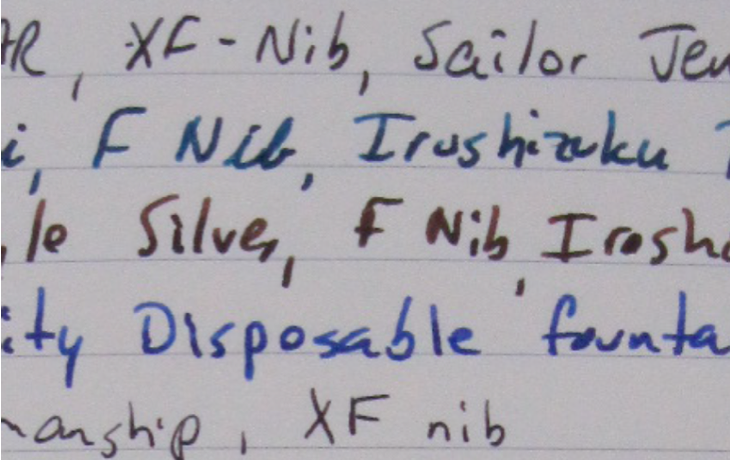
Keep magnifying it, and you'll see pixelation before you see any feathering!
You might remember that
my first impression of the webbie when I saw
it in the store was disappointment in its size. That was probably due
mostly to the fact that I was (and still am) on my first notebook, which
is an
extra large Piccadilly. I 'd been using that for
several weeks for notes at work, and still getting used to the fact that
it is smaller than a standard letter-sized sheet. As you can see from
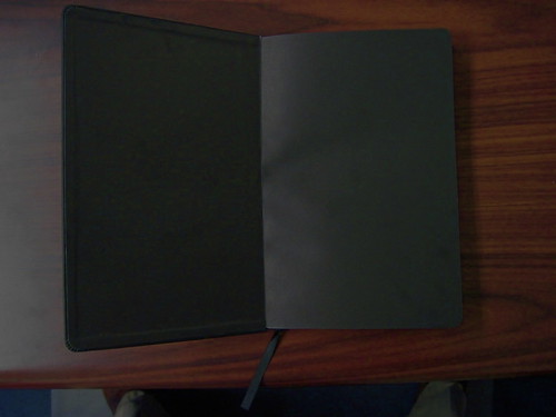
the photo below, the Webbie is quite a bit smaller (5.5" x 8.25" according to the label):
See how the overhead flourescents are reflected by the Piccadilly, yet the Webbie has a flat matte look?
Love that! It gives the Webbie a kind of "stealth" persona that is refined and formal. It seems
fast, somehow, and that feeling is also furthered by the black inside covers:
From the pictures I've seen in reviews of the orange-covered version, it appears the end papers and inside covers likewise match the cover, which is a little too much orange for my taste, but probably not enough for Rhodiaphiles.
I love the black cover, inside and out. Some other reviewers have been a little turned off by the deeply stamped Rhodia logo smack in the middle of the cover, but it doesn't bother me. The cover itself feels quite luxurious (the Rhodia website calls it "Italian leatherette"), and maybe a little too nice to carry around and subject it to the rigors of constant use, with resulting scuffs and scratches.
Nifty at Notebook Stories noted that the cover "takes impressions easily," as could be seen by indentations left in the cover by the elastic strap. Sure enough, when I removed the Webbie from my briefcase, I was bummed to see that it had two very deep impressions on the front cover near the spine, left by something it had been pressed against in my briefcase. Hours later, however, the cover had almost fully rebounded and you had to look closely to see where the impressions had been. Still, I think I may prefer to find a use for this where it doesn't have to leave the house — not because the cover is exceptionally delicate, but because it seems a shame to risk marring it, it's that nice.
Some reviews have described the cover has having some flex, but the one I have sure doesn't seem to have much. If anything, it seems
less flexible than the large Moleskine hardcover, and it's certainly nothing like the curiously flexible "hard" cover on the
Quo Vadis Habana.
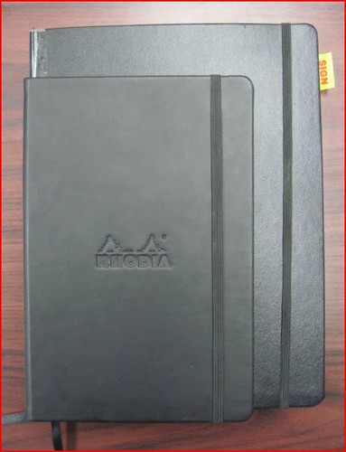
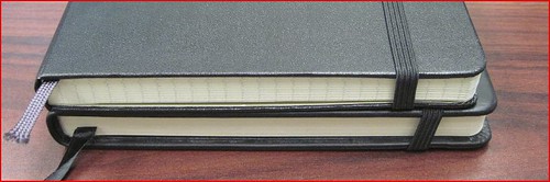
Like I said, I was initially disappointed in its size, but now that I'm far more familiar wih the different notebooks out there, I know that the Webbie is typical of what is referred to as a "large" notebook. In fact, it's actually a touch wider
than the large Molskine, but the pages don't come as close as flush to the edge of the cover as the Moleskine pages do. You can see these differences in this picture of the large
Moleskine stacked on top of the Webbie:
It's not the flattest opening notebook you'll find, as
Nifty
and
Biffybeans pointed out in their reviews. Opening flat was never a big a deal for me, but then I bought a Moleskine
and saw just how flat a notebook can open, and now I want that in all my
notebooks! The Moleskine, from my (admittedly sparse) experience thus
far, still seems to be the champion of laying flat while open. However,
the Webbie 3.0, due out soon, is supposed to open flatter than the Webbie 2.0.
The pages have other notable features besides the quality of the paper. First is the Rhodia logo in the bottom right of every right-hand page.
I've seen several reviewers and commenters mention that they don't like this. Perhaps it isn't scaled down enough and takes up more room in the pocket size, but I don't find it bothersome in the large size at all, especially since it only appears on the right pages. Still, it appears Rhodia got enough negative feedback that the "Webbie 3.0" will not have that logo on the pages.
Second is the spacing of the rulings on the page. You might recall that my initial reaction to the Webbie included some disappointment that the ruling was so wide, but
it turns out it's not much wider than the Piccadilly I'm used to. Here
they are side by side:
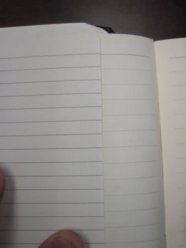
Besides, there are some things I really like about the ruling. The rules themselves are quite thin, and the gray color has a low contrast against the ivory paper, making the rules less obtrusive. You barely notice them once you have added text to the page.
Another thing I like about the ruling is how it gives some structure to the page. The ruling imposes this structure by ending short of the binding and the edge of the page and by the top and bottom rules being slightly thicker and darker than the others. This gives the blank page a much cleaner look than the blank page of a Moleskine or Piccadilly. I'd like to think it will also make my pages look neater after I've scribbled on them, but only time will tell. I know some people hate any structure to the ruling and prefer to have it extend the entire width of the page and the entire length of the page until you run out of space; they view any blank header space as a waste and an infringement on their ability to place text wherever they want on the page. Here, however, the header and footer are insignificant, though, and the leave enough pace for an additional line, so even "anti-structuralists" may be OK with this layout.

Finally, the Webbie 2.0 has a ribbon bookmark that I like because it is quite long, extending about three inches past the bottom of the page. It's a small thing, but the bookmark in my Moleskine is barely long enough to stick out from the bottom, and that drives me nuts.
All in all, this is really a winner of a notebook. It is refined and well-finished, so much so that it makes me want to create something special to go in it. Since I'm not an artist, that means text, and . . . unfortunately, I'm not a writer, either! But maybe the Webbie will inspire me!

Quite possibly the last review in the entire world of the second generation Rhodia Webnotebook (large U.S. version)