They had me at
lava. As soon as I saw an ad for the
Visconti Homo Sapiens fountain pen, explaining that the barrel and cap are made of a mix of resin and volcanic rock from Mt. Etna, I was as hot for this pen (hot? lava? I'm
hilarious!) as your typical 16-year old on a car lot is for the cherry sports car parked next to the used compact sedan his Dad wants to buy him. Lava alone did not seal the deal, but it got me started on the road to ownership. (Yet, it still took me more than a year before I caved in and bought it. What willpower!) After more than a year of longing, I finally bought one at
Flax Pen to Paper during their May 2011 sale. (My understanding wife allows one expensive fountain pen per year.)
Let me start by saying that I love this pen,
but . . . it has what I think is a huge design flaw that almost made me regret buying it, and caused me to send it into Visconti, hoping it might be a repair issue rather than a design issue. (More about that later.)
There's surprisingly little information about this pen on the Visconti website (the above link), but you can learn more about it from the websites of the various vendors who sell it. There's also a nifty mini-DVD video produced by Visconti. Flax gave me one when I told them I was considering the pen. In addition to being informative, it was designed beautifully to sway people like me, with lots of shots of red lava spewing from volcanoes. That might be a stupid reason to want a pen, but it sure was an effective presentation. I'm not saying I wouldn't have bought the pen if I hadn't seen the video, but the video sure didn't hurt.
Presentation
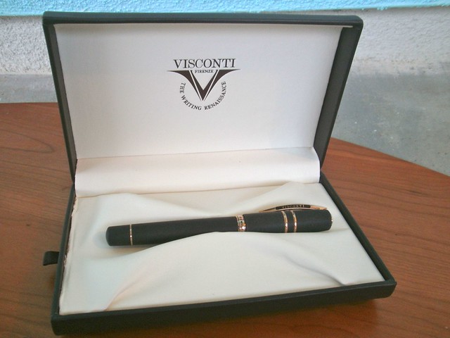
The one comes beautifully packaged in a very nice gift box, which includes a drawer holding a small video DVD and pen instructions. Nice, but for a pen this expensive, maybe you should expect a little nicer. Look at the left edge of the box in the photo above, and you'll see the ragged edge of the fabric, which should not be showing. Also, real leather would have been an improvement. But I guess the really deluxe packaging is reserved for special editions, and this is a regular production pen.
The Materials
Lava. From Mount Etna, a volcano on Sicily. That's what comprises more than 50% of the barrel and cap material. I'm not sure what the ratio of lava to resin is, but Visconti claims that the pen is virtually indestructible because of it. I'll leave the testing to the guys on
Mythbusters; the thought of
trying to damage a pen just to see if it withstands the trauma makes me queasy. But I have probably been a little more cavalier in my treatment of this pen because of its sturdiness and the seeming difficulty of doing any real damage to it.
The material is hygroscopic, meaning it will absorb some moisture. I've seen this used as a big selling point because the pen is supposed to be able to absorb sweat from your hands. Is that really a problem for most people? I don't know if the pen has behaved hygroscopically or not, because my hand doesn't sweat while I'm writing.
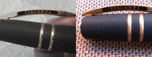
Those caught up in the gold trim versus chrome/rhodium trim (I usually prefer rhodium or chrome trim to gold-colored trim) might be pleasantly surprised to find out that this pen has neither. The trim on my pen is pure bronze (Visconti has since come out with a version that sport stainless steel trim), which makes it very different. I've seen at least one vendor describe the color of the bronze as a rose gold color, but I don't think that's accurate, because there's no pink tint in the bronze.
The bronze has a nice shine to it when the pen is brand new, but it tarnished very quickly. Some people prefer to call this a patina and say it gives the pen character. I call it
tarnish and wish there was an easy way to shine up the bronze again. Within a month or two, the bronze was quite tarnished. Maybe living near the beach has something to do with that; the air here is hell on most outdoor fixtures, so maybe its enough to tarnish the pen quicker (even though it spends little time outdoors). Here's how it looked new versus what it looks looks like around seven months later:
 |
| The bronze is so shiny when new, but hard to keep that way. |
I tried applying lots of elbow grease with the cloth that came with the pen, but it didn't get me very far. I'm hesitant to use any solutions, as I'm afraid they'll be absorbed by the pen and maybe discolor it.
The pen has since been released in
a version with steel trim, which almost made me want to buy a second one (or sell mine to buy one).
The Barrel and Section
Normally, I don't go for chunky pens. Most Deltas I've seen, for example, leave me cold. But somehow, a thick pen seems like the only kind of pen made that should be made from lava. It just fits somehow. This is not an absurdly chunky pen in any event. I don't have calipers to measure it, so it's hard for me to quantify its chunkiness, so let's just call it . . . masculine.
I think the pen has a masculine look built from a combination of the materials and its dimensions. I'd be curious about the ratio of men buyers to women buyers. If you're a female owner of this pen, how about letting me know in the comments and tell me what attracted you to it?
 |
| Porous, gray material - not black! |
The barrel only looks black if you skim over a few photos of the pen. In reality, it's more of a dark gray, with some color variation, and it's quite porous. Bronze is the perfect compliment to this texture, which really seems to take you back in time (and I'm not talking vintage pen time, I'm talking "Bronze Age" time, as is Visconti).
The Cap and Clip — and the Flaw
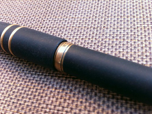
The cap is large and, to my mind, is a huge part of the pen's masculinity. The two bands of bronze against the porous lava/resin mix make the cap look masculine and tough.
The cap incorporates the
Visconti "my pen" system, which lets you replace the Visconti logo on the end of the pen with any number of designs available from Visconti, from gemstones to initials. The original end piece and any replacements are held magnetically, which means Visconti couldn't use bronze for this piece. Whatever it's made of, it stayed nice and shiny while the bronze tarnished severely. This mismatch in materials solved itself; about a year after I got the pen, I noticed that the end piece that came with the pen had fallen off. (Perhaps due to my rough treatment of this supposedly indestructible pen.) I looked at the available replacements, and decided everything but the initials clashed with the rest of the pen.
Here's the original (and shiny!) logo, the end of the cap after the logo came off, and the initials with which I replaced the logo.
 |
| Same pen, three different looks via the "My Pen" system |
I think the initials actually look better than the original logo, because their finish is a better match for the bonze. And, they were quite inexpensive — only $8 for the pair of initials from an eBay vendor. The gemstones and zodiac signs cost about twice that.
You're thinking that the accidental loss of the original Visconti logo is the flaw, right? No, that is not the flaw.
The clip is the typical springed Visconti "bridge" design. The clip is not designed to slide easily over things like your pocket, however, unless you pull the clip away from the cap a little with your fingers as you try to slip it over whatever you're trying to clip it to.
You're thinking that the clip is the flaw, right? No, the clip is not the flaw.
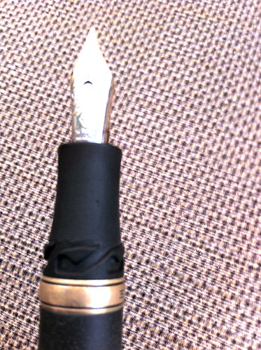
 |
I've really tweaked the exposure to get
these locking grooves to show up |
Here's the flaw: the cap is supposed to secure with a grooved locking system, but . . . it comes of quite easily, much
too easily. Visconti touts this as very secure cap, requiring one to push down on the cap and then twist it to remove it, something like removing the top from a prescription drug bottle. However, one need only twist it, without pushing down at all, and it pops right off. In fact, I
accidentally removed the cap twice in the first week or two I had the pen. That should not happen! (I haven't accidentally popped the cap since, probably because these accidents reside in my unconscious and guide how I handle the pen, notwithstanding its otherwise seeming indestructability.)
I took the pen back to the store to compare to others, and couldn't feel much difference, but I sent it in to Visconti anyway, just to have them check it out. When it came back a few months later, there was no explanation of anything they did. Other than getting the bronze nice and shiny for me again, nothing seemed any different.
This design flaw is not enough for me to regret buying the pen
after the fact, but if I'd noticed it
before I bought it, I might have thought twice. I'm really surprised I haven't seen this issue mentioned in other reviews. I recommend you check this out before you buy, to make sure it won't bother you later.
The Power Filling System
I'll confess, I have no idea how this works. I mean I know how to fill the pen, I just have no idea what the mechanism is doing inside when I do it and, since this isn't a demonstrator, there's no way to observe the mechanism. You can pretty easily find diagrams of the power filler design.
To fill the pen, you unscrew the blind cap behind the bronze ring at the end, and pull out the plunger. Dip the nib into the ink, push in the plunger, wait several more seconds, and
presto! Your pen is supposed to be filled with ink.
(Right about this point in writing the review, I realized I had no pictures of the filling system in action. So here's a link to someone else's
video review, which includes a demonstration of the power filler.)
I say "supposed" to be because the inability to see inside the pen also prevents you from knowing how well you've filled it (or how much ink is left). I've read some complaints that the power filler does not fill the reservoir unless the plunger is pressed at least twice, but I just don't know. Unfortunately, I don't write enough to be able to tell you whether it feels like the pen runs out of ink quickly.
What I
can tell you is that the fill mechanism feels quite durable. The spindle on the plunger might
look fragile and easy to bend, but it actually feels quite sturdy. I think it's made of titanium.
 The Nib and Section
The section is quite short. Unless you have very small hands, your grip on the pen is going to include both the locking grooves for the cap and perhaps the bronze ring near the section. The short section made me wonder if the pen would be comfortable to hold, so I tried it out several times in the shop and at the pen show before taking the plunge. I don't find it a problem at all.
There's been some discussion at The Fountain Pen Network over whether the hygroscopic quality of the lava/resin combination will cause the section to absorb ink when dipping the nib to fill the pen, and eventually discoloring the section over time. I can see a very narrow band of darker color on the nib end of the section, but honestly, I don't know if I see it because people suggested there could be a problem or because there really is one. Wiping the section down thoroughly after filling seems the practical thing to do, but if the ink has already been absorbed by the pen, it seems like that wouldn't help much. I just try not to dip the pen very far past the nib, use a wet paper towel to clean the section, then hope for the best.
The 23k Palladium nib is quite fittingly called the "Dreamtouch" nib. It's remarkable. Smooth. Wet. Aesthetically beautiful. There's nothing to dislike about it. It makes me want to write.
This short Youtube video describes the extra fine version of the nib as "springy, but not flex," then
really bears down on the nib to show how it bends. The thought of doing that with my pen scares the heck out of me, and I'm not about to try it to see how flexible the medium nib is. I'm not a flex guy, and I so marvel at the smoothness of the nib, I don't really care if its flexible or not.
Price
Let's talk about price. For some people,
this is the flaw with the pen.
This is a crazy expensive pen unless (a) you have money to burn (that's not me) or (2) you're obsessed with the pen, lust after it on the internet for a year, then justify the purchase by telling yourself "Well, it's my only expensive pen this year, and it's on sale . . . and it's made of
lava" (
sucker — that's me).
Retail price is $595. On sale, I got it for $476 (20% off) which I suspect was the price at all those online vendors that used to tell you to call for the discounted price. Lately, I haven't seen it discounted anywhere, which is odd, because the fact that a vendor at the L.A. Pen show in 2011 offered me one for only $385 leads me to think it wasn't exactly flying off the shelves. Perhaps sales have picked up?
Conclusion
I love my Homo Sapiens. It is a real dream to look at, hold, and write with. And did I mention it's made of
lava?
But I wish the cap didn't come off so easily. I highly recommend you try this pen out in a brick-and-mortar shop or at a pen show — everything from filling, to the cap locking system, to writing — before you actually buy one. If you live too far from any retailer to do that, I recommend you at least try out the cap and work the power filler a few times before you ink the pen and make it un-returnable.
As usual, there are more poor photos at
my Flickr set for this review. You can see other reviews of this pen at:
Goldspot Pens
Sieze the Dave
Inky Journal

Review: Visconti Homo Sapiens Fountain Pen — a fantastic pen with a huge flaw

