 |
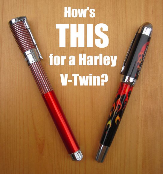
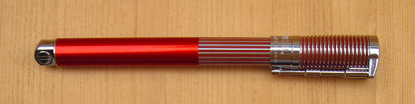
| Left: Waterman Harley Davidson Horizon Orange Fountain Pen Right: Waterman Harley-Davidson Free-Wheel Flames Fountain Pen |
Waterman and Harley may seem like an odd pairing. A French Harley-branded pen? But Harleys are a world-wide phenomenon. Twenty-five years ago, I was a Marine stationed in Keflavik, Iceland, and was amazed to see on a trip into Reykjavik that the cops there rode Harleys!
Let's start with what's the same between the two, then go into their differences.
So far as I can tell, the nibs are identical in construction, size, and performance. They are very large, and these medium nibs (I'm not sure they come in any other sizes) write broader than my Lamy Safari mediums.
They are also fairly wet writers. This, combined with the nib size, makes them extremely smooth writers. These inexpensive pens probably glide more smoothly across the page than any of my other pens. (I've read, but not confirmed, that the Free-Wheel is essentially a Phileas with Harley branding; if that's true, I now know why there are so many Phileas fans at FPN.)
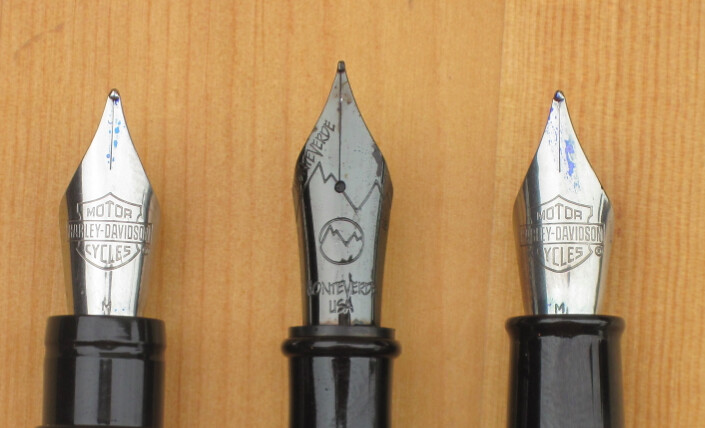 |
| Left to right: Harley Horizon, Monteverde Invincia Stealth, Harley Free-Wheel Flames |
The only other similarity I've observed is that the barrels and caps of both seem to be plastic, but each has a very different feel. The Horizon is a larger and much heavier pen. Despite the plastic body, the Horizon has quite a bit of heft, and feels a little top-heavy with the cap posted. The Free-Wheel, on the other hand, is quite light. It also feels less substantial, more delicate.
The Free-Wheel is slightly more compact than a Safari, and the Horizon slightly larger. With caps posted, though, the Horizon is longer than the Safari because of the Horizon's short relative cap length and the way it posts.
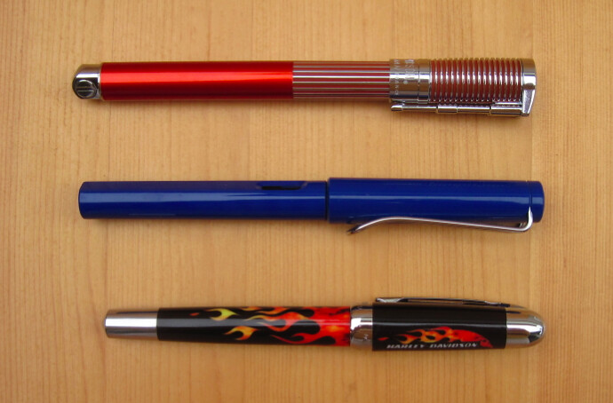 |
| Top to bottom: Horizon, Safari, Free-Wheel |
 The presentation of the Horizon is fun: it ships in a plastic case that is shaped like the teardop of a motorcycle gas tank. (Hey, if you're going to be a little kitschy, why not go all the way?)
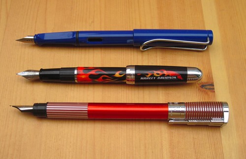 |
| Here they are posted (and shuffled around from the other photo, just to keep you on your toes) |
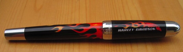 |
| Fuzzy letter graphics, but the flames are better |
The Free-Wheel flames are a clever idea, and surely more fitting than the Wayne Campbell's flames, but the execution is a little lacking. I think the pen has the right amount of flame (wow, how do you measure that?), but the fuzzy lettering graphics next to the flames kin of bring the overall look of the pen down. I'm not sure one has a right to expect any better for $17.49, but if you are considering the purchase, you should be aware of this.
This pen is very light and easy to write with, but the plastic body does feel a little cheap. The best way I can describe it is that it feels sturdier than a Noodler's piston-filler but not as sturdy as a Lamy Safari. I'm not sure it's a good pen for slipping into your jeans pocket as you walk out the door.
There is nice detail on the cap ring, which bears both the "Waterman Paris" and "Harley-Davidson" marks.
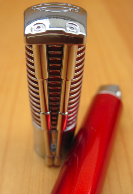
There is quite a bit more detailed relief in the design of the Horizon Orange pen. Unfortunately, by modeling the cap after a cylinder, they had to give up the classic V-twin design (though I seem to remember Harley made a thumper back in the bad old AMF days).
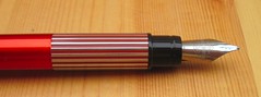 I don't particularly like the section on this pen. Where it steps up in diameter is placed so that your grip has to take into account that step, unless you grip the pen a long way from the nib. I have seen this design on other pens and don't quite get it. It just doesn't seem like it would be comfortable for anybody. Is there some trick to gripping it that I am missing?
The detailing on the cap is quite nice. It includes a bar and shield logo on the end of the cap.
Of these two pens, I use the Free-Wheel more because I can grip it more comfortably.
So there you have it. These pens aren't nearly as exhilarating as a real bike, but they are as close as I will come for a while!
As usual, I have more photos in my Flickr photo set for this review.


I got the rollerball version of the flame Harley pen as a gift a few years ago, and I was so excited to see this review! The fountain pen looks lovely, I think I might have to add it to my collection!
ReplyDelete