This is my first ink review, so you'll have to cut me some slack. Perhaps you'll be more inclined to do so if you understand that tortured journey that brought me to this first review. If you don't care to read this part, skip to the heading "The Review" below.
The Struggle
About four months ago, I bemoaned the unhelpfulness of many ink reviews, due not to the inadequacies of the reviewers, but because of all the variables involved in performance. Really, all a review can do it tell you how the ink wrote in the particular pen(s), on the particular paper(s), with the particular nib(s) used in the review. On top of that, everything from writing pressure to humidity will cause variations even with a particular pen/paper/nib combination, and then you've got to wonder how closely the depiction on your monitor resembles the color of the ink when its right in front of you.
So, I set out to write the world's best ink review, even though I only started using fountain pens consistently last February. Such is my hubris, I suppose. I had grand plans of comparing entire color families in a single review, with the objective of helping readers choose the perfect gray, or perfect red, or perfect what not for their tastes.
I failed utterly.
Through the convenience of ink samples available through Pear Tree Pens and Goulet Pen Co., I started by comparing 6 different grays before settling on and purchasing a full bottle of my favorite. But I never got around to writing the review because all the sheets of writing I had in front of me at that time made the project too daunting.
So humbled, I set about trying to review one ink at a time, figuring I could at least design the perfect review format, with a consistent form that would provide readers with everything they needed to know about the ink. (There's that hubris again.) I'm sure there must be a name in the psychological literature for the symptoms I displayed in that difficult quest — but I believe the layman's term is that I "couldn't see the forest for the trees." I got so bogged down in minutiae (it is an exaggeration, but not a great one, to say that I was considering buying an anemometer, barometer and hygrometer so I could take wind speed, air pressure, and humidity into account) that I finally gave up.
Humbled yet again, I've decided to wing it with one or two good ideas that survive from my experience, and to refine my technique as I go. Why deprive my readers of my unenlightened ink commentary? I mean, they come here for my unenlightened commentary on everything else, so why should inks be excluded?
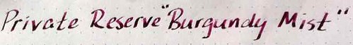
As a result of all that, Private Reserve Burgundy Mist became the subject of my first review merely because I got tired of trying to do it right with some other colors, got fed up, and posted this out of exasperation.
But enough about my personal problems. On with the show!
The Review
I like this ink. A lot.
I should write a little more.
Like I said, I came up with at least one ink review idea that I think is pretty good. That is to show how
the ink looks from different nibs. So, I went online and ordered extra nibs for my Lamy Safari and Al-Star. Then I thought I'd also feature the ink in a "guest pen," i.e., something other than the Safari or AL-Star.
In the photo below, you can see the same line of text written in progressively broader nibs on the Safari, starting with XF on the top, on Rhodia Dot Pad paper:
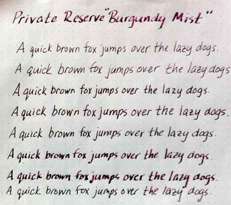 |
| Top to bottom: Lamy Safari with XF, F, M, B, 1.1 mm italic, 1.5 mm italic, and 1.9mm italic nibs; Cross Apogee F nib at bottom |
 |
| Shading is most visible in the italic nibs |
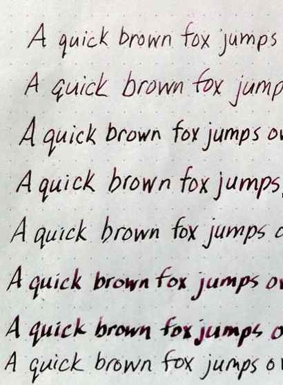
Not much more help, is it?
I tried photographing the writing samples in flat outdoor light (both in and out of the shade on a cloudy day), next to a brightly lit window, even under a few different types of artificial light. None of the photos satisfactorily shows the differences in color and shading among the different nibs, but I ultimately used the photos taken next to a sunny window and applied the "enhance" function in iPhoto, which took me closest to the actual color of the ink. The best depiction of the shading is probably the enlargement at the beginning of this post.
Here, I've written next to some Burgundy Mist test squiggles in Visconti Burgundy with a Lamy Safari medium nib, and you can see that Private Reserve and Visconti have very different ideas of what "burgundy" is:
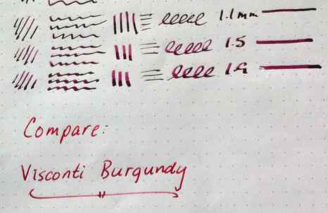 |
| Visconti Burgundy looks red compared to PR Burgundy Mist |
I wonder if they would see eye-to-eye on burgundy wines.
I didn't do extensive testing on flow, feathering, bleeding, etc. For one thing, these samples were written on a Rhodia Dot Pad, an insanely fountain pen-friendly medium, on which I don't expect any ink to bleed or feather. However, on less friendly papers the bleeding and feathering seemed modest, considering that my squared Moleskine bleeds inks so badly that I half expect it to cause a graphite pencil line to bleed through the paper.
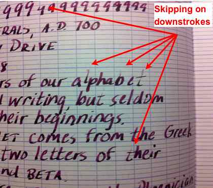 |
| I don't blame this skipping on the ink |
That, too, is a canvas especially friendly to fountain pens, but this is not the first ink I've had skip a lot in it. That, combined with the fact that the nib seemed a little loose, makes me think that the ink is not to blame here.
So, there you have it. These photo enlargements don't look too good. I'm going to see if I can get better resolution photos up, so if you liked the review but didn't like the photos, try checking back in a week or so.


ROFLOL! Yes, trying to review an ink when there's not much to really say and your writing is nowhere near as good some of incredible samples seen on other blogs is one major PITA.
ReplyDeleteInks shade when using certain pens and not others, ink creep can be a problem either because of the ink (Noodler's, I'm looking at you) or the pen nib needs some adjusting. The paper contributes to the review but what does that mean, exactly? You've nailed all the confusion perfectly.
I think reviews should be stream of consciousness, so I can include the "get off! get off!" part when the cats decide to lie down on not-quite-dry paper. :)