A technophile lawyer rediscovers the joys of pen and paper

Tuesday, June 7, 2011

The June Carnival of Pen, Pencil and Paper

All these posts can make a person dizzy! (Photo courtesy of publicdomainpictures.net)
Welcome to the June 7, 2011 edition of the Carnival of Pen, Pencil and Paper. I'm both excited and embarrassed to be hosting this month. Excited because, well, it the Carnival, which means lots of cool posts and probably means higher traffic than usual for me. Embarrassed because all that traffic is going to hit after several months of very little posting here. Nonetheless, feel free to poke around while you're here. Let's hope this kick-starts my posting motor.

And, we're off!

editor's picks

Science or art? 

Two regular ink reviewers consistently put an unusual amount of artistry into their reviews, and this month is no exception: David Garrett presents ink review - sailor jentle blue black posted at seize the dave, the best-named blog on the net! Clement Dionglay presents Ink Review: J. Herbin Diabolo Menthe at Rants of the Archer.

Do-it-Yourself:

DIY enthusiasts will enjoy Nrepose's write-up of the Noodler's Friction Fit Pen at Unposted. (Not quite a Noodler's pen, but you'll understand the name of the post soon enough.) And, take a moment to get in on the ground floor of Alex Witte's Nib Grinding Project on $3 Pilot Varsity pens at Economy Pens.

Decisions, decisions:

Most people wouldn't call this a brain-teaser, but we're not most people, are we? Snarky's Machine challenges us to choose favorites in Desert Island Pens: Which 10 Pens Would You Take? at Does this Pen Write? That might have some of us thinking for a few hours . . . or maybe days. Whatever you choose, don't forget the paper. That tree bark will wear your pens down something awful.

Ink. It's not just for pens anymore:

Ink Nouveau guest blogger Jamie Williams Grossman explains that the artistic use of ink isn't limited to pens in Beyond the Pen: Fountain Pen Ink as Watercolor Wash, while Ink Nouveau's founder Brian Goulet goes his guest blogger one better, skipping the pen and the brush altogether and taking the ink straight to the water: Ink in Water Pictures at Ink Nouveau.  (I share Brian's fascination with this, especially when the ink looks like an entirely different color outside the pen than it looks when flowing from the pen.)


penmanship

Whodaman presents 4 Steps to Improving Your Handwriting - However Bad it is posted at Smarter to Smartest.

Cheryl from Writer's Bloc presents Do I need a left-handed nib on my fountain pen if I’m a left-handed writer? at the Writer's Bloc Blog.

notebooks, paper, and journaling


Moleskine Releases New Cahier Planners for 2012 posted at Journaling Arts.

Dolly once again offers help for the journalist struck with writer's block, with Journal Writing Prompt #21 — Right Now at Journal Addict.

Father's Day is coming, and Nole has some card suggestions for you in Father's Day Card Round-Up and Father's Day Card Round-Up, Part 2 at Oh So Beautiful Paper.

Last week, yours truly introduced you to Unquestionably the coolest notebook I've ever seen, right here at Note Booker, Esq.

office supplies

Nrepose presents The Classroom Friendly Pencil Sharpener at Unposted.

ink and art

Oh, how I envy artists!

Inkophile helpfully leads us to several examples of pen art in Links to Artists Who Put Pens to Good Use at An Inkophile's Blog.

Carnival founder Nifty shows us a recent favorite piece in Moleskine Monday: “Weekly Moleskine” at Notebook Stories.

AK lets us in on the Inside: A Ukranian Sketchbook at Notebook Loves Pen (next month's Carnival host).

The Trone presents Trone Art posted at The Trone blog, saying, "My own art! Only five pieces now but I have many others that I will post on a regular basis (daily or bi-daily). I hope you enjoy and browse my blog!"

You might think that carving up a Moleskine with a razor blade should be punishable by prison time, but you'll probably change your mind when you read The Book Surgeon at Moleskinerie.

Heather at A Penchant for Paper provides some interesting Art Journal Prompts, Part 1.

ink reviews

Peninkcillin presents Noodler's Burma Road Brown (V-Mail) Ink Review at Peninkcillin.

The Classicist reviews Waterman Black at Penned House.

pencils


M. Meckel wonders if yesteryear's factory seconds are better than some of the cheap pencils that pass quality control today, in Seconds at Bleistift.

Thinking pencils? That's what Palimpsest writes about in Brainstorming with Pencils at Palimpsest

pens


Multi-pens, anyone? Diane B presents Uni-ball Jetstream 3 Color Multi-Pen posted at Pocket Blonde, and Yochanan introduces his new blog, Multi Pen Dimensions, with Why multi pens? Welcom aboard, Yochanan!

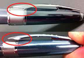
Here's a "two-fer" from Alex Witte at Economy PensZebra AR7 Blue and Kaweco Sport Classic.


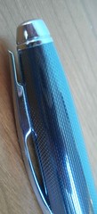
Millie presents Product review: a new Lamy and a new ink posted at Planet Millie, saying, "The new aquamarine Lamy and a review of Caran d'Ache Caribbean Sea ink. It's all very aquamarine!"

Maria Fallas presents Moleskine Rollerball Pen posted at Pen and Paper Hoarder, another very young blog.

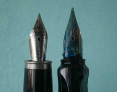
Julie (O-kami) presents Edison Pearl at Whatever.

Some of us are constantly on the quest for the "perfect" pen. Dowdyism reminds us that sometimes the search involves more than shopping, with Pen Hack: Zebra Sarasa Clip to Pilot Hi-Tec-C Cavalier at The Pen Addict.

miscellaneous

Julie at Peaceable Writer presents more samples of her too many inks in Writing Down the Ink #6. I'm having a little cognitive dissonance trying to process the concept of "too many inks." Who knew that was possible?

Another year, another National Stationery Show missed. Rats! But Office Supply Geek was there, and brings us his 2011 National Stationery Show Highlights.


next month

That concludes this edition. Next month's carnival will be hosted by Notebook Loves Pen.

Submit your blog articles for the next edition of carnival of pen, pencil and paper using the carnival submission form. Past posts and future hosts can be found at the blog carnival index page, and you can read about the Carnival's origins at Notebook Stories.

Don't be strangers!


Share/Save/Bookmark

Wednesday, June 1, 2011

Unquestionably the coolest notebook I've ever seen

Cool Indian Notebook - Close-Up
Close-up: top right of cover
Granted, I've only got about 18 months of the notebook bug under my belt, so I've seen a lot fewer notebooks in my time than Nifty has. But I find the coolness factor of this notebook is off the charts.

I bought it at Flax in L.A. last month. Joan, the proprietor at Flax, said once the salesman showed then to her she bought all they had —and she only had 5 left when I bought this one.

The notebook is from India and appears handmade. Joan didn't know what language that is on the cover, and I don't, either. Hindi? Punjabi? Bengali?

Let's start with the cover: part leather, part canvas, with a rough-hewn interface between the two and around the edges.
Cool Indian Notebook - Front and Back
Front and back views
The pages are heavily textured, and likewise finished roughly around the edges, and it has a very narrow leather bookmark. It seems like this notebook should be used only for important things. Forget about daily to-do lists. That just wouldn't seem right.

Cool Indian Notebook - Edge Views


Everything about this notebook — the rough edges of the paper, it's texture, the materials (the cover is part leather and part canvas, the bookmark is leather), the stamp and writing on the cover — screams "Old World." Sitting down with it, I feel like a British Lieutenant leading an expedition or manning a remote outpost in colonial India or South Africa, keeping my log in this notebook, writing in the heat as I sweat under my heavy red tunic.

But, that's just me.

Share/Save/Bookmark

Wednesday, May 11, 2011

Booker wants you for the June Carnival of Pen, Pencil & Paper!

Public domain photo courtesy of PDphoto.com
Yours truly will host next month's Carnival of Pen, Pencil and Paper on June 7. You can't win any stuffed animals at this carnival, but it will be lots of fun for my regular readers and anyone else that cares about what they write with! In the words of carnival founder Nifty of Notebook Stories, the carnival is a "traveling monthly collection of the best blog posts about notebooks, pens, pencils, paper products and anything else deemed relevant by the editors."

If you're unfamiliar with the carnival, you can check out the current edition of the Carnival at Economy Pens or go here and click on the "past posts" tab of the widget for links to all of the past carnivals.

Please use this form to submit posts for the Carnival (link repeated in the final line of this post); do not email me directly. Submit as many posts as you like, and there's no rule against submitting your own. (I won't tell.) I'll do my best to include all but spam submissions, but I can't promise everything will make it in.

I know it's only May 11, but there haven't been many submissions so far, and I'm starting to worry a little. So get crackin', everyone! Make me look good.

Is there anything in it for you? Not really, unless you submit one of your own posts. And you'll have a warm, fuzzy feeling knowing that someone will see your submission that might otherwise have missed it.

Submit posts at this link

Share/Save/Bookmark

Friday, April 29, 2011

What's better than getting a bunch of ink samples in the mail?

Ink TenpinsGetting a bunch of full bottles of ink, that's what! I think this order from Goulet Pens just about doubled my ink collection so far.

The reason for ordering so much ink at once? I decided I needed some dark inks for my new Visconti Homo Sapiens. I had some dark ink samples, but I wasn't able to fill the pen from any of the sample vials because the nib is too large to submerge. So, I tried out some of the inks in other pens, then bought eight colors that I thought fit the personality of the Homo Sapiens (though I'll certainly use them with other pens, too)..

Four of those colors are purples: Diamine Damson, Noodler's Purple Martin, Noodler's Nightshade, and Private Reserve Ebony Purple. Why four shades of purple? Because you never know what purple you're going to need. That's just common sense!


But I also got two deep greens — Private Reserve Ebony Green and J. Herbin Vert Empire — and Noodler'sRed-Black, which is what the Visconti is currently inked with, and which looks great flowing out of the pen. The J. Herbin Cacao du Brésil is an interesting color because it's hard to categorize.


I rounded out the order with J. Herbin Rouge Hematite and Noodler's Bad Belted Kingfisher. The former is not only a good ink, it has one of the coolest bottle designs ever (special because it is the 340th anniversary ink - see the middle bottle in the top photo). And Bad Belted Kingfisher, besides having a bitchin' name, is a great blue-black and replaces my old bottle, which I lost in an "ink incident" that is still evidenced by stains in the caulk near the sink.


By buying ten bottles, I got a 10% discount, to boot!

ALL SWABS COURTESY OF THE GOULET PENS SWAB SHOP.

Share/Save/Bookmark

Monday, April 25, 2011

Review: Cross Apogee Fine-Nibbed Fountain Pen with Frosty Steel Finish

An "apogee" is the point of orbit of a heavenly body in which it is furthest away from the center of the object around which it is orbiting. So, I take it Cross intended the name of this pen to mean a pen that has reached the highest standards.

I'd say that's about right in this case. I like almost everything about this pen. Pens being so personal, of course, I found a thing or two I don't particularly like, but my complaints are mere quibbles.

Cross Apogee - What color is Frosty Steel?
I could not capture the true color of this pen. See the Flickr photo
set at the end of the post for some better pictures.


First Impressions

Usually, I have this "first impressions" section because the pen I'm reviewing was ordered online and I haven't seen it up close before. This pen is an exception, because I saw and tried the pen at Flax in L.A. before buying it there. A first impression at Flax is a little different than a first impression opening a package at home, because Flax does such a beautiful job of presentation. It looks like you're viewing jewelry in the display cases . . . Joan could probably display a charcoal gray Lamy Safari in a way that would make it look worth hundreds of dollars!

Even out of the display case, though, this pen in "blue steel" finish is quite stunning. The name of the finish is probably meant to connote blue tint to the gray/silver color. The Cross website, describes the finish as "pale blue translucent European lacquer over guilloché-etched chrome." The resulting color, in my opinion, is  more of a bluish silver than a silvery blue, and certainly less blue than the pen appears online on my monitor. The true color is somewhat of a hybrid of the three views in the picture above. If color is important, I recommend you first see one up close.

The pen has a somewhat odd, but not unattractive, outline, with a very wide variance between its widest and narrowest points. A pen this thick (0.49 inches) usually doesn't narrow toward the end of the barrel as much as this one does, and you'll note that the contour of the barrel is far narrower than the contour of the cap.

Cross Apogee - Frosty Steel - Guilloché EngravingFinish and Appointments

At first glance, the finish resembles a very tight carbon fiber weave, or maybe scales, but on closer inspection — I looked at it under a 14x loupe — the barrel has a series of longitudinal wavy lines engraved into the barrel, spaced so the raised ridges narrow and broaden along their length. This is very difficult, if not impossible, to see with the naked eye.

The sleekness of the pen is broken up by a very wide cap band. The appointments are chrome plated, but the cap band has polished chrome only on its borders, with a satin finish over most of its width. The cap and barrel ends are all polished (no satin finish) with engraved rings that also tend to break up the sleek outline. This is one of my quibbles: I think the pen probably would have had a sleeker look if the cap ring was all polished chrome or the cap and barrel ends did not have the engraved rings. This, of course, is purely a subjective factor.

Cross Apogee - ClipCap

The cap is not threaded, and goes on feeling like it will just be friction fit until it's almost on, when you finally get the somewhat soft click that tells you its seated. This is not a sharp click like you get on a Lamy Safari or Lamy 2000. It's a little mushy, and even more so when removing the cap. Not what I'd prefer, but there's no mistaking when the cap is seated.

Which brings me to another of my quibbles, this time a a functional one. The spring-loaded clip requires you to squeeze the top of it to open it before sliding it over your pocket. The clip is so tight against the cap and and shaped so there's just no way it will slide over a pocket without opening it first. I think Lamy Safaris have spoiled me on clip functionality forever.

Nib, Feed, and Section
Cross Apogee nib and Lamy AL-Star nib side-by-side
Cross Apogee nib om the left;
Lamy AL-Star nib on the right

The nib is rhodium-plated 18k gold. It's not particularly distinctive, except in size: it's tiny on such a large pen. I think it's even smaller than the nib on my A.G. Spalding & Bros. mini fountain pen. Given the size of the pen, the appearance is somewhat the equivalent of a person with a noticeably small head. At right, it is compared to a Lamy AL-Star nib. (Check it out compared to the giant nib on the Monteverde Invincia Stealth here.)

The section has a plastic cover on it, so those of you that avoid metal pens in order to avoid gripping metal need not worry. The section is comfortable and has never felt slippery.

I know nothing about the feed except that you don't push the converter straight onto it. The converter is threaded, which I really like. Some of my other converters get lose after many uses, but the threaded converter stays in place with no wiggling, so I'm hoping that the actual connection to the feed stays tight for a long time.

For a while, I had a difficult time with ink leaking into the cap between uses, even when I wasn't carrying the pen around with me. That seems to be a thing of the past, though. I'm assuming that certain inks will and most won't.

Writing & Feel

Someone on the Fountain Pen Network has three maxims in his signature, one of which is: "Chase the nib, not the pen." I don't know whether to attribute the pleasurable writing to the nib or the feed, but I can tell you the one obvious benefit to writing with this pen that distinguishes it from most others I own: it doesn't skip even with quick changes of direction and long, fast lines. Many of my pens tend to skip a little if I make a quick circle or long line, but this one never does.

The fine nib is probably a little broader than the fine nib on my Lamy Safaris and Waterman Expert. It is wonderfully smooth and wet. This tends to smooth out the writing even on textured paper; you'll get less feedback from the texture with this nib than with some other fine nibs. I don't know if those characteristics are standard or a fluke, but I like 'em!

People not used to metal pens may find this one a tad top heavy when posted. I started writing with fountain posted, because that's the way I always wrote before using fountain pens, but that's because everything I wrote with was plastic. I now write mostly unposted with this pen and my other metal pens, and I find it more comfortable that way.

Bottom Line

As I said, I like almost everything about this pen.

Pros: Smooth, skip-free writer, threaded converter, nice aesthetics.

Cons: squishy cap closure and difficult to use clip.

Maybe you've been toying with $30 to $40 pens and want to see if a more expensive pen is worth it. If you're willing to spend around $200 (a little less at discount retailers), this pen is a fine choice.

As usual, more photos at the Flickr photo set.

Share/Save/Bookmark

Thursday, April 21, 2011

Making the most of a parking ticket

Parking ticket in Oslo, Norway.Image via WikipediaNothing like getting a parking ticket right in front of your own house. But that's what happened to me this week. I usually park in the back, but after having my gas tank siphoned twice in a week, I decided to park in front of the house, where a gas thief will be more exposed, until I can get a locking gas cap.

Geez, didn't I just write something in my last post about trying not to bore people?

Anyway . . . because I'm not used to parking out front, I forgot that the streetsweepers come through on the first and third Tuesday mornings each month, and my wife wasn't here to remind me, so I got a ticket.

So, how did I make the best of it? I got out a nice Crane's envelope, my newest pen, and my wax seals . . . and sent off perhaps the most elegantly posted parking ticket payment the processing center will see all month (if you don't take my handwriting into account):


I'm wondering of the clerk who gets this will even notice it among the hundreds or thousands of others to be opened that week. But of course, I didn't do it for the clerk, I did it for me. It's such a pleasure to use the good stuff!

Share/Save/Bookmark

Where did that month go?

What month? The month that I didn't post, that's what month!

I know it's customary to return from such a lengthy and unannounced hiatus with a post explaining one's absence, but . . . I'm not going to bother, because it would bore you silly.

Suffice it to say I have some posts in the queue and should be back to 1-3 posts a week starting . . . wait for it . . . wait for it . . . now!

Share/Save/Bookmark